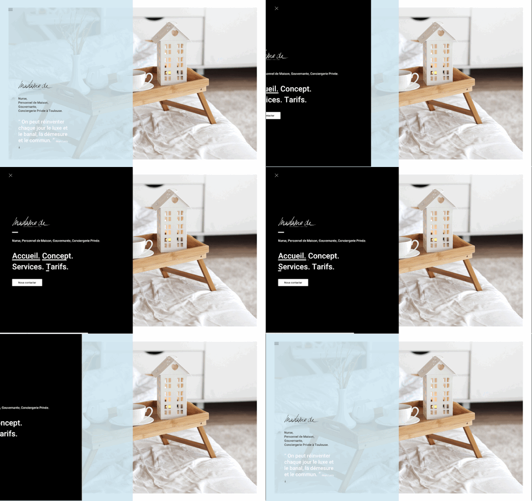
Good example of a left side fly-out overlay style navigation. The links to sub pages are bold and pretty much the only option once you discover the nav is there via the hamburger icon.
Source

Another left-side fly out menu. In this design they cover the entire page content and have a neat little interactive menu design. They’ve put the word “home” right next to the hamburger icon too to help reinforce where that leads you.
Source

This interaction is cool, because it all starts with the placement of that hamburger icon. The layout of the page is such that your eye is drawn almost instantly to it. It’s hard to miss, which helps lead you directly into interacting with the sub nav below it.
Source

Here’s an example of an overly minimal approach to using the hamburger nav. I can only assume the #1 thing they want you to do is watch the video first, then explore. I’m not a huge fan of it but it’s a great example of this minimal usage.
Source


0 Comments