Web Design Inspiration Curated
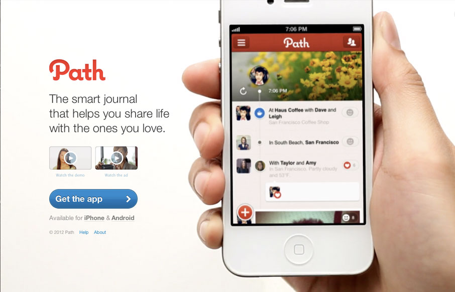
path.com
The path.com website is a simple/minimal thing of beauty. The background of the site is a demo video that auto-plays in a very unobtrusive way. It's brilliant really, showing off the app like that - since that's what will make you fall in love with path in the first...
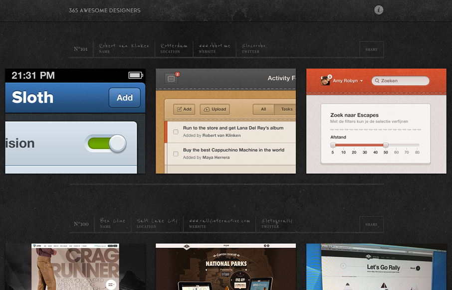
365awesomedesigners.com
Matthias Mentasti is debuting a designer a day over at 365awesomedesigners.com. The site pulls in Dribbble feeds of some of the best designers currently dressing the interwebs. He's created the perfect textured backdrop for showcasing the crazy detail of the work. So...
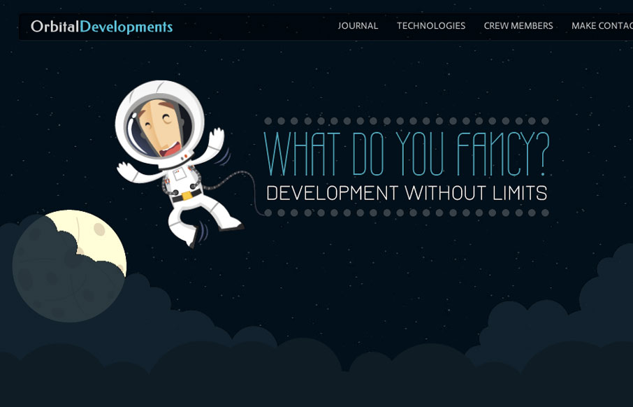
orbitaldevs.com
Love the Orbital Developments site design. It's fun and functional. I really dig the responsive approach and some of the finer details. Like the moon and slight astronaut animation. Gio and I dig in with our screen cast review, give it a watch and tell us what you...
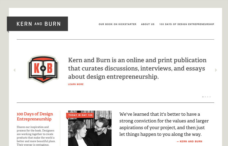
kernandburn.com
A great great project and a really cool looking site design make for something I love. This site isn't super duper interactive blow your mind away but it's content and overall presentation make me smile. Crsip lines and type and great color choices here. Lovely work.
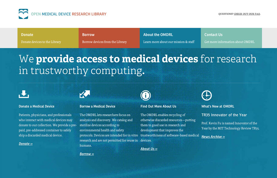
omdrl.org
Love the omdrl.org website, it's a beautifully minimal example of solid design. The typography and hierarchy of most everything across the site is in order. Particularly interesting is to study the three different phases of the main navigation design for the major...
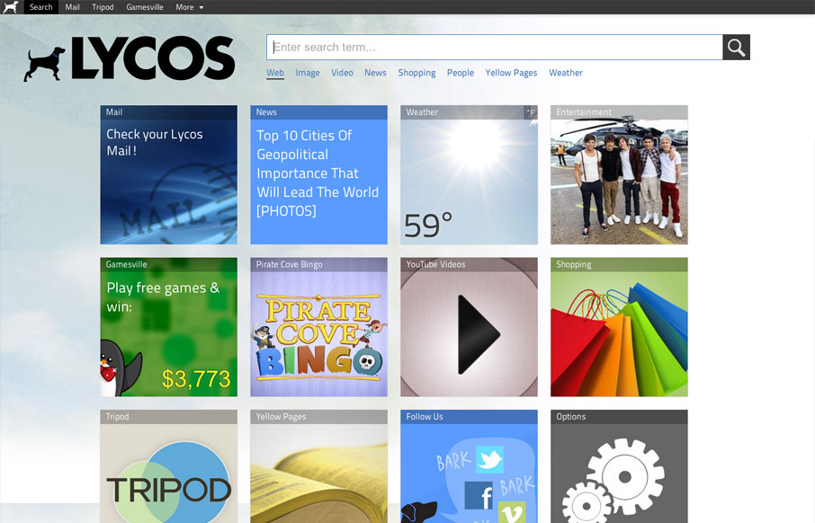
lycos.com
The new Lycos website is interesting. It's primary use is the deliver the search field and also has a large grid of selections for different stuff you can do. Like news feeds and video feeds, etc... I like that it's responsive a lot, honestly that's enough to make me...
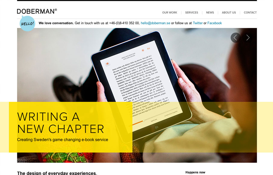
doberman.se
I really dig the hierarchy designed into this home page. The large image/slideshow is nice with nice details and you get t focus on that, with simple messages and then as you scroll down the info gets more densely populated and then eventually just some basic about...
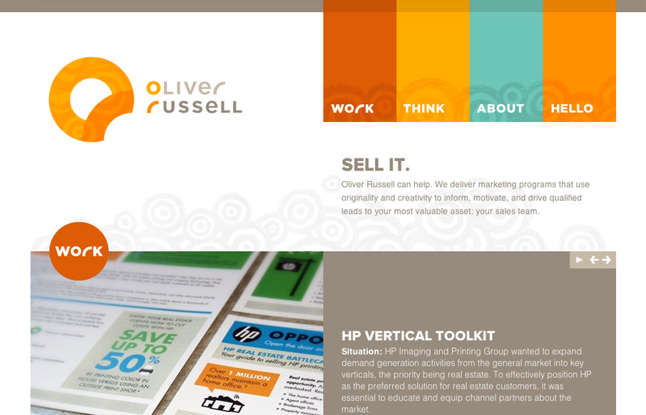
oliverrussell.com
I like the two main column layout for this website. The use of the circles and overall blocky feeling of the design makes for a nice contrast, especially with the circular swirly pattern behind the main elements. The responsive design for this site is pretty well...
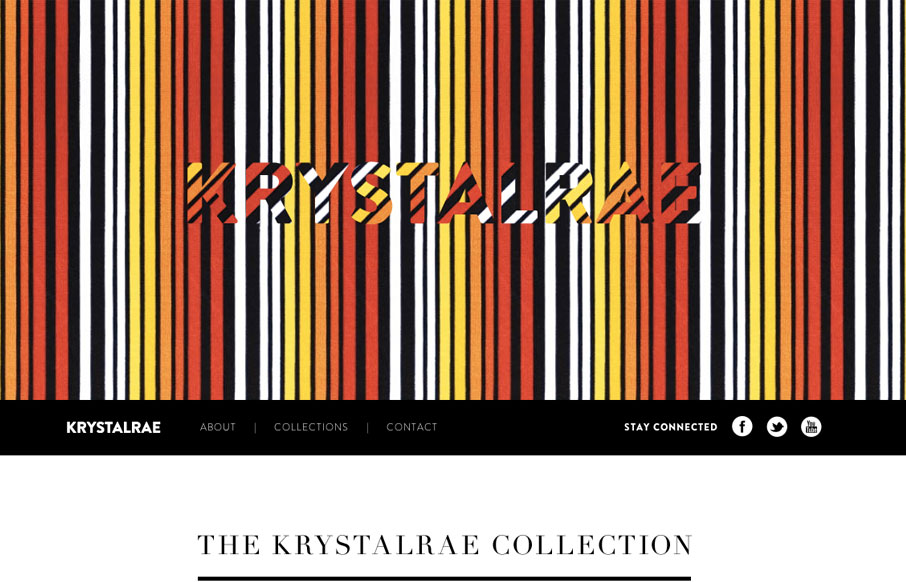
krystalrae.com
Very fun parallax website. Super great execution too. The best part is the way it's used to view different sets of cloths over the model. But the bottom nav slides into place and you can then use the up and down arrows to load the clothes. I love clever usage of...
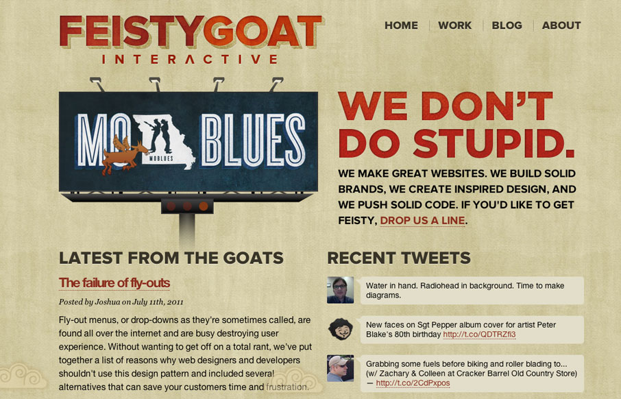
feistygoat.com
I love the bold two column layout of the Feisty Goat website. The animations are fun and the overall tone is indeed feisty. I really like that they have thought out their brand's tone so fully and push it with the copy and everything. In this case it really helps...
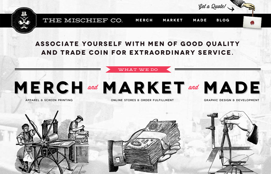
themischiefco.com
The Mischief Co's visual branding is quite fun. It's somewhere between olde school and future classy (heh, I just made that up.) But I love it, it's fun and that's just what a site like this needs right? Technically it's put together well too. There's also some nice...
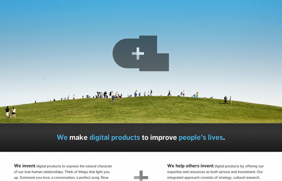
crushlovely.com
The new Crush Lovely website is simple and direct. I really dig how the tone is mainly delivered with copy and such. The "select clients" and "imagined future clients" stuff is pretty smart. The super large contact form with the large text box is also smarty used....
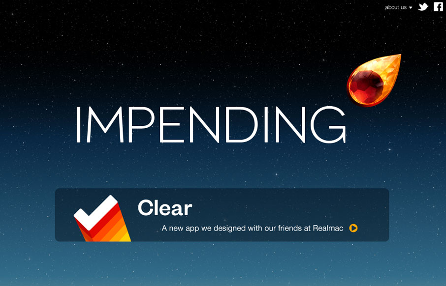
impending.com
Beautiful blog/website design by the team (partly) that made Clear. I love the crystal comet and that animation and the overall character the design gives the site. The footer is well done too and carries the visual tone all the way through.
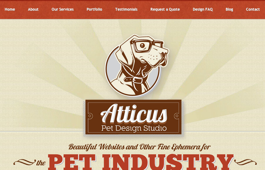
atticuspetdesign.com
Very tight design. I like the animated background image around the logo/illustration. I particularly like the effectiveness of the footer area/contact form. The experience of going from page to page and getting the slide down effect is pretty cool, but gets a bit...
rdio.com
The music app everyone loves right!?! The website is very clean and cool looking, from the apple influenced design (which is entirely appropriate here BTW) to the sign up experience. Very well done. My favorite part of the rdio site is the sign up. It's a modal with a...
uxmad.com
I can really appreciate a simple approach to a website - especially a conference website. I like the three column design, keeping things front and center like uxmad.com is doing. Kinda screams to be responsive too.
soleilnoir.net/believein
Soleil Noir's 2012 wishes is just plain fun to play with. Vertical parallax meets bright happy colors, simple messaging, and some animations to add another slight layer of wow. The nav on the side is neat. Choosing a colored dot is like picking an easter egg not...
hiutdenim.co.uk
This is a super straightforward and attractive site. The rich images create a consistent visual experience that almost feels like a story. Also, there's more content to this site than you might initially think, but it's all organized well and easy to navigate to. I...
offscreenmag.com
I love the slideshow of the inside of the magazine, well done and shows off what it's all like. The black/white/gray color scheme fits well to help accentuate the photos and such too. Would love to get my hands on one of these for a review!
lifetreecreative.com
The heading on the home page of this site says it all. "Simple, Beautiful, & Effective." The colors are fresh, the typography inviting, and the layout feels spot on. The flow of info and scanability of the site is great. The site is cleanly done and reflects that...
EMAIL NEWSLETTER
News & Articles
mchiaviello
RT @unmatchedstyle: Nice icons! http://weloveicons.com #ums
unmatchedstyle
Nice logo inspiration site. http://www.logofi.com #ums
unmatchedstyle
A slew of great podcasts here from IA Summit. http://bitly.com/JDVOF #ums

HARD WORK. CLEAN FUEL. NO EXCUSES
Use “WARRIOR2023″ for 10% off.