
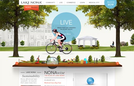
This site immediately serves its primary purpose: to get you to engage. I love the stunning graphics and the clever loupe slider that when interacted with offers a horizontal parallax effect. The mega-nav has a couple of winning points to it too. First, there’s a decent sized thumbnail and description for each section without needing to click away. Secondly (and most cleverly) the dropdown acts like a modal, darkening everything about the page except the navigation, which gives focus to the task at hand. Some of the interior pages are more purposefully designed than others, however the site overall really does give a rich sense of community.




0 Comments