getsatisfaction.com

getsatisfactioncom

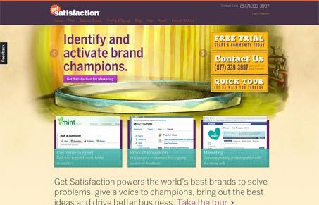
Nice design update for getsatisfaction.com. I really like the background image with the text based slideshow on top of it. I love the three screenshots that enlarge as you mouse over them.

I do however think the page is missing a really clear and simple call to action. The three gold(ish) buttons do stand out, but they are three different paths that you can take off into. That might be their purpose – I lack the insights that the site’s designers have but playing armchair designer here, that’s what I see and what my gut is telling me about it.

Kinsta

0 Comments

Submit a Comment

Your email address will not be published. Required fields are marked *

Time limit exceeded. Please complete the captcha once again.

News & Articles

Brutalism: The Beauty of Breaking the Rules

Brutalism: The Beauty of Breaking the Rules

Brutalism in web design rejects perfection for authenticity. Stark grids, raw type, and honest structure create interfaces that feel human, intentional, and impossible to ignore. Break the rules, on purpose.

Monochrome Minimalism

Monochrome Minimalism

Monochrome Minimalism merges Bauhaus discipline with IKEA simplicity. Clean grids, muted tones, and functional beauty create digital calm, proof that restraint, not decoration, defines timeless design.

4 CSS Features That Changed Everything

4 CSS Features That Changed Everything

Over the past five years, a handful of new CSS features have completely reshaped how we build for the web. According to the 2025 State of CSS Survey, these are the true game-changers.