Web Design Inspiration Curated
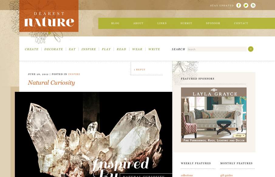
dearestnature.com blog
Posted by: Donaville Herrick @dearestnature This site was 5 years in the making. The original concept behind the site arose while working on niche publications for my previous employer from 2007 - 2010. It wasn't until 2011 that I hunkered down and mapped out the...
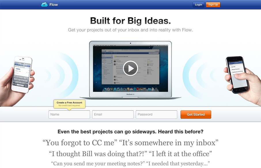
getflow.com
Really great looking/working website. I dig the bold colors, they kind of burn into your retina in a good way. I also like the small animation on the initial page load from the two hands holding the iPhones. The thing I like the most is the multiple chances to get...
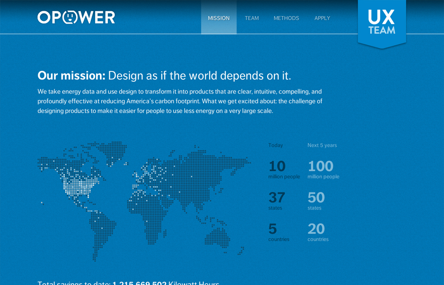
opower.com careers
Digging the new Opower UX team site bit.ly/LBtazr with fun facts & some friendly energy savings competition (cc: @jimjones) — Samantha Warren (@SamanthaToy) June 27, 2012 This is a nice representation of the Opower UX Team from their collective mission down to...
jessandruss.us
This is the wedding invitation/announcement website for Jessica Hische and Russ Maschmeyer. There is a lot of beautiful illustrations and just purely joyful feeling effort put into this website. There are some neat little easter eggs you can find in the site too, I...
ajmarksberry.com
A random Google search brought me to the site of AJ Marksberry and I have to say I was pleasantly surprised. I really dig what AJ has done. It's a straight up portfolio site which does an excellent job of selling his skills and representing his work, but it also is a...
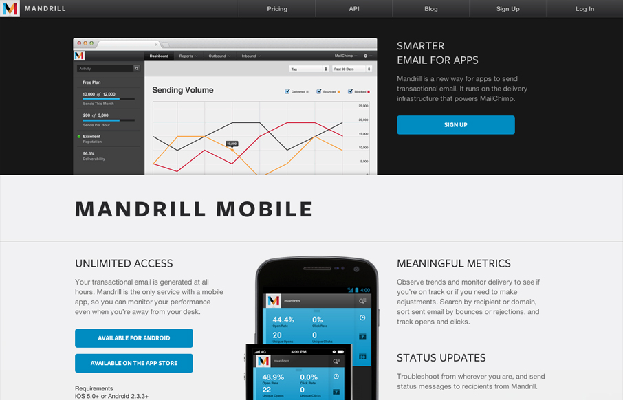
mandrill.com
The Mandrill site is a such a nice product/app website. The experience is clean with a few little visual treats here and there, like the slight parallax type image shift on the two mobile phone images. Good responsive design too. I particularly like the signup form...
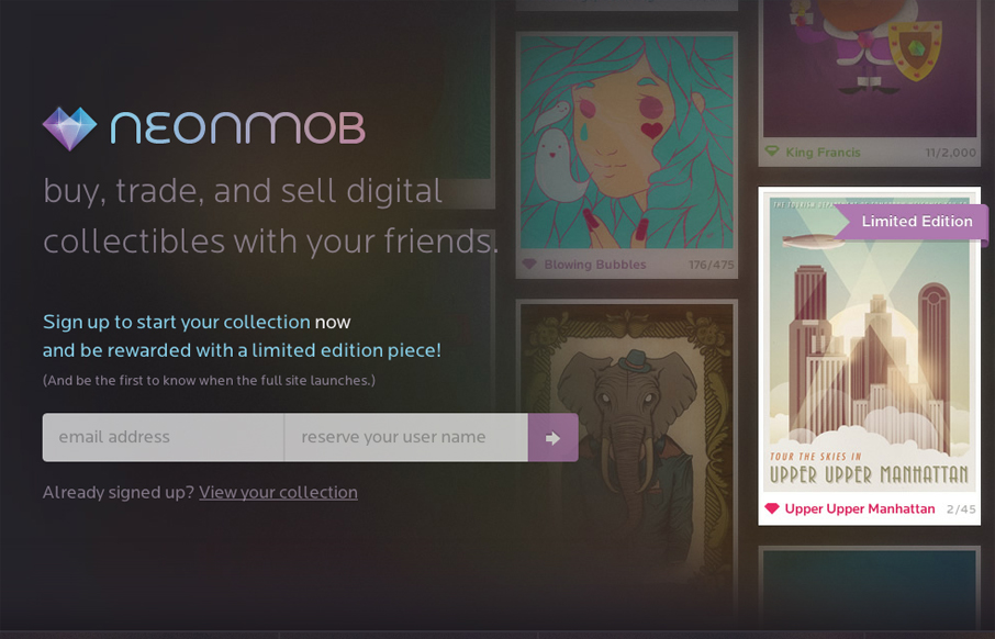
neonmob.com
I love the interactions on NeonMob. They're simple color shifts and sliding shapes but the overall experience is delightful. That's really all it takes sometimes to really draw you into singing up. In this case, onboarding by great interactions, it's a first for me to...
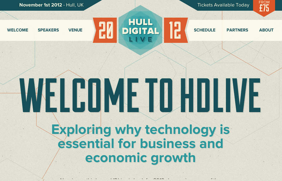
hd-live.co.uk
The Hull Digital Live conference website is a nice responsive top navigation design to study. I like the pattern here of going with the fixed top nav then as you get smaller screen widths, it still stays fixed but folds out with a slight transparency on it. It's not...
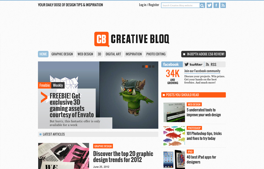
creativebloq.com
Creative Bloq is a brand new website by the makers of Computer Arts, 3D World and .net magazine that offers up a daily dose of design tips & inspiration. First impressions are that this could be something good. What I noticed immediately is that it's SUPER easy to...
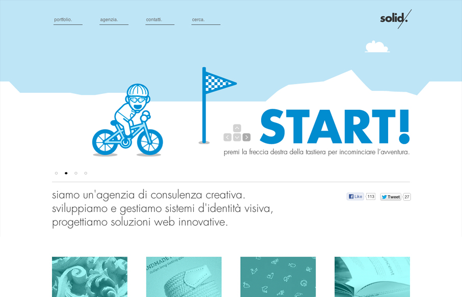
solidstudio.it
We are a consulting creative agency.we develop and manage systems of visual identity, Innovative web design solutions. Submitted by: Maurizio Cascio soldistudio.it is a, well, solid design, if you'll excuse the pun. The designer(s) paid a great deal of attention to...
soulmedia.com.au
We've worked really hard on this new version of our site to use HTML5, CSS3 and javascript to create an interesting, exciting and user-friendly experience (with a bit of humour) for our potential new clients. Submitted by: Daniel Ogden @Soul_Media Role: Designer &...
chaos.co.ke
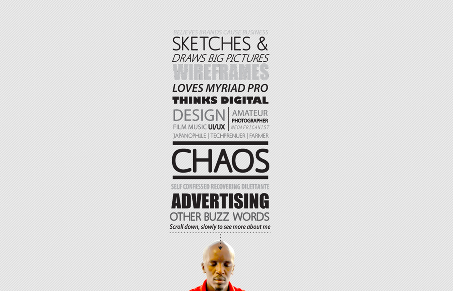
Submitted by: Charles Gichuki @kibee Role: Designer & Developer Way to show off the big guns! Don't get me wrong, I know what you are thinking... all the usability problems, the possible accessibility issues, etc. But, seriously, this site is a great example of...
andypatrickdesign.co
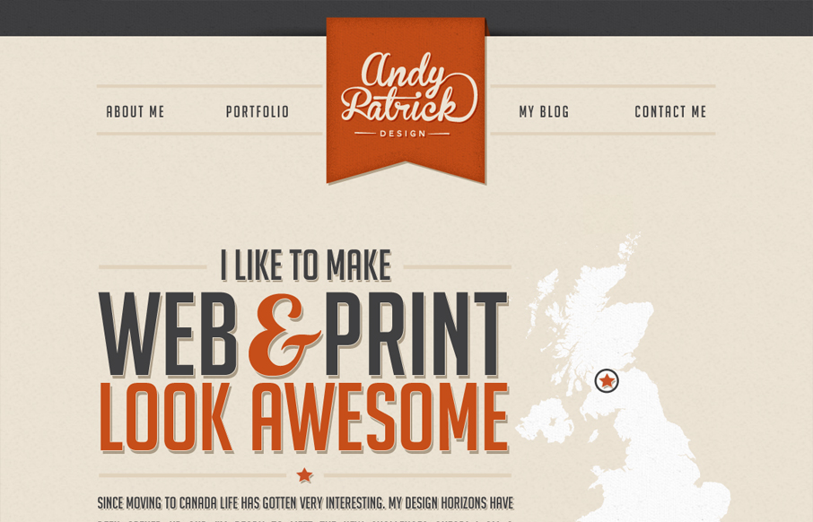
A personal portfolio site with a fun look at the changes taken in my design career... by plane. Submitted by: Andy Patrick @handyandydesign Role: Designer & Developer I really dig the type work on this website, it has a ton of character even if the color palette is...
glorm.com
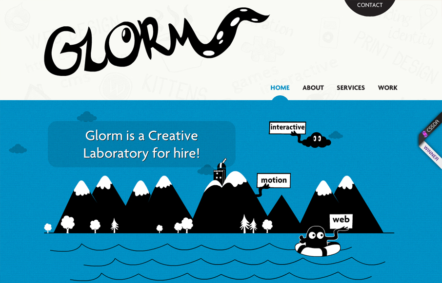
This site is hilarious and incredibly entertaining. After 10 seconds you get a real sense of what they do and how they do it, which is perfect for a portfolio site. It's also a perfect case study for multiple types of web based animation techniques. Some of the...
panelfly.com
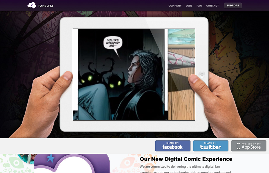
Introducing the new Panelfly Website, this showcases the release of our new app! Submitted by: Clinton Halpin @clintonhalpin Role: Designer & Developer panelfly.com is a lushly colorful site, full of energy and movement. I love the panelfly's palette; dominantly...
squareup.com
I love the super simple direction of the Square App home page. It's deceptively simple in that there's one thing they want you to do, signup. But it's done with a slideshow that loads in different signup options with each type of product and it's a slick way to...
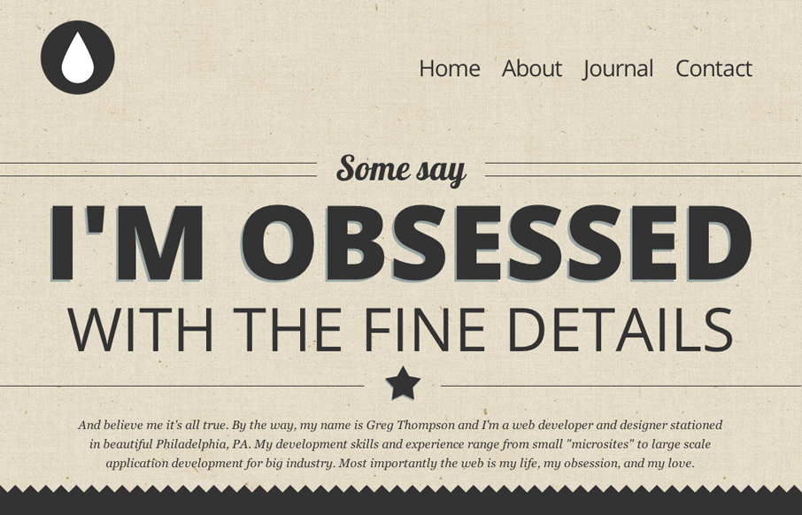
thegregthompson.com
This is my site, and I'd like to show it off. I'm very proud of it, it's fully responsive and use HTML5/CSS3 framework. Submitted by: Gregory Thompson @thegregthomp Role: Designer & Developer This is a great type-based, responsive site. The copy is engaging, but...
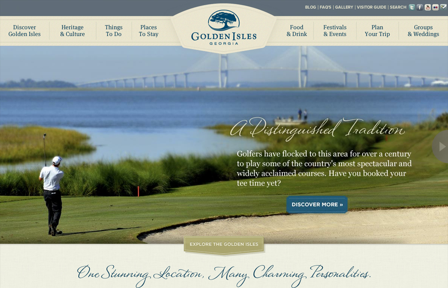
goldenisles.com
This is a very thorough responsive design solution. The main navigation changes alone are worth reviewing in some detail. Plus there is just a ton of info/elements on the home page that get handled well through each screen size transition.
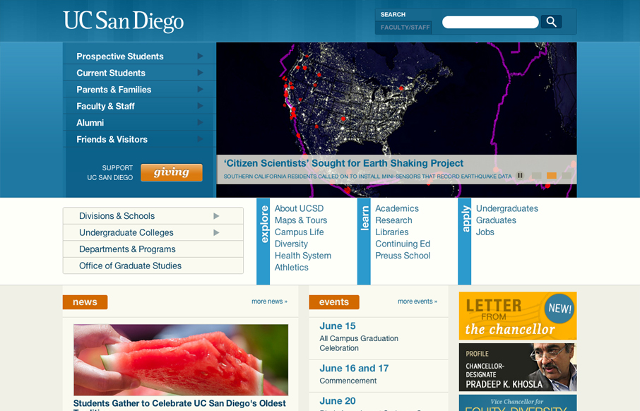
ucsd.edu
The UC San Diego website is very modular and square which is softened up a bit by the colors and a few slightly rounded corners here and there. There are a few sections of the home page that fall into a sort of "i'm just tired of designing" sort of vibe, like all the...
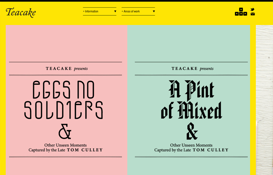
teacakedesign.com
I really enjoy teacakedesign.com because, while the layout and design present the work beautifully, the main thrust of the design revolves around making it easy for a visitor to navigate through the work. On teacakedesign.com, I enjoyed the ability to move through the...
EMAIL NEWSLETTER
News & Articles
unmatchedstyle
How Important are Avatars? http://bokardo.com/p/1086 #ums
unmatchedstyle
Not sure how i've not gotten around to reading this yet, but wow! http://blog.typekit.com/ #ums
unmatchedstyle
So does this sound familiar? http://bit.ly/nfBS4 #ums
HARD WORK. CLEAN FUEL. NO EXCUSES
Use “WARRIOR2023″ for 10% off.

