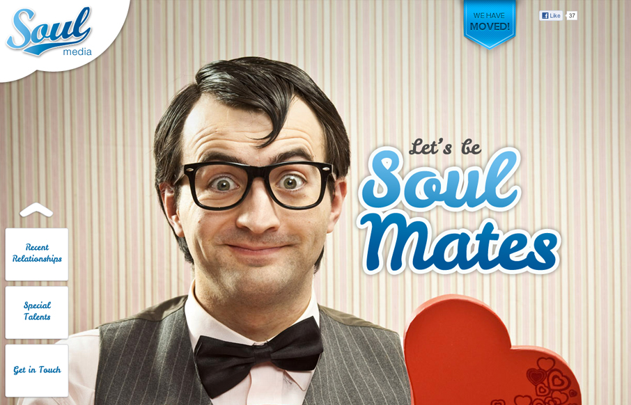
We’ve worked really hard on this new version of our site to use HTML5, CSS3 and javascript to create an interesting, exciting and user-friendly experience (with a bit of humour) for our potential new clients.
Submitted by: Daniel Ogden @Soul_Media
Role: Designer & Developer
I like the mix of oversized graphics and then smaller denser content as you scroll down the page. I’m not wild about the mix of navigation that only goes with the home page on the bottom left then the main navigation across the top that shows up as you start to scroll down. It feels too mixed and as a visitor i’m confused as to what the difference is from the contact stuff at the bottom of the home page is from the contact us page itself. This isn’t something that kills the site’s overall experience however which is driven with a nice sense of humor and style.


0 Comments