Web Design Inspiration Curated
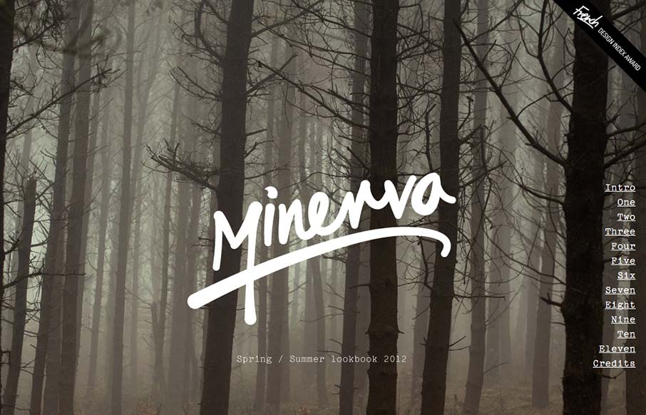
minervastreetwear.com/lookbook/
Great looking single page scroller. I love the long almost narrative feel to the catalog here, the product displays are well done too. I think the fixed nav element is a little bit understated but it's a subtle design and I totally understand it in the end.
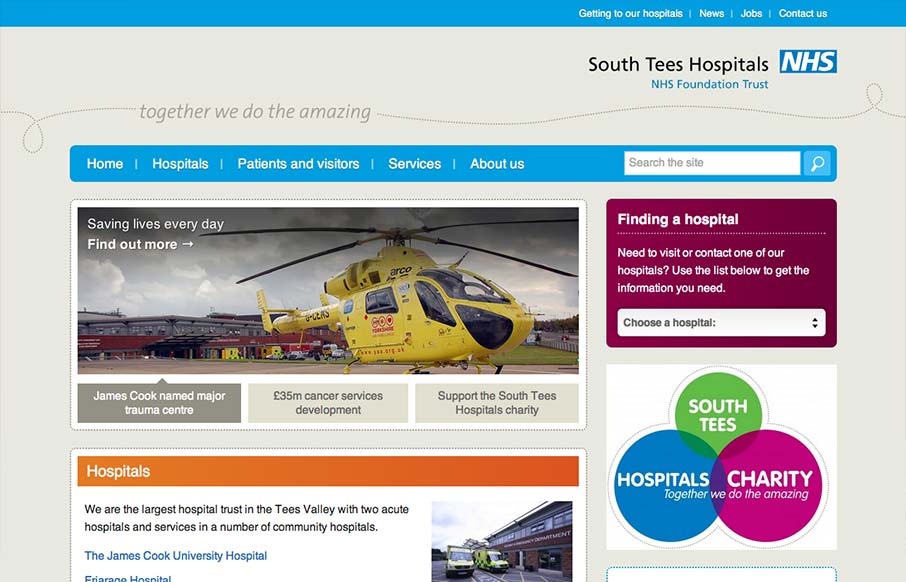
southtees.nhs.uk
The South Tees Hospital website is a superb example of responsive design for a large organization and not just a personal portfolio or design firm's website. We always love it when we come across large scale projects like this that utilize a lot of the same techniques...
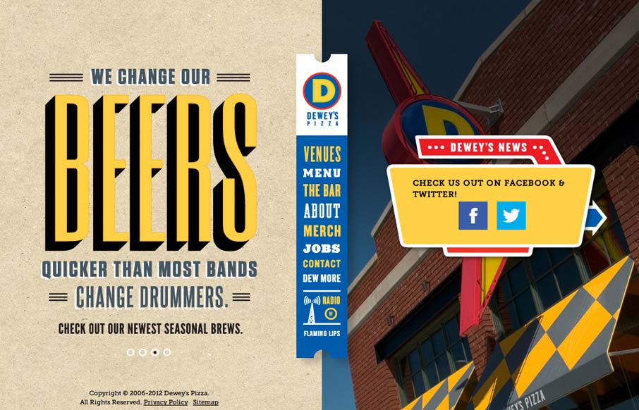
deweyspizza.com
I usually hate when websites hit me with a 'site soundtrack', but in this case I really think it helps to complete the experience. The colors, texture, and typography go really well with the music. It took me a little while to realize that the center banner is the...
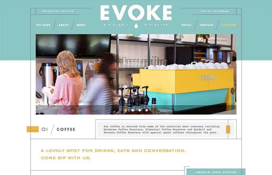
cafeevoke.com
What a great vibe this website has. I love the lines and stark yet very soft graphic feel to it. It's amazing how this shows off hard edges and soft colors at the same time. Truly creating a harmony of the two. It's also a superbly designed adaptive experience. Each...
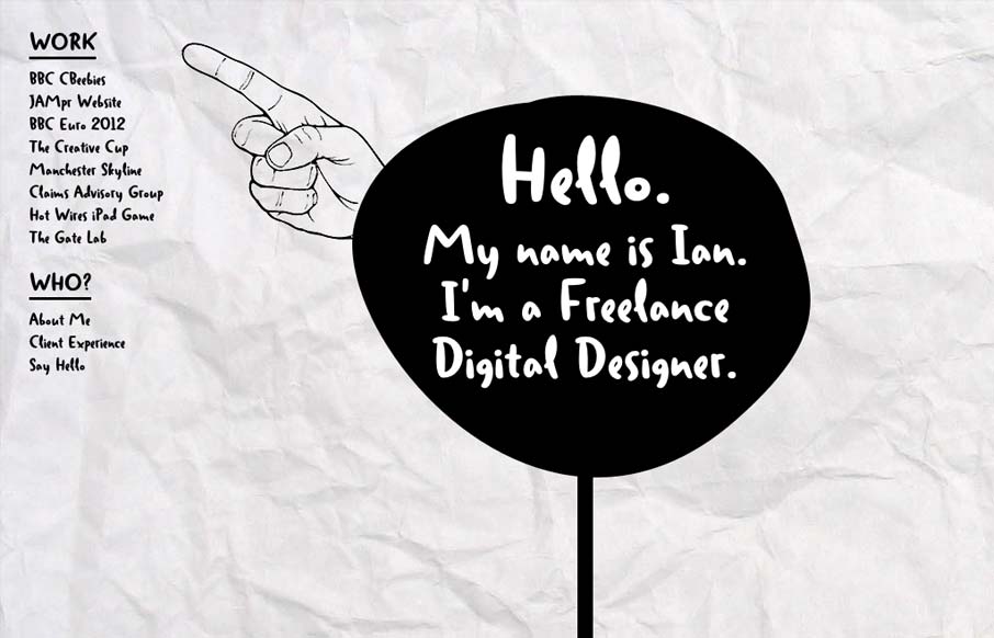
ianjamescox.com
Ian put together a nice post for us about his thought process while building this site. I love the experimental feel of the design, so I thought I'd throw it in the gallery. As Ian mentioned, this site certainly makes accessibility sacrifices to accomplish the desired...
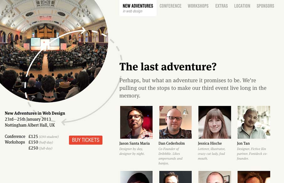
2013.newadventuresconf.com
Nice site. I really like the static content on the left. Really, this site is all about selling tickets. It makes sense to keep that button on the page at all times. I think that the collapsed nav is interesting, though I feel that area of the page has room for a...
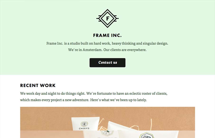
frameinc.nl
I can really get behind the minimal approach to content that frameinc presents. The site isn't cluttered up with overblown copy or quirky language and I'm not forced to wade through a huge portfolio to get a sense of what this business does. The design and the short...
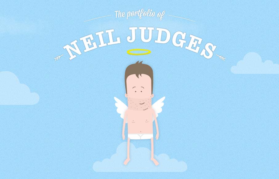
neil.judg.es
Damn, this site is fun! It's all about animation and storytelling, both of which it handles beautifully. Here's a case where the art is the content. It shows how clever Neil can be, as well as his skill set. One of my favorite personal sites to date. I'm jealous I...
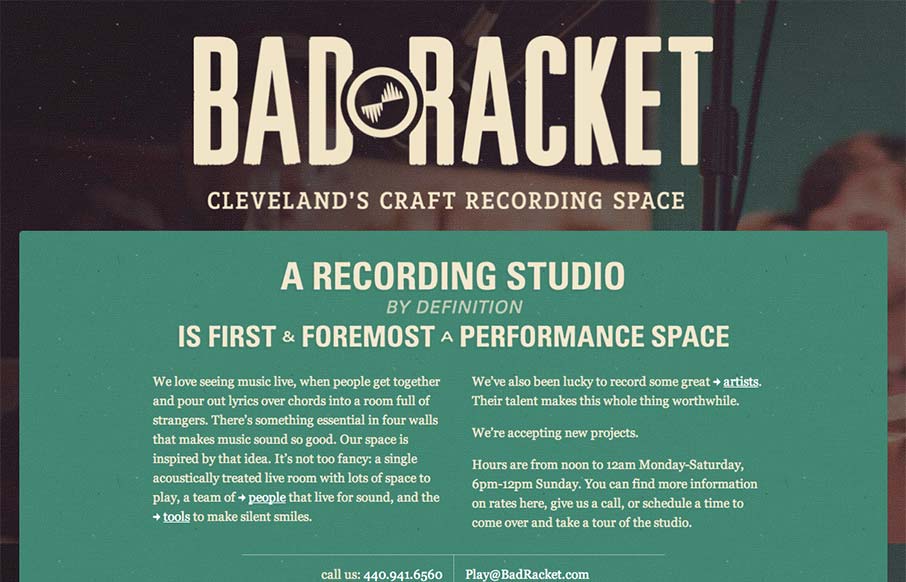
badracket.com
Deceptively simple design is badracket.com. It's a well designed responsive solution with some nice little goodies spread across it's single page layout. I love the interstitials designed into the content flow that allow you to open picture slideshows. The small...
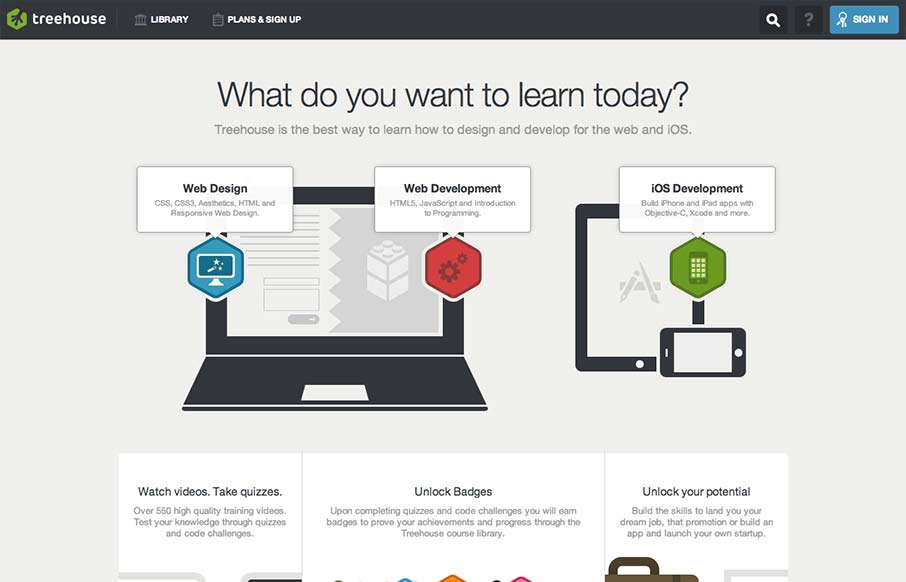
teamtreehouse.com
Really tight design for the Treehouse website. I love the main graphic with the interactions that make the other elements on the illustration disappear. They work really well to pull you in deeper into the chosen section. I equally like the fixed header and how it's...
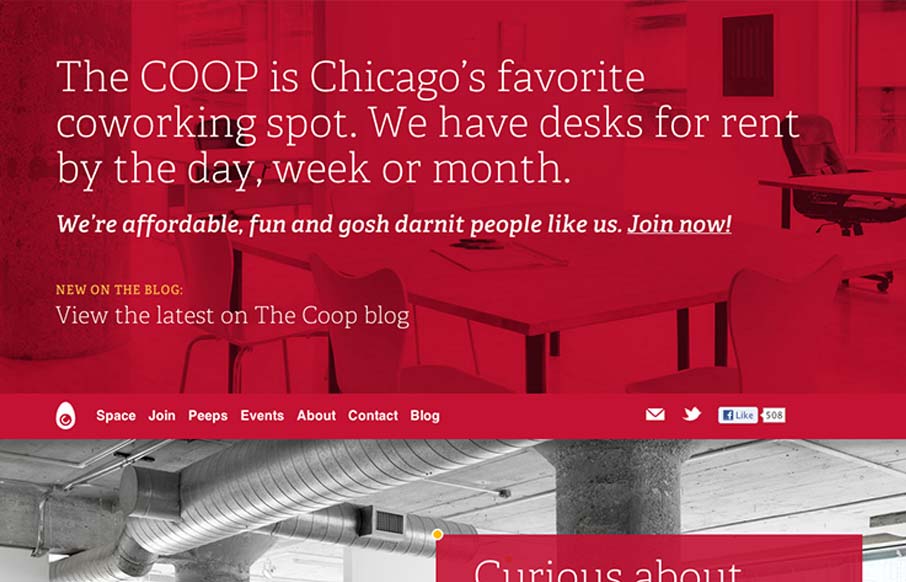
coworkchicago.com
Great website for a Cowork location. It's marvelous, I couldn't think of what else a website for something like this would need. I love the interactions on top of the slide-show images, they are clever and not overpowering. I also love the large background map image...
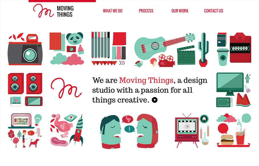
wearemovingthings.com
The illustrations are really great on this site and the animations completely sell The humor. Love it?
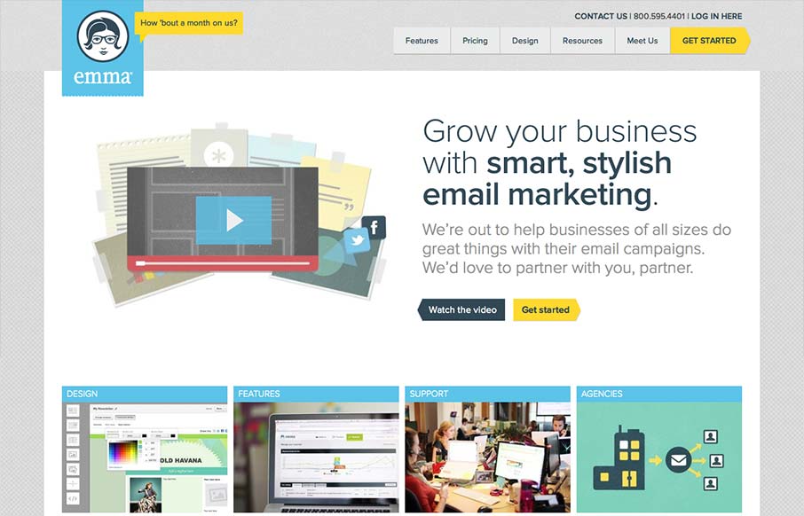
myemma.com
The emma website is very crisp. I dig that top nav and how crisp and brite it looks to me. The "get started" call to action is easy to find and understand and I like that it's echoed on the page a couple of times. The overall layout gets more dense with content as you...
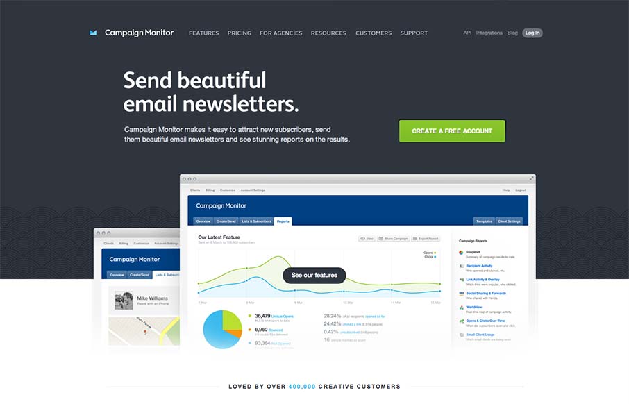
campaignmonitor.com
Such a great clean and clear experience. I love the overall simple approach, keeping the visual noise to a minimum, it's totally different in approach to most product websites like this. The call to action is super clear and concise but doesn't beat you over the head...
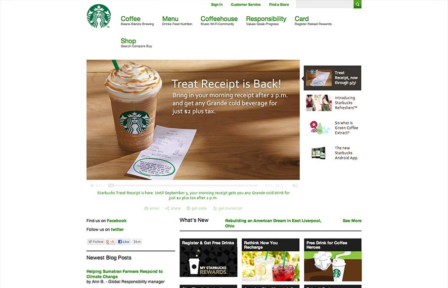
starbucks.com
Pretty much have to include the new(ish) responsive Starbucks Coffee site in here. It has some neat sections of it's design that are worth studying for sure. Like the different views for different screen widths on the big slideshow slider. We'll take a closer look at...
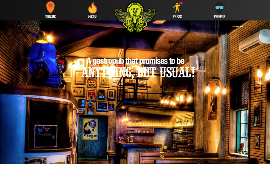
mobar.in
Submitted by: Tejas Bhatt Role: Designer & Developer Pretty cool experience with this website. It's fun and set's a good tone visually for what you might expect there. It's also responsive and all HTML which when it comes to bars/restaurants you hardly get that, this...
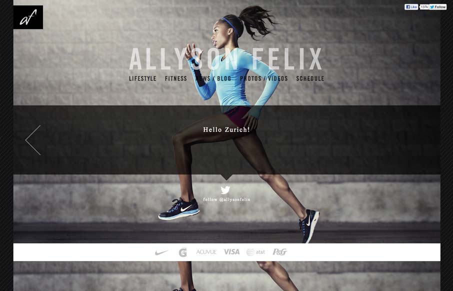
allysonfelix.com
Submitted by: Steve Paterson @stevepaterson Role: Designer & Developer The Official Site for 3-time 2012 Olympic Gold Medalist, Allyson Felix, this single-page vertical scroller allows fans to get to know both her athletic, and personal side. Really a great example of...
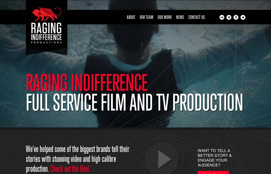
ragingindifference.com
This site runs a little slower than we would like but unfortunately, the host provider was already chosen by the client. That aside, amazingly, this is @lindzington 's first ever site design. First ever! Can't wait to work on more. The cool photos were taken by the...
pixelsetaromates.com
Submitted by: Jeremy Metral @pixelsaromates Role: Designer & Developer Hello i'm Jérémy! I'm a french freelance designer and this my website. I used HTML5/CSS3, mediaqueries, Jquery, Ajax and Wordpress. You're welcome! Cool illustrations always help make your website...
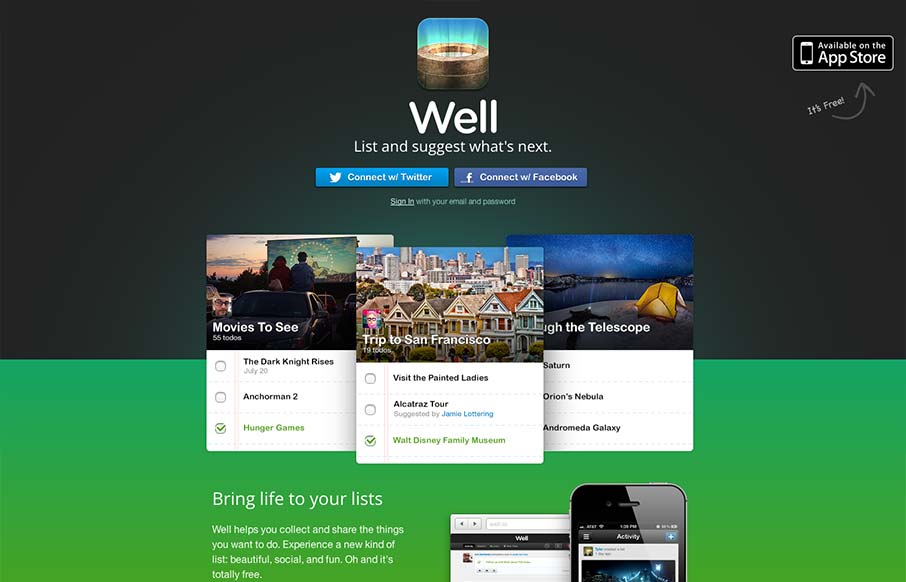
well.io
Beautiful site from @addison - well.io - love the subtle animations— Jason VanLue (@jasonvanlue) August 23, 2012 Beautifully simple and minimal website for the iPhone app Well. Using some simple animations as you scroll down the page to engage you visually on...
EMAIL NEWSLETTER
News & Articles
unmatchedstyle
jQuery class to read RSS feeds on a website without the use of a server-side language like PHP: http://bit.ly/JnhEl #ums
unmatchedstyle
Great reference for those special characters/entities in HTML http://www.entitycode.com #ums
unmatchedstyle
456bereastreet.com's take on Cufón and screen readers. http://bit.ly/WrqXC #ums

HARD WORK. CLEAN FUEL. NO EXCUSES
Use “WARRIOR2023″ for 10% off.