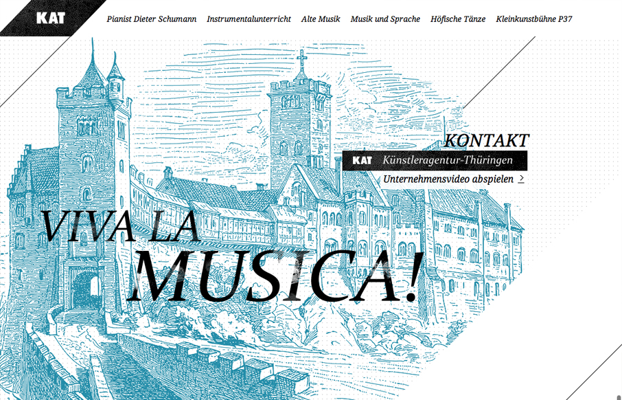
I love the consistent use of art throughout this site. It couples with the monochromatic palette and helps to create the victorian feel that is clearly evident. It also compliments the typography to create a tight, consistent visual experience.
At times, i get a little lost in the content, but that is probably just the language barrier (I don’t speak German) and poor translations. I also wish that the animations had a little softer easing. I normally don’t mind if an animation is linear, but the animated areas area quite large and they move quickly. It would be nice to soften that a bit.
Still, its a nice site with a tight mix whimsy and structure. My gripes are very minor and are far outweighed by the overall experience.


And yet another website that isn’t progressively enhanced or degrading very gracefully. Website design is more than just the graphical design, there is a user experience/interaction component to it, too, and this includes users that don’t have JavaScript available (for whatever reason).
How would you say it fails from a user experience/interaction standpoint?