Web Design Inspiration Curated
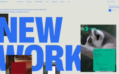
Spring/Summer
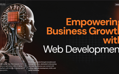
Zaibatsu Technology
Zaibatsu Technology is a UK-based agency that offers bespoke AI & Digital Solutions with over 5+ years of driving business growth with the help of development & marketing solutions. Elevate your brand voice through innovative and strategic solutions, dedicated to discovering new ways to showcase user content with cutting-edge web development, AI/ML, and digital marketing solutions.
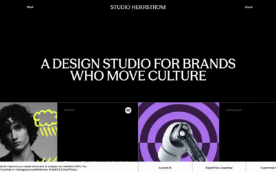
STUDIO HERRSTRÖM
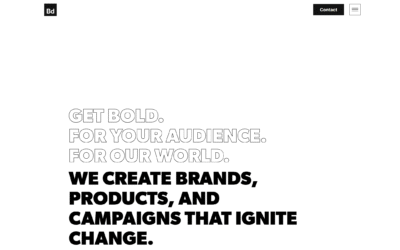
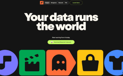
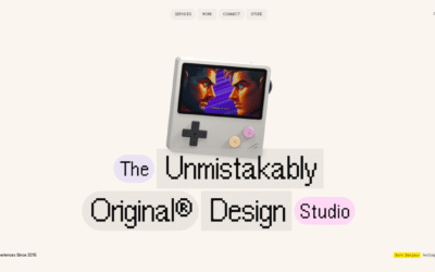
Boldium
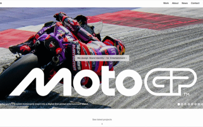
Pentagram
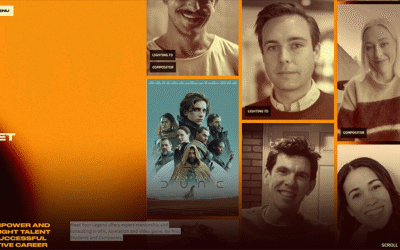
Meet your Legend
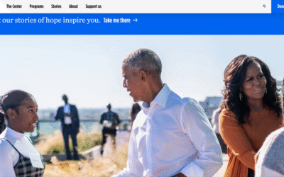
Obama Foundation
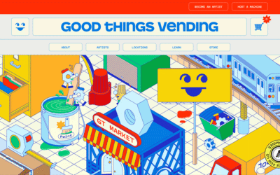
Good Things Vending
BOND
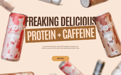
SPYLT Milk
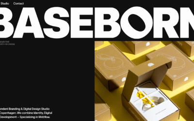
BASEBORN
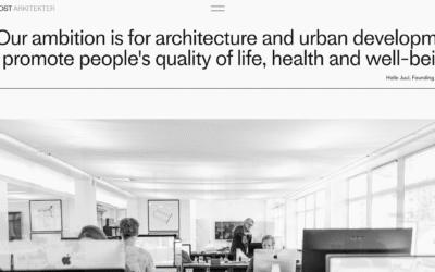
Juul Frost
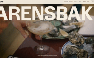
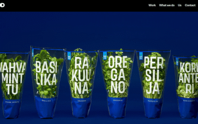
ARENSBAK
Navigate
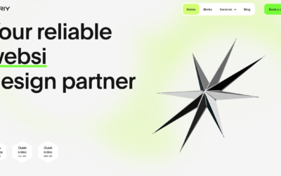
Obriy
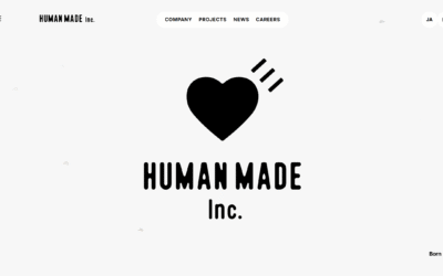
HUMAN MADE inc.
Very nice and fun interactions. I love the "born" - duck thing. Super fun website.
ToyFight
Fun design. It's minimal yet has a layer of 'crazy' on top of it. The type is fun and fitting and the nav is consistent yet not at the same time.
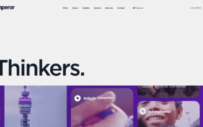
Emperor
I love the 'swiss grid' inspired design/layout to this website. It's clean and yet feels active. I really love the "features" nav item, that's brilliant.
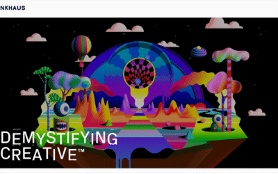
Funkhaus
Super cool, clean and minimal-feeling design. There's some stuff, like the 'hamburger' nav shape, I feel like could be a bit confusing for users, but the look & feel of it is beautiful overall.
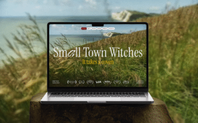
Small Town Witches
An immersive website for Small Town Witches, designed and developed to capture the show’s magical tone. It draws visitors into the story world and builds early engagement around Melissa Graves’ supernatural drama
EMAIL NEWSLETTER
News & Articles
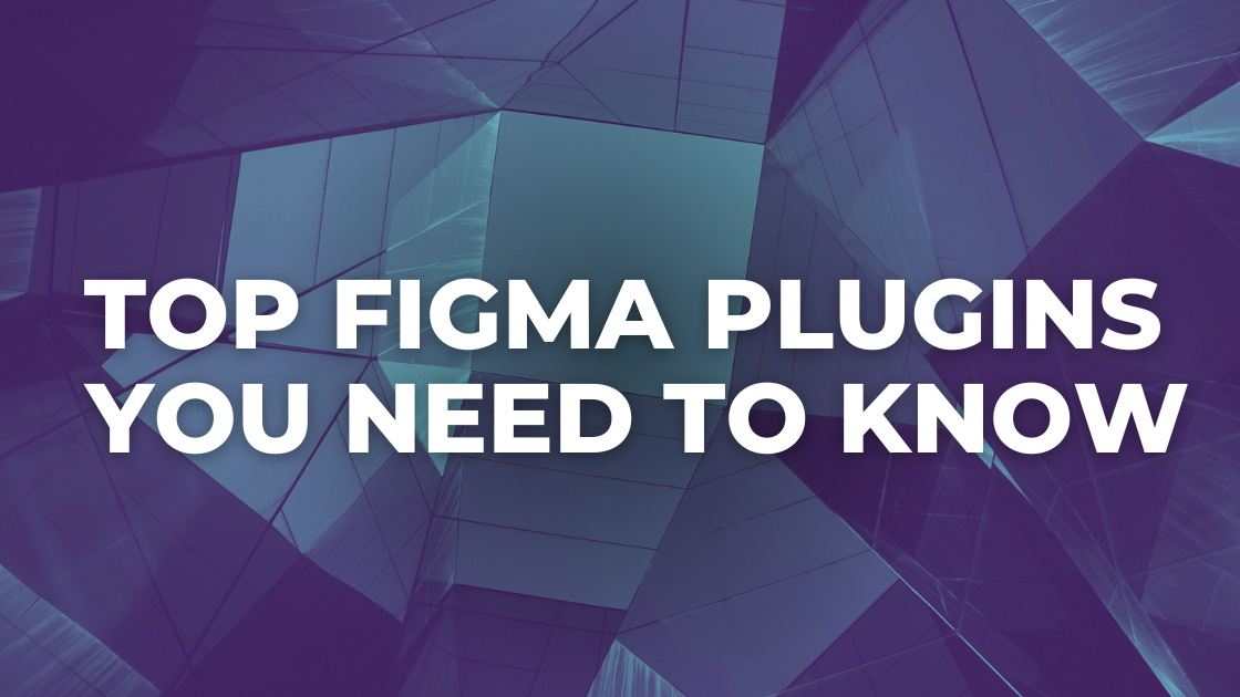
Design Smarter, Not Harder: Top Figma Plugins You Need to Know
Figma’s diverse plugin ecosystem empowers designers with advanced prototyping, code generation, and seamless integration, enhancing functionality and productivity in design and development workflows.
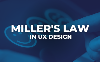
Enhancing User Experience with Miller’s Law in UX Design
Crafting optimal user experiences, Miller’s Law in UX design advocates presenting information in digestible chunks, aligning with cognitive limits for enhanced comprehension and navigation.
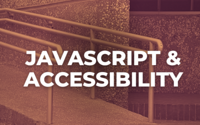
JavaScript and Accessibility
We all know that the basic structure of any website is created using HTML, and the design and layout are managed through CSS. But what about making the site an interactive and engaging experience for users?

HARD WORK. CLEAN FUEL. NO EXCUSES
Use “WARRIOR2023″ for 10% off.