
When it comes to creating an impactful web page, one of the most effective techniques is employing contrast. Contrast is the visual difference between two elements on a page, and it can be achieved through various means such as color, shape, size, patterns, or even different typefaces. By strategically using contrast, you can guide your visitors’ attention and ensure that specific elements stand out, leading to increased engagement and conversions.
The Power of Visual Contrast
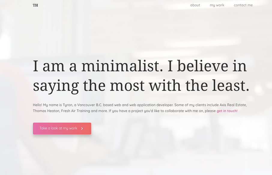
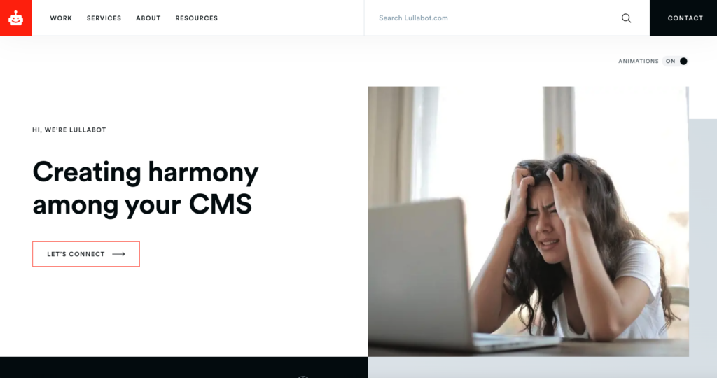
Imagine a web page with predominantly neutral or gray-colored elements, and in the midst of it all, there’s a bright red button. The stark contrast between the red button and the rest of the page draws immediate attention to it. This technique is perfect for highlighting important call-to-action buttons, like guiding visitors to a sign-up page.
Making Elements Stand Out
When you want a particular element to stand out on your web page, utilizing contrast is a straightforward approach. By selecting a distinct color or shape for that element, you can ensure it catches the eye of your visitors. This visual emphasis will direct their focus to the most critical parts of your content, ensuring they don’t miss out on any essential information.
Going Beyond Color
While color is a common way to create contrast, it’s essential to remember that contrast is not limited to just colors. You can also achieve it through differences in shapes, sizes, patterns, and even the choice of fonts. For instance, a bulleted list in the middle of a long page of text will naturally stand out and make the content easier to scan.
Going beyond color, contrast in web design encompasses various elements that can capture users’ attention. Shapes play a crucial role in creating contrast, as unique or unconventional shapes stand out amidst standard ones. Utilizing different sizes for elements can also create visual distinction, where larger elements become focal points, while smaller ones complement them.
Patterns provide an excellent opportunity for contrast, especially when used sparingly on an otherwise uniform page. Introducing a patterned background or border can draw attention to specific sections of content. Moreover, the choice of fonts can significantly impact contrast. Combining contrasting typefaces within headings and body text can add visual interest and hierarchy to the page.
An effective example of contrast through design is the use of a bulleted list within lengthy textual content. This simple technique breaks the monotony of long paragraphs and presents information in a more digestible format. The bullets act as visual cues, guiding readers through the content and making it easier to scan for essential points.
Concealing Less Important Information
Contrast can also be used strategically to hide or downplay certain elements. If you have minor details like bylines or legal disclaimers that are necessary but not the primary focus of the page, using lower contrast will make them less noticeable. This prevents them from distracting visitors from the core message while still being present for those who seek them out.
Concealing less important information through strategic use of contrast is a smart approach in web design. While certain details like bylines or legal disclaimers are essential, they may not require immediate attention from all users. By employing lower contrast for these elements, they become less conspicuous, allowing the main content and call-to-action to shine without distractions.
When visitors access a web page, their attention should be directed towards the primary message or action the page intends to convey. If less critical information is highlighted with the same level of contrast as essential content, it can create visual noise and cause users to lose focus on the main purpose of the page.
Using lower contrast for less significant elements ensures that they blend harmoniously with the overall design while remaining accessible for those who specifically seek them out. For instance, users who are particularly interested in reading the fine print or legal details can still locate and access them, but they won’t be intrusive to the average visitor.
Striking the right balance in contrast allows web designers to prioritize the flow of information, guiding users smoothly through the page and avoiding confusion. By making important elements stand out and relegating less crucial details to a secondary position, the overall user experience improves, leading to higher engagement and more favorable outcomes.
The Importance of Remembering Basics
In the ever-changing world of web design and SEO, it’s easy to overlook fundamental principles like contrast. However, revisiting these basics from time to time can be immensely helpful in achieving our design goals. When used correctly, contrast can significantly improve the user experience, encourage engagement, and ultimately drive more conversions.
Color Contrast: This is the most common form of contrast, achieved by using different colors or hues to make elements stand out. Contrasting colors create visual impact and can be used to highlight important buttons, headings, or sections on a web page.
Shape Contrast: Varying shapes can be used to create contrast, making certain elements more distinctive. Combining geometric shapes with organic shapes can add visual interest and draw attention to specific design elements.
Size Contrast: Differences in size can create a focal point on a page. Larger elements naturally attract more attention, while smaller elements can serve as supporting details.
Typography Contrast: Using different fonts and font sizes can help differentiate between headings, subheadings, and body text. Bold or italicized fonts can also add emphasis to specific words or phrases.
Texture Contrast: Incorporating contrasting textures can add depth and dimension to a design. Combining smooth and rough textures or glossy and matte surfaces can create a visually engaging experience.
Space Contrast: White space or negative space can be used to create contrast by isolating elements or providing breathing room around important content. This helps prevent visual clutter and allows users to focus on essential information.
Pattern Contrast: Patterns can add visual interest to a design. Contrasting patterns can be used to draw attention to specific areas or create visual hierarchy.
Opacity Contrast: Varying the opacity or transparency of elements can create subtle contrast and highlight important information.
Contrast in Imagery: Using images with contrasting colors, themes, or styles can make specific visual elements pop and enhance the overall design.
Motion Contrast: In interactive design, animation and motion can be used to create contrast and guide users’ attention to specific elements or actions.
Employing contrast in web design is a powerful technique to capture and retain visitors’ attention. By using contrasting elements strategically, such as bright colors, distinctive shapes, or different font styles, you can guide users through your page, ensuring they focus on what matters the most. Remember that contrast not only makes essential elements stand out but can also help you hide less critical information. Keeping these design fundamentals in mind will undoubtedly lead to a more effective and visually appealing website, contributing to its overall success in outranking other websites. So, embrace the power of contrast and elevate your web design to the next level.


0 Comments