Web Design Inspiration Curated
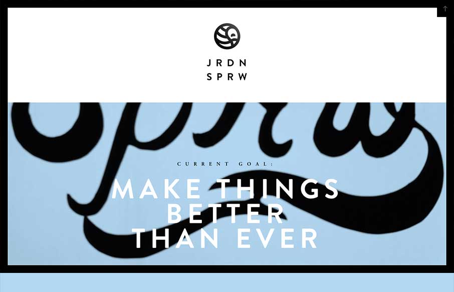
Jordan Sparrow
I love the Jordan Sparrow site design. The black frame and the stark lines really play well off the background video which is set in place as you scroll down. The bold lines in the design and type match up perfectly to give me something to remember the site by days...
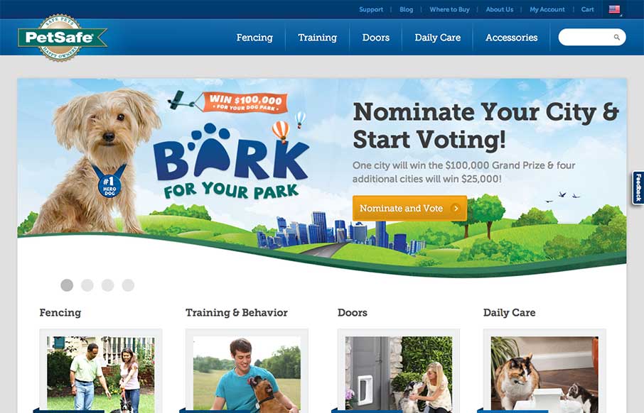
PetSafe
Really stoked to see the new PetSafe site launched. @bold did all the #RWD and CMS buildout.d.pr/ZPlu — Noah Stokes (@motherfuton) May 15, 2013 Really great larger commercial example of a responsive solution working great. I particularly like how this site...
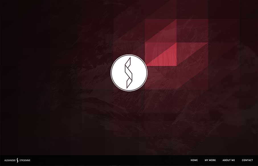
stroemme.net
I'm seeing a few new design trends like this one, where there's basically a splash page but it's executed as an oversized header area. Pretty clever, like this one, which reminds me of a cylon's eye for some reason. That alone is enough to make me like it, but it's...
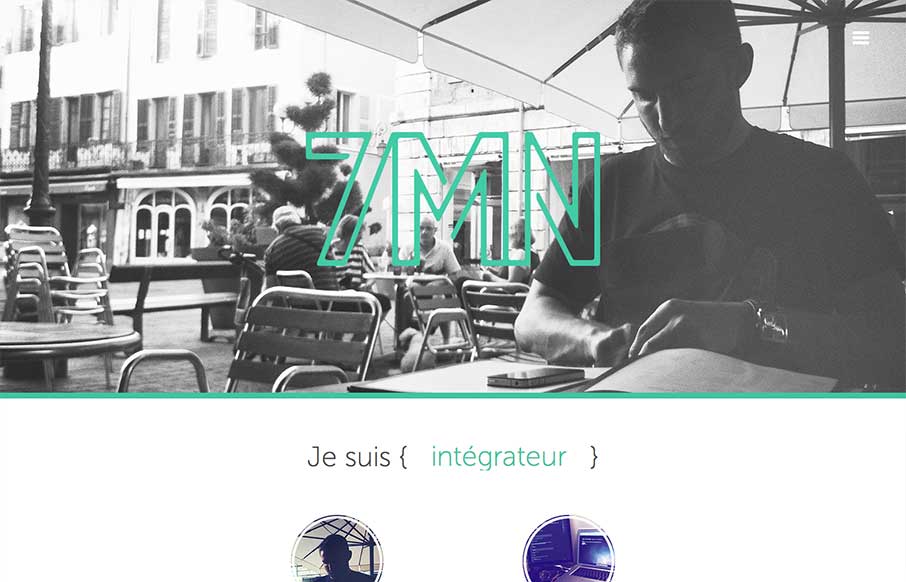
7 Minute
Pretty cool single page website design. The way there is a slight parallax feel to the header, then the way the nav slides into place is very well done. I also like the simple different views designed for the smaller screen widths. My favorite is the green color and...
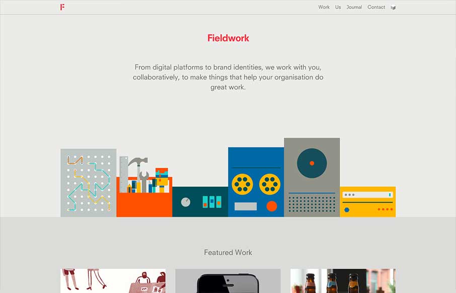
Fieldwork
What a beautiful site Fieldwork is. It's so simple yet full of detail. I love the soft transition between pages, which I can't see working on another site as well as here. Then each page while similar is just a bit different enough to show it's all been made with care.
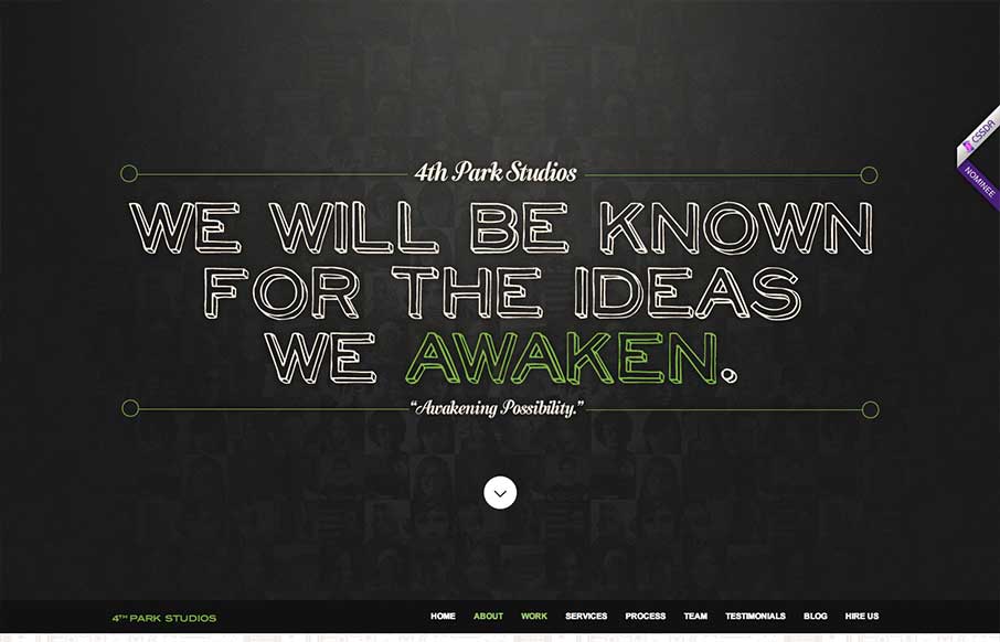
4th Park Studios
The 4th Park Studios site is a great design. There's a great feeling for timing as you scroll down the page, which makes it feel very complete. The site looks like it's based on this theme, but they've changed it out and used it as a base. Overall the site is quite...
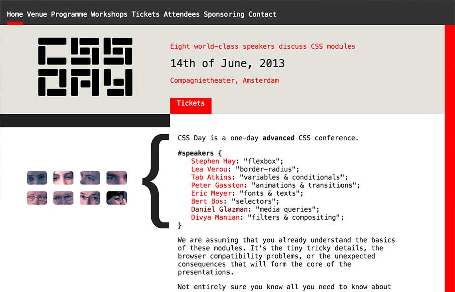
CSS Day
What a great simple concept for a conference website. It's super appropriately designed for the audience and for the subject matter. I LOVE stuff like this. I'll also let Cameron Moll's quote do the explanin': Also, click the speaker's name and watch the content...
Playground
Wonderfully worked animations as you scroll down the home page. They keep it responsive as well which is great. I like the article on how they created their new brand for Playground as well.
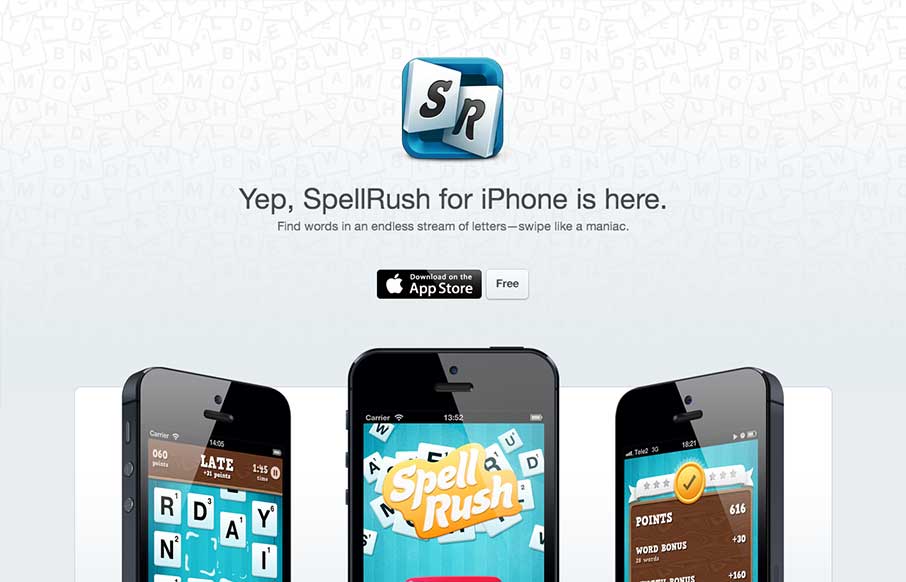
Spellrush
I've always liked well executed microsites. This one has a very Apple appeal, which makes sense. They are selling to a specific platform. Everything is clean but tight. The site is a good billboard/magazine ad. It presents the product beautifully, it sells the...
ROZMOWA
Submitted by: Advan Shumiski @shumiski We are a creative studio based on Sao Paulo, Brazil. Here we think that all is about people. Design is just a tool, humans are the subject. Really interesting interactions for this website. I like how the categories sort the art...
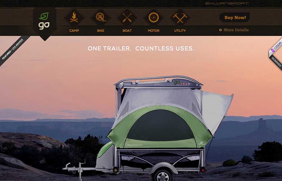
Sylvan Sport
Submitted by: Justin Bernard @fleeangrybear Role: Designer & Developer Damn, I love detail like this. The slight parallax on each image of the products down the the animations on the main navigation before you scroll it to the fixed layout spot. Lovely. The colors are...
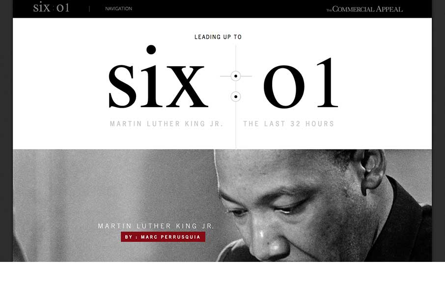
MLK The last 32 hours
This is about as beautiful a timeline as I've ever seen. The content is presented clearly and concisely. It's linear presentation is perfect for telling a story and the mix of images, video, and text creates a rhythm that punctuates the high points of King's story....
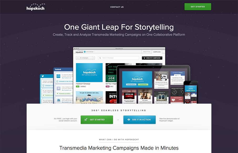
Hopskoch
Hopskoch is joyful and simple. It's subtle animations are perfectly appropriate for selling the brand and pair nicely with the easter color palette. I really dig how the main product image scrolls up a little and fades out as you scroll down the page and the reveal of...
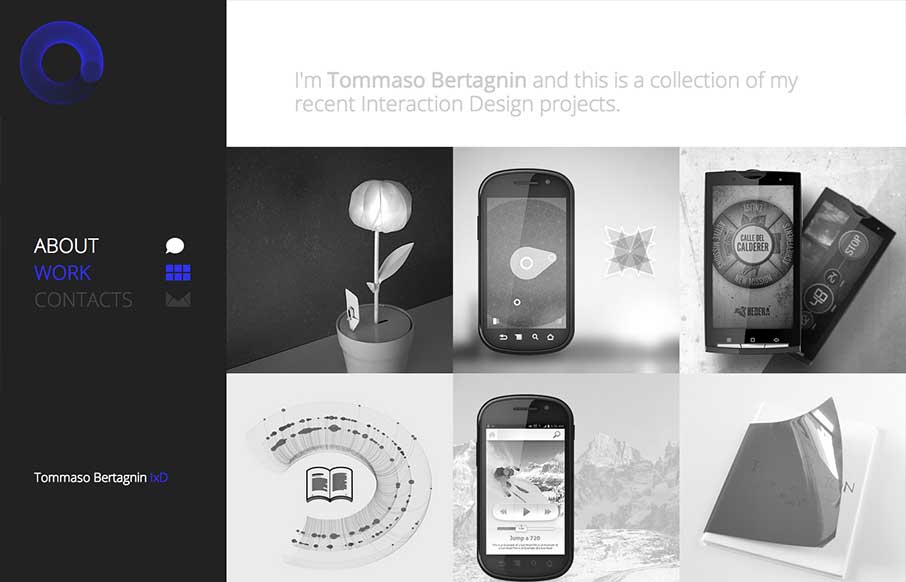
Tommaso Bertagnin
Deceptive simplicity. I love this stuff. This site is one of the first i've seen that goes from it's initial layout to something almost completely different as you get to the smaller screen sizes. Going from the left nav to a top nav like that is just cool when you...
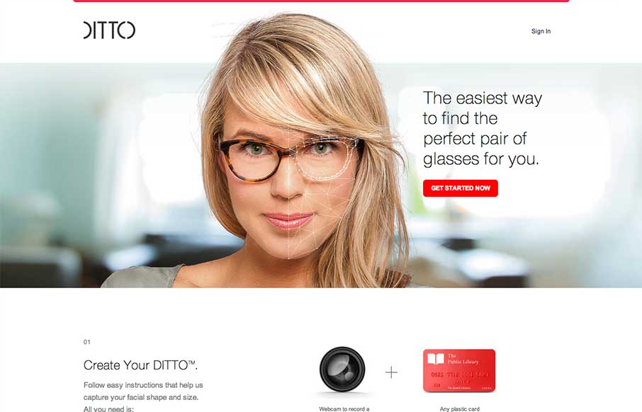
Ditto
Okay, lots of things to love about the Ditto site. 1. Super clean, beautiful design with no fluff. Gets the job done with style. 2. Awesome product. Haven't tried out the service but looks super cool. If anyone has gone through the camera thing, let us know how it...
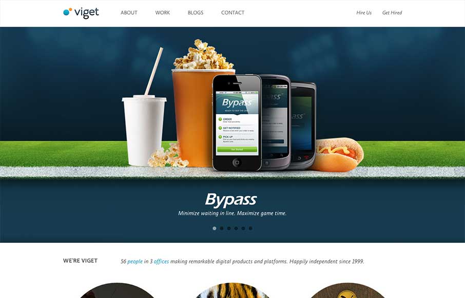
Viget
There is a lot of good looking design scattered across this website. Each page looks like it has had the same amount of love and attention paid to it as the home page has. I love it when I come across a site design like that, that's so thorough and finished feeling....

The Paint Drop by Valspar
Website by Viget The Paint Drop is a paint store on wheels offering color consultation, paint and supplies on site. Whew! What a finely crafted visual design and executed website for Valspar. I love the responsive design decisions and how that's been executed. Sharp...
Vibes Design
vibesdesign is a site that takes bold typography to an extreme. The site has a simple structure and minimal interactions, both of which I like, and places character and content in the forefront. Every 'page' has a custom layout, which keeps the long, single scroller...
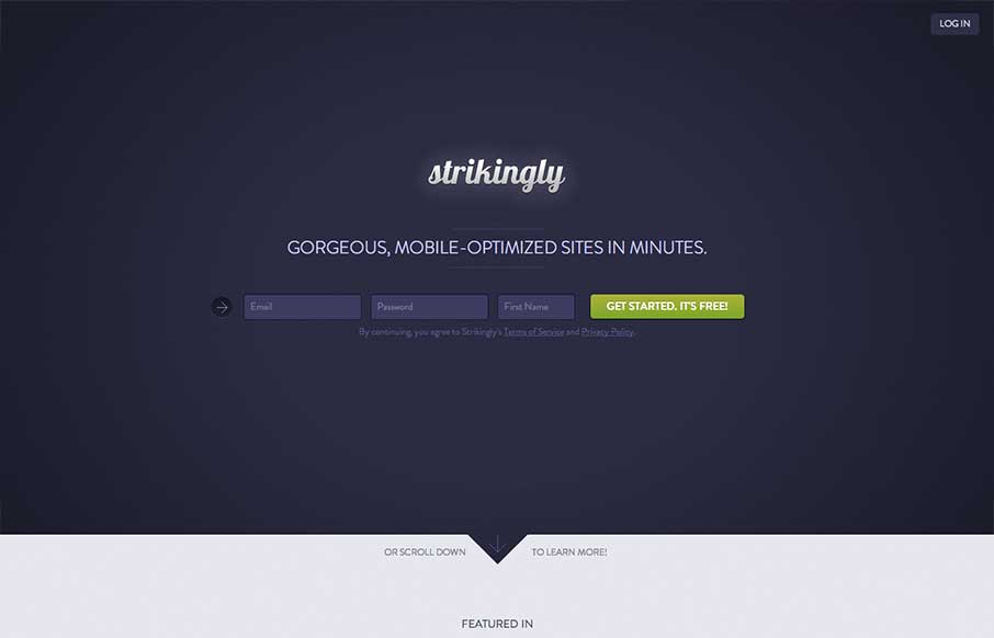
Strikingly
I like the minimal approach mixed with the full on product tour in the middle section of this site design. You start and finish with the same form layout as you scroll through the page. I also study sign up forms a good deal and I like the horizontal layout of the...
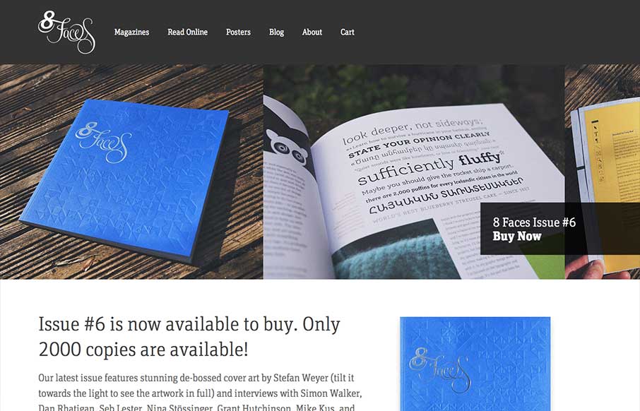
8faces
The whole point and appeal of 8 Faces is the tactile, printed objects that they produce, so much so that the website might seem like an afterthought regardless of how well it's designed. Luckily it's a great example of simple, effective design. The purpose is to sell...
EMAIL NEWSLETTER
News & Articles
QUnit – Hello World Podcast Episode 1
Ever wondered what test driven development was all about, check out QUnit a jQuery project that helps you do just that.
Virb.com – Full Website Review
Virb.com is a beautifully understated meditation on simplicity and elegance. By careful selection of how much content to show the viewer, virb.com presents a soft and open layout that is easy to scan and establishes a distinct and refined hierarchy. virb.com also puts...
jQuery Summit with Christopher Schmitt
![]() Info about the upcoming online jQuery Summit and we’re giving away 2 tickets!
Info about the upcoming online jQuery Summit and we’re giving away 2 tickets!

HARD WORK. CLEAN FUEL. NO EXCUSES
Use “WARRIOR2023″ for 10% off.