Web Design Inspiration Curated
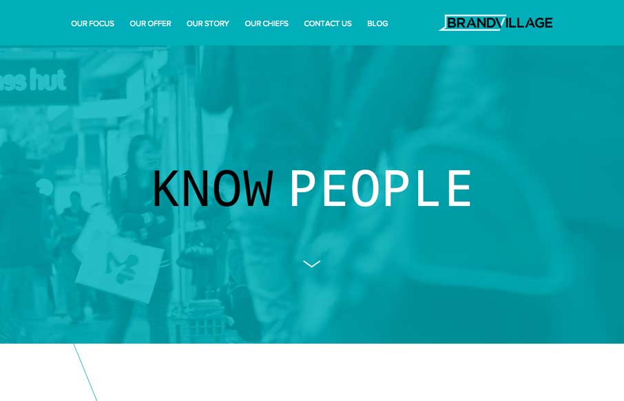
Brand Village AU
I know a lot of what makes up this site is trendy but I like it when someone takes something that's used a lot and changes it up a bit. Like with the angular cuts to show the imagery as you scroll down, that's a nice effect. Especially for those of us that build this...
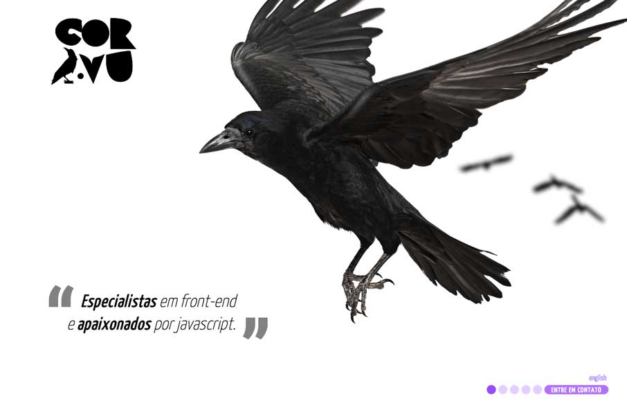
Cor.vu
Probably pushing the limits with this site, but I like the way they've utilized the imagery and loaded it up with some animation. Maybe not the best functional use, but it is fun.
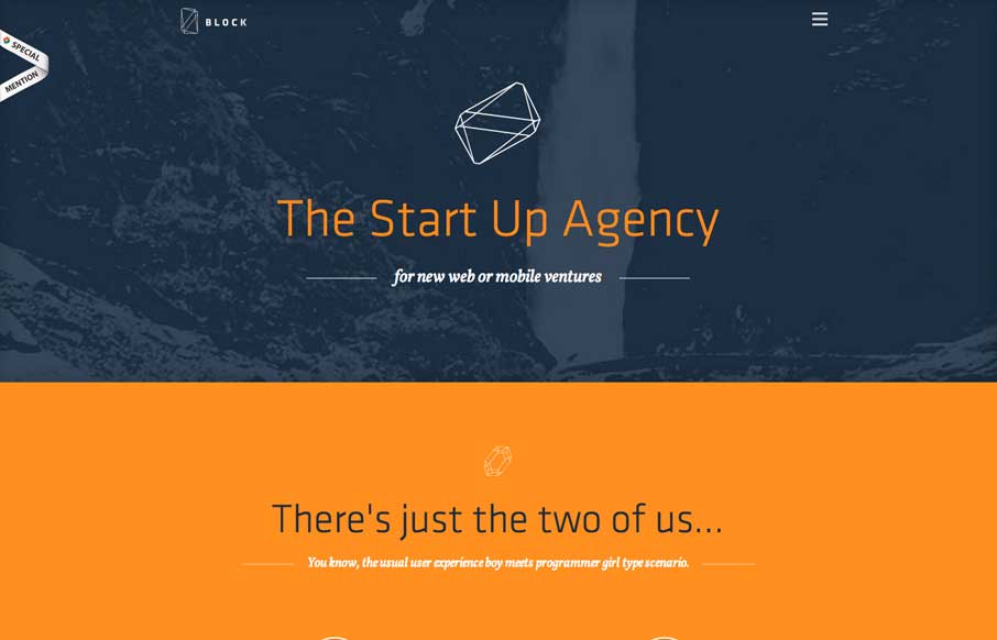
Made By Block
Cleverly designed illustrations/animations as you make your way down the page. I like the little detail in how the main nav works with the hamburger icon vs. how the nav items load.
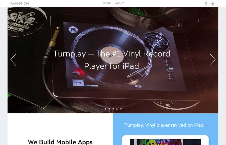
Ramotion
What a nice minimal(ish) design approach. If I were to think about what a site for a company that designs apps/icons this is what i'd hope I'd come up with. Beautiful sections and simplified nav choices make this site super easy and laid back feeling while being sharp...
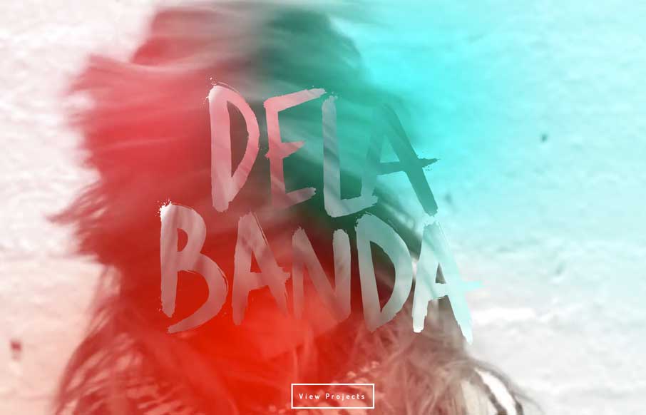
Dela Banda
Pretty crazy presentation here with the video and large "splash" section. I really dig how that transitions into the asymmetrical layout with the photos and how they handle while changing screen widths.
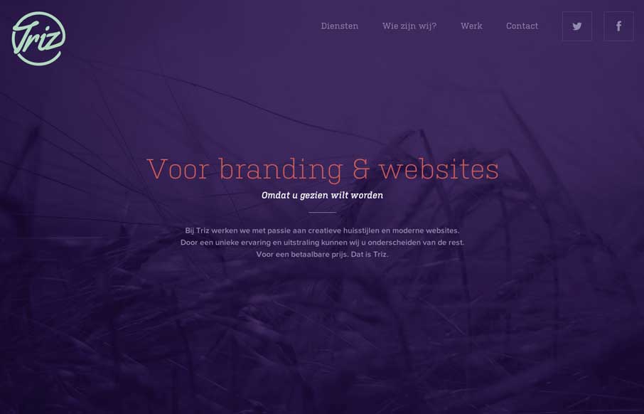
Triz
Nicely done straight forward design. I love the dark color scheme and the tiny animation work. Beautiful design.
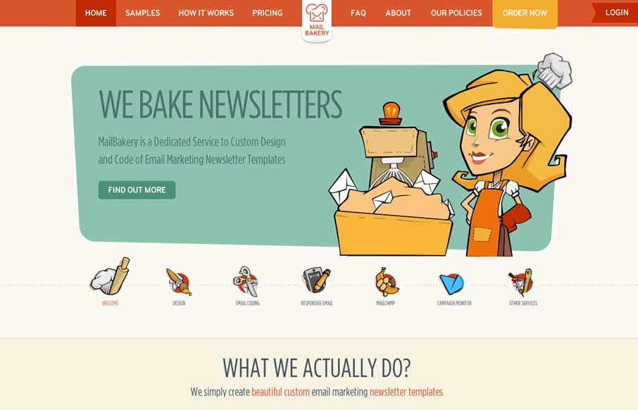
Mail Bakery
Really nice illustration work. It truly keeps me wanting to dig around more through the site's content. I also like the little interaction animation stuff like when you resize the browser window and the main nav bar's movement when you start scrolling.
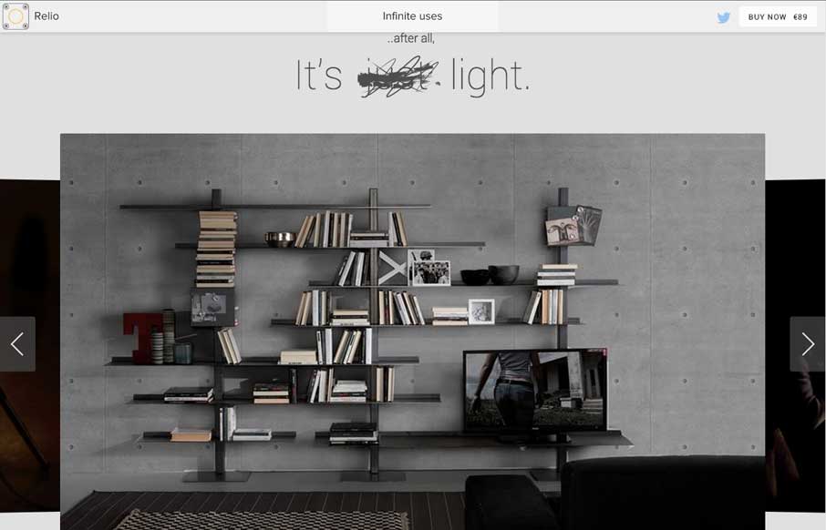
Relio
Neat illustrations down the page. I really dig the rhythm of the page too, there are some sections that are "scroll hijacked" but overall I like it. Neat looking contact form area near the bottom of the site too.
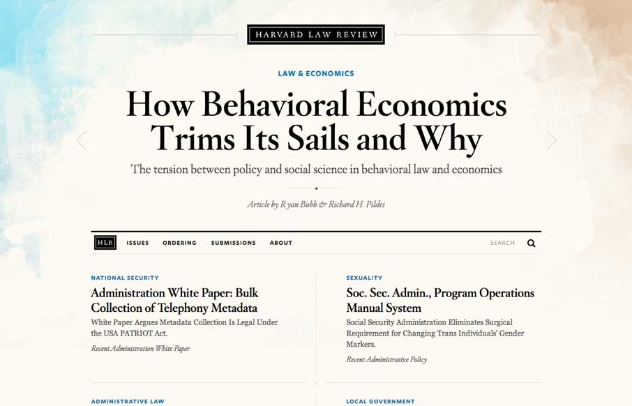
Harvard Law Review
I wasn’t expecting to see something as remotely beautiful as the home page of the new Harvard Law Review site. It’s rich yet lean, and really pushes the limits of typography successfully. The background graphic elements frame the page nicely. It's curious that the...
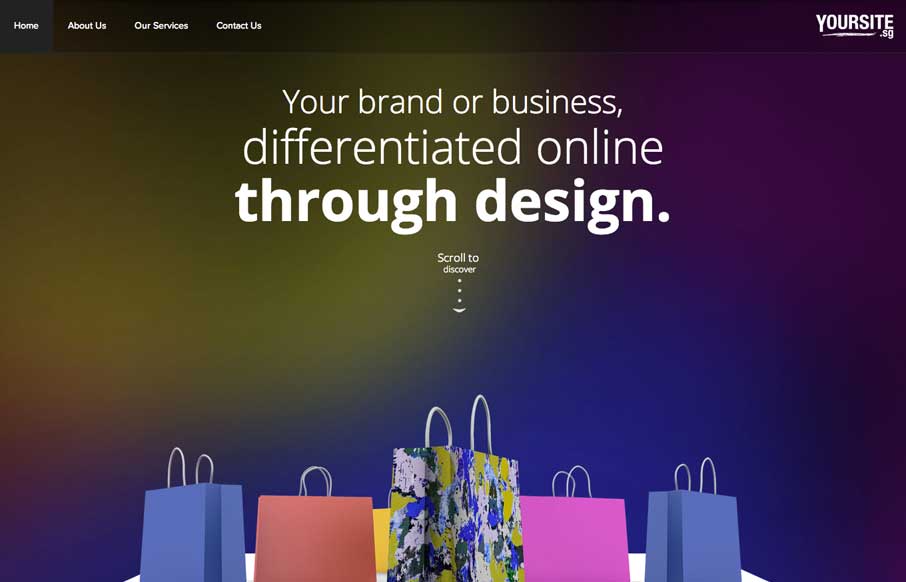
Yoursite
When I first looked at the site, I thought, hmm.. that's a little too simple - one picture, no scrolling.. what gives. Then I clicked on the navigation and realized it's a different spin on the single page website that is real trendy lately. Instead of scrolling...
Web Canvas Design
I just replied to a comment about one of the sites we reviewed a week or two ago, while I was starting to write this review. The other site was beautiful, with every whiz-bang feature you could think of, but very laggy. Then I looked at Andy Cracicle's...
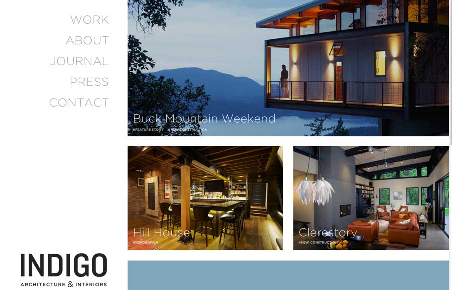
Indigo Architecture and Interiors
Clean and straightforward. That's what I think a lot of the best architecture is all about. These guys website tells that story to me. It's clean and simple, even in the way the responsive design is approached. Nice work.
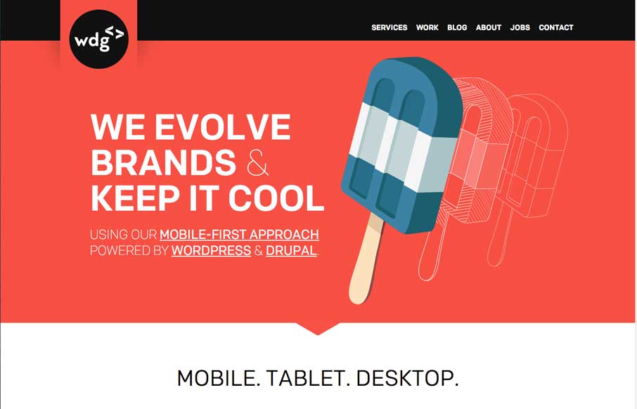
Web Development Group
Well done, highly visual website here for the Web Development Group. I dig their name too. I really like the rich graphics and animations placed across the page. My favorite part is the logo and how it changes around as you scale down the page. Smart stuff.
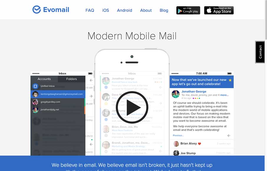
Evomail
I like the larger than real life imagery of the iPhone screens, so I can see the app really clearly. The site isn't overly complex and doesn't appear to be responsive either. But overall I like the simple approach to it.
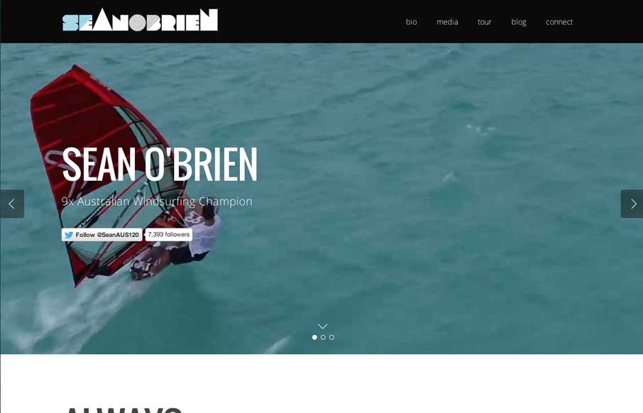
Sean O’Brien
I like this site because of the vibe it has. It totally makes me want to go jump in the ocean, right now. Also I find myself drawn into finding out more about this guy and what he does. Good stuff.
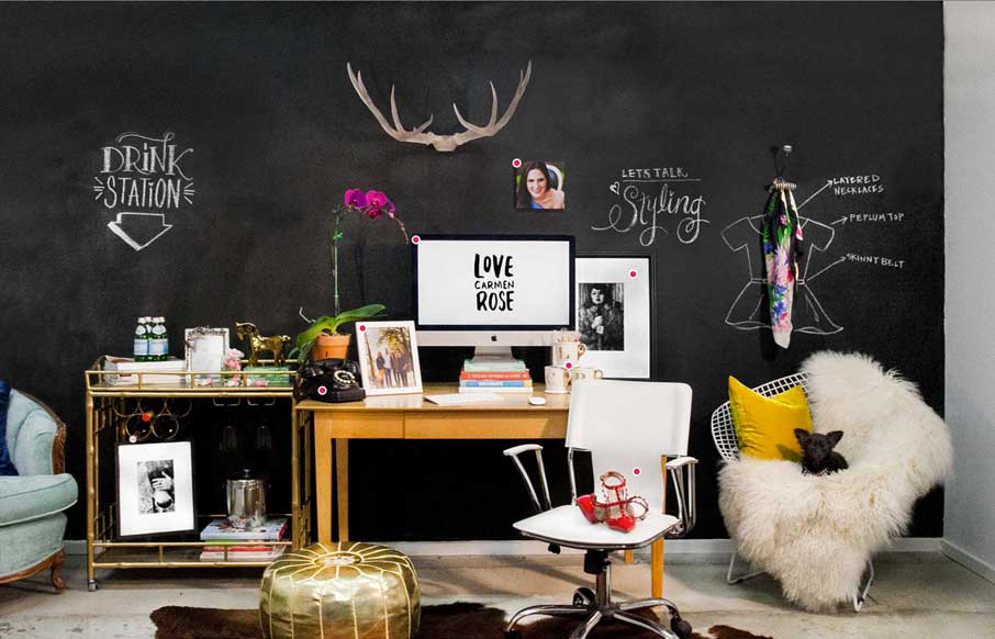
Love Carmen Rose
Really interesting interactions on this site. The way the right hand nav works, only coming into view when you scroll, drives me sort of mad. Overall though the site is super fun and intriguing to mess around with.
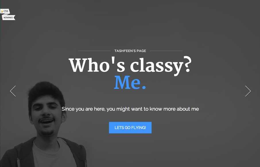
Tashfeen Ahmed
There is a lot of content to take in on this site, from the topmost slider images, to the section animations, down to the timeline design. I really dig the effort put into making this site feel filled out and visually rich.
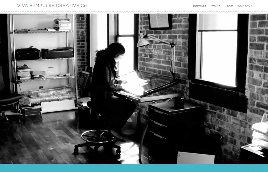
Viva + Impulse Creative
Here's a similar visual formula for a layout but there's a slight difference to this site with the light line work and icon designs. I dig it.
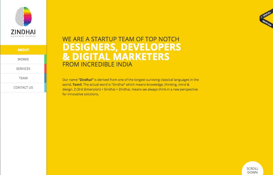
Zindhai
I'm not wild about the loading animation on this site but I freaking love the page transitions. Very clever and very unique when you compare it to other web dev shop's sites.
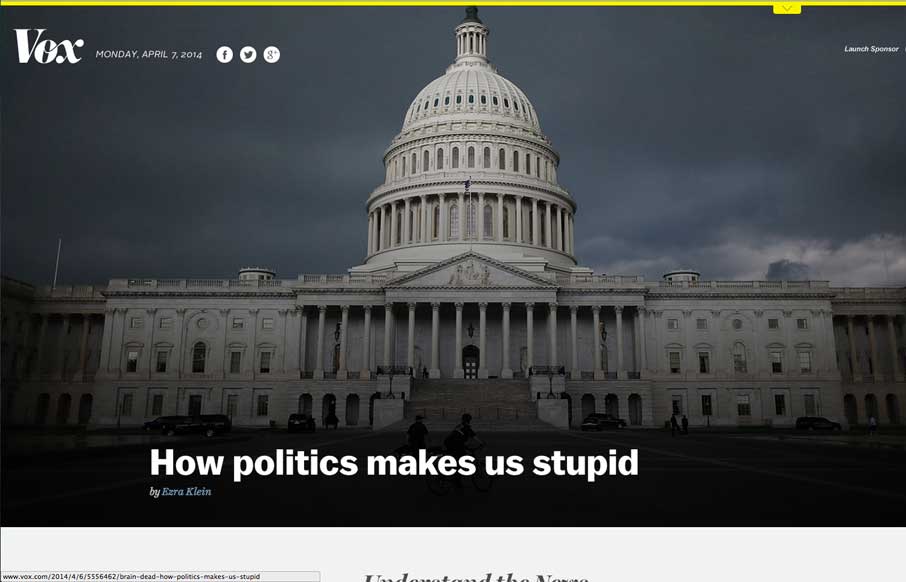
Vox
I love the different screen width designs for Vox. There's plenty of transitional differences for different devices. Go there and slide your screen around and check it out.
EMAIL NEWSLETTER
News & Articles
August 2011 Newsletter
A Quick Dose of Inspiration Here's some of our favorite stuff for August as well as interesting people, dribbbles and links from around the design community. If you like our newsletter why not subscribe so you get it delivered fresh to your inbox? 2 quick conference...
The Web Tarot is now for sale!
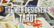 It’s the Tarot for web designers. Straight from the ConvergeSE conference we’re now offering them for sale here on UMS.
UMS Buttons Giveaway
A thank you from us to you for reading UnmatchedStyle! Come on claim a button set, they’re limited to 100 sets.

HARD WORK. CLEAN FUEL. NO EXCUSES
Use “WARRIOR2023″ for 10% off.