Web Design Inspiration Curated
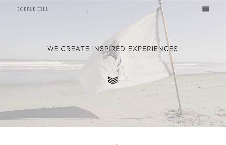
Cobble Hill
We're back from BDConf Nashville - and as much fun as we had, we're happy to look at site from South Carolina. Cobble Hill's site is crisp and clean, and uses it's images really well within the mostly black and white site. The Featured Work pages come together nicely,...
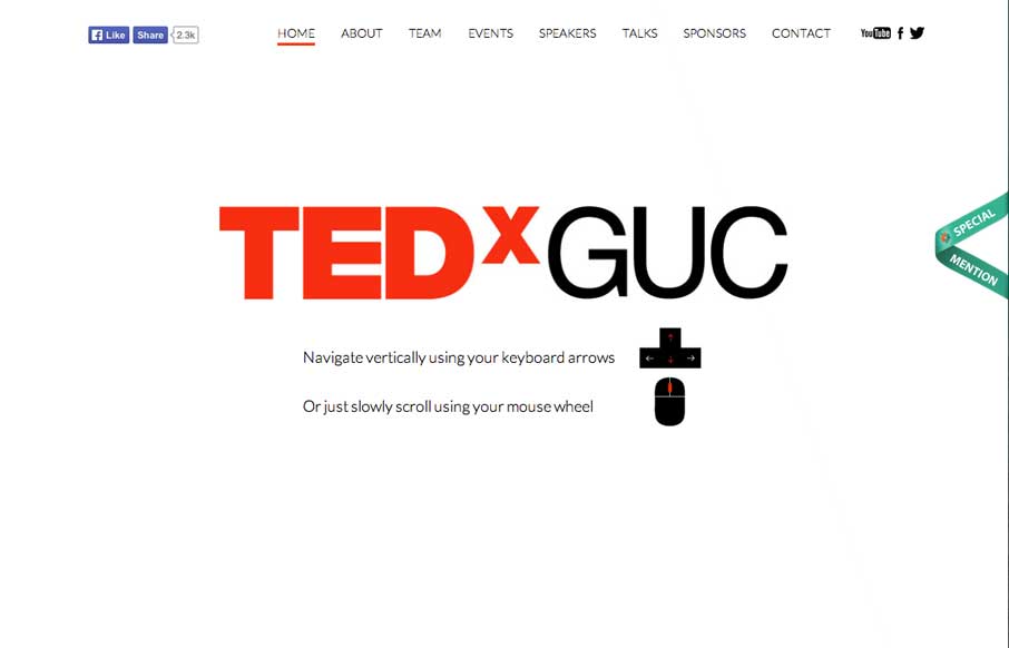
TEDxGUC
Man, what a cool home page. We're at BDConf right now, and had a few of our speakers talking about the importance of "if you're going to use animation on your website - use it right" - tell a story with it. This site follows that rule to a T. Submitted by: Rana...
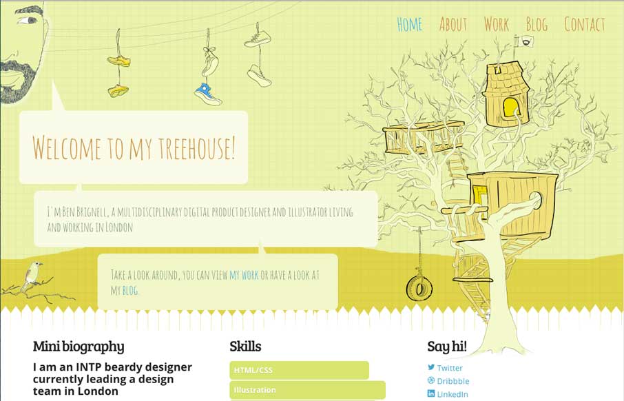
Ben Brignell
Let's start this morning off with a good one - Ben Brignell does that for us! I really like the entire site - from the animation opening on the home page, to the javascript color changes you can make on the About page, to the project tags in his Work area (how many...
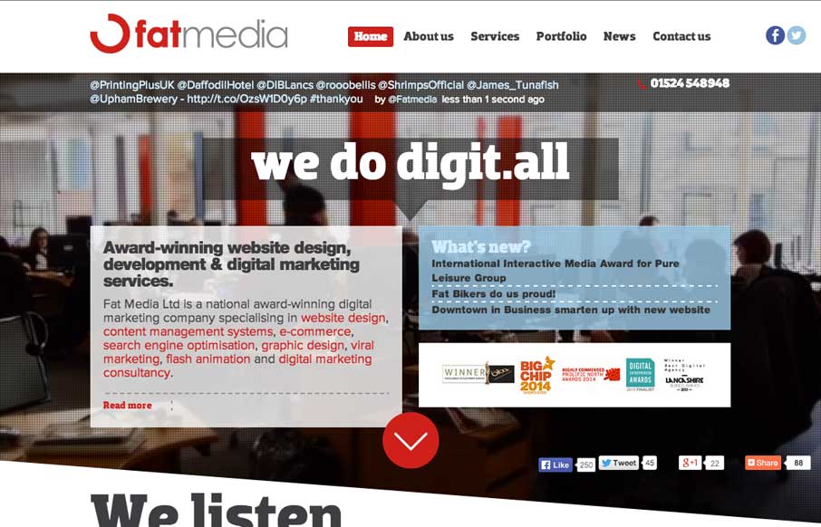
Fat Media
Definitely like how Fat Media is doing the foreground / background imaging with a different slant (figuratively and literally). The scrolling animation seems pretty seamless on the home page - and like the hover state of the staff on the home page too. Submitted by:...
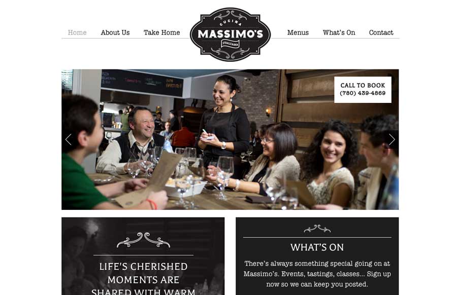
Massimo’s Cucina Italiana
We love websites that make great use of fonts, and Massimo's Cucina Italiana uses a couple of different fonts, accent illustrations, vibrant pictures, and black, white, and gray to tell the story of their restaurant. Simple, and effective. Submitted by: Landon Poburan...
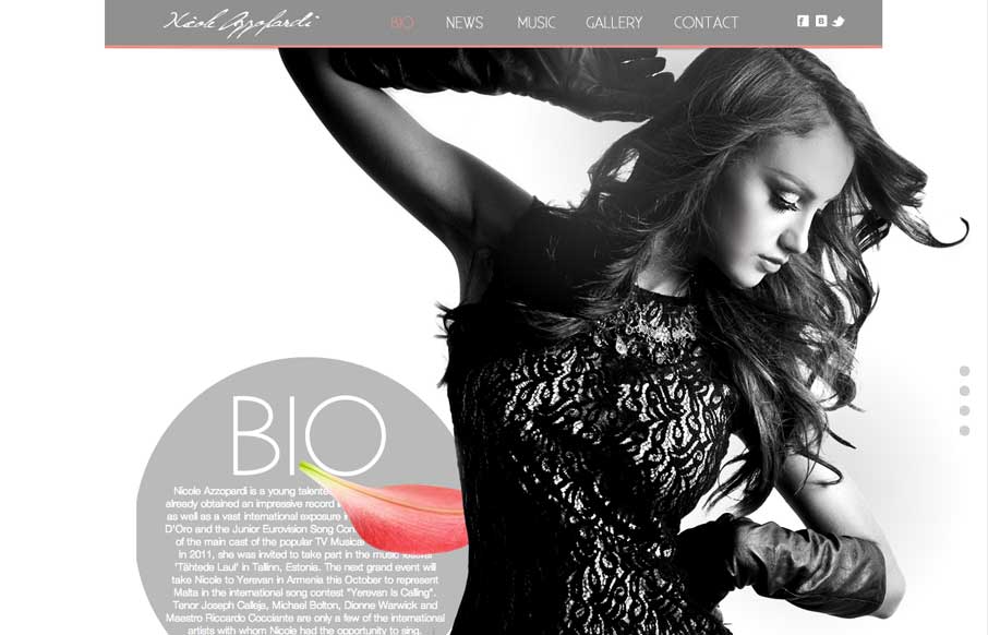
Nicole Azzopardi
Great use of parallax with flying flower petals, bios, and a singer. Also like the use of texture in one of the sections, and then subtler parallax in another section to give some differentiation. Submitted by: Justin Sammut Role: Designer
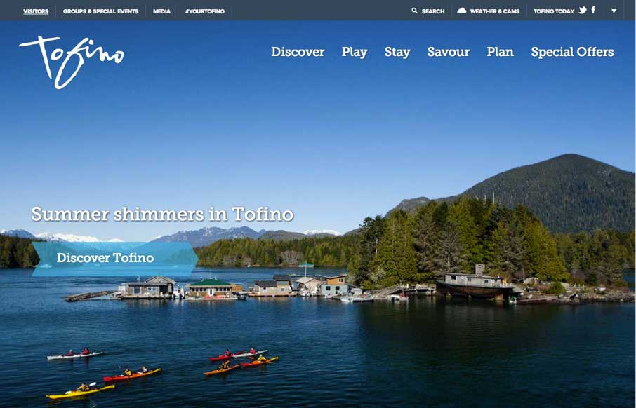
Tourism Tofino
Cool use of different elements and shapes to give clear section delineations on the home / single page design. Also like the only drop-down in the top right corner (arrow) that works as a dashboard for the site. Submitted by: Jim Morris @ventureweb Role: Agency
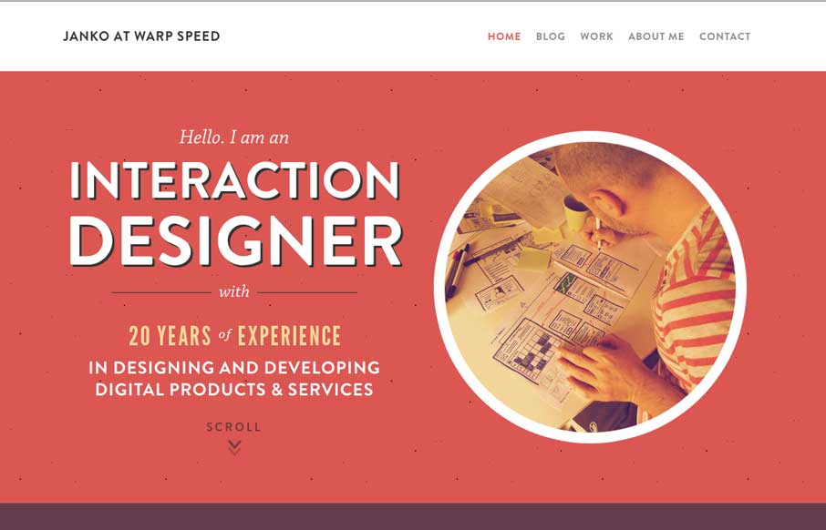
Janko at Warp Speed
Hallo Janko! You probably know we see a lot of portfolio sites from graphic and web designers, but not as much from interaction / dashboard designers and developers (if that is a separate category). Janko's site has a cool feel to it, and in the Works area, you get a...
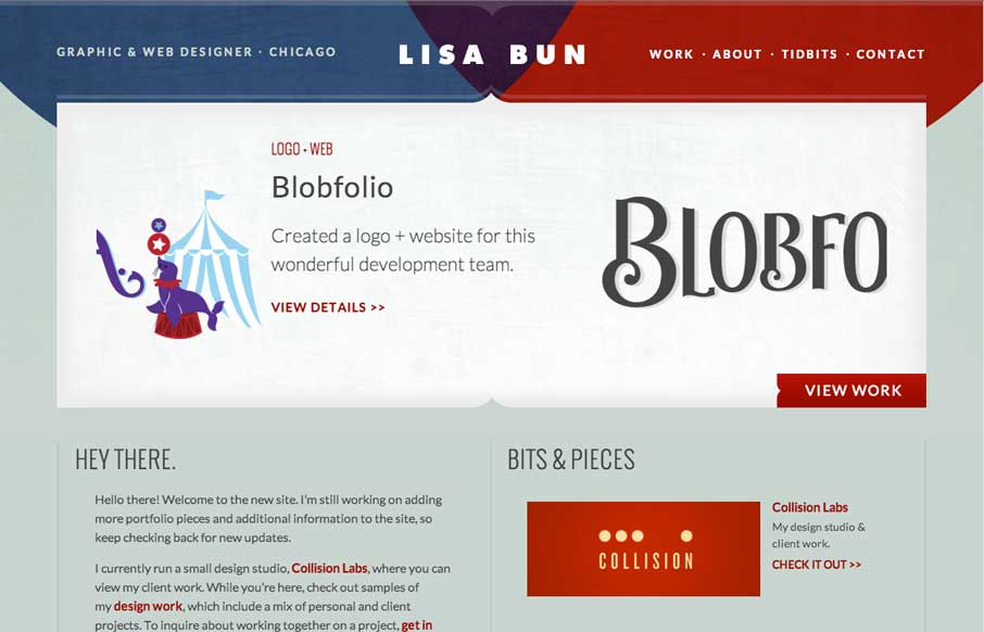
Lisa Bun Designs
Cool to see portfolio sites from graphic designers. They always put a little more into the aesthetic design of the site like Lisa has. Fits with her motto of "Be Creative, Keep it Simple". This is the website and portfolio of Lisa Bun, a graphic and web designer in...
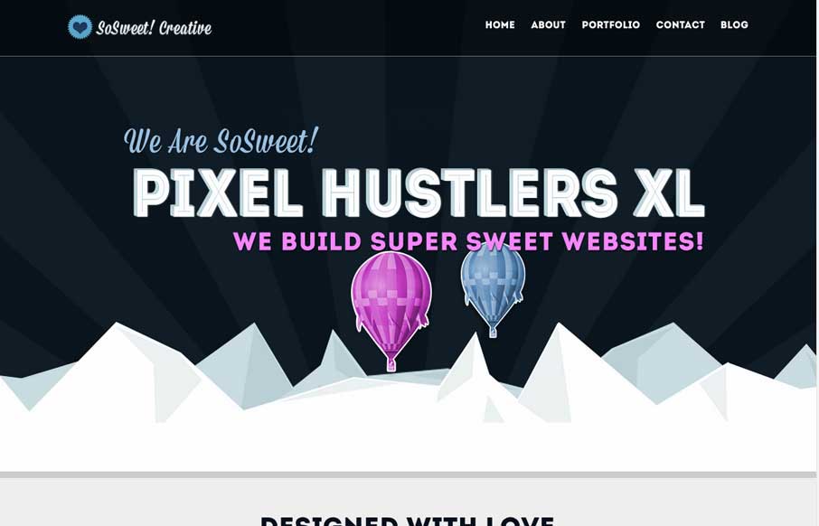
SoSweet! Creative
Nice strong colors and graphic feel to this design. I really like the beating heart when the page loads up. I extra dig the way the contact form loads in too, nice touch. Submitted by: Stephen Scaff @SoSweetCreative Role: Designer & Developer SoSweet! Creative is...
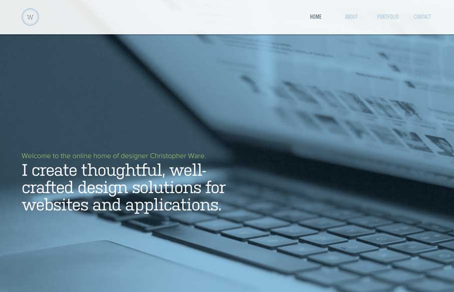
Christopher Ware
Just a really clean and nicely subdued site design for a designer. I like it much. Submitted by: Christopher Ware @christopherware Role: Designer & Developer
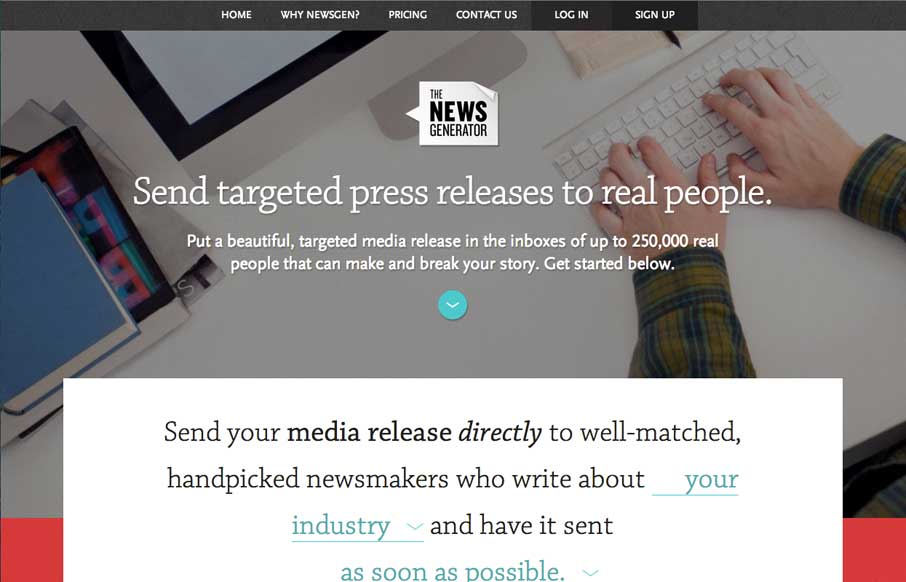
The News Generator
Nice layout, it uses a lot of tried and true layout but it just feels a little different to me. I really dig the way the main signup form is right in the center of the home page but not in your face at the same time. Some clever form field design to go along with it...
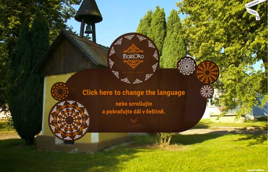
Bozi Oko
We leave you today with the type of site we see very rarely (for now - see this as a trend in the coming years) - you can scroll through a virtual tour of this resort in the Czech Republic. Looking at the code - each scroll forward or backward is an individual mapped...
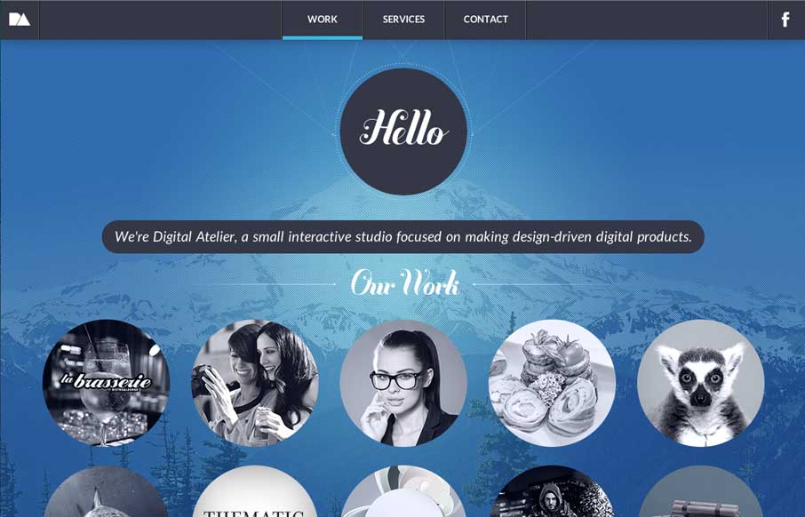
digitalatelier.ro
We like seeing sites that mix it up a little, but still keep a sense of simplicity. This one does that - horizontal transitions on top of a cool background image (get it... top... cool...?). Like the flipper that holds the page headline at the top. Also - looks like...
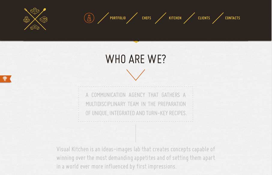
Visual Kitchen
We've seen a lot of animated gifs - most of them are some crazy cat/dog/weird meme. Luckily, Visual Kitchen uses them to give a little bit of cool expression, coupled with a semi-transparent reveal of content as you scroll down. The drop-down header menu, with the...
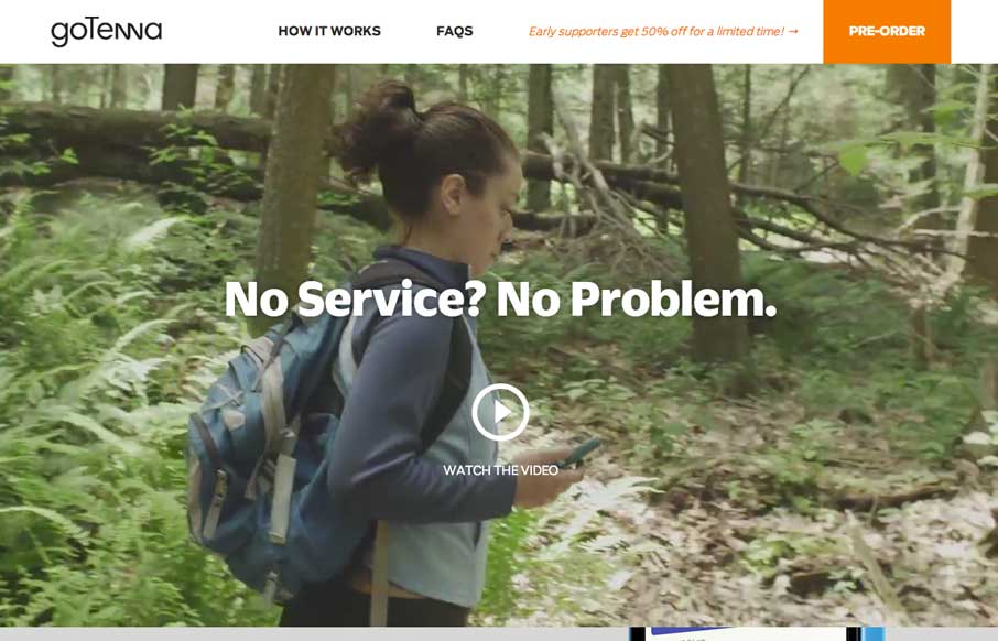
goTenna
We have a saying around here for when we like some new tech gizmo - "Me likey - me want one" - no really... we actually say that... I know... but me likey goTenna - me want one. But that's not important now. goTenna's website has great use of video background,...
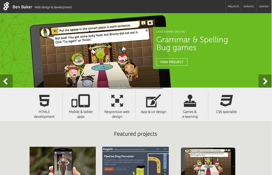
Ben Baker
Good portfolio site from Ben Baker. Two things to really note - like how the icons fly in when you hover over the navigation. And the project detail pages have some off-screen navigation in the left top corner to quickly change out which project you're viewing. Smart...
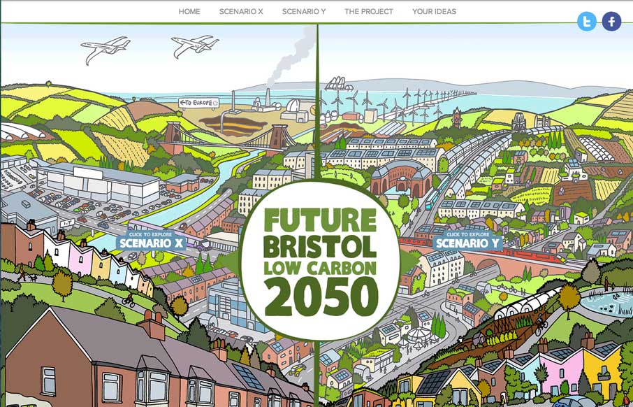
Future Bristol Low Carbon 2050
Great way to start your Tuesday - this interactive graphic website on the the future potential of Bristol (UK), that allows users to see the potential scenarios the city may go towards, and vote on the ideas, with real-time feedback on what others have voted on too....
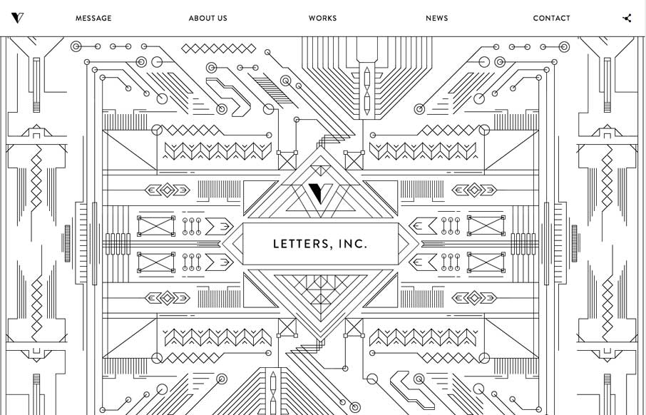
Letters, Inc.
At first I didn't know what to say about this site. What finally comes to mind is "Thank you" - thank you for an awesome site that doesn't look like every other site and every other agency site. Thank you for having a fun site that really shows some of the awesome...
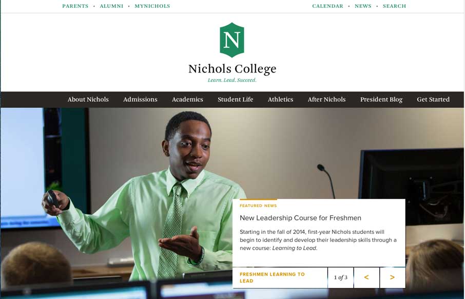
Nichols College
College sites are hard, mainly because of all the content from all the different areas that content and data comes from. Nichols College does a good job unifying all of it into a modern, responsive design - that probably looks even better on a tablet view - meaning...
EMAIL NEWSLETTER
News & Articles
ConvergeSE 2012 – Year 4
 Saying thank you’s to everyone for this year’s Converge conference and already looking forward the next one.
Web Icon Set: Icon Pack Giveaway
Web Icon Set freebie download of a 20 icon set and comment contest to win a full membership.
The Non Breaking Space Show
![]() Introducing The Non Breaking Space Podcast. With Christopher Schmitt – @teleject, Dave McFarland – @davemcfarland, Chris Enns – @ichris & Gene Crawford.
Introducing The Non Breaking Space Podcast. With Christopher Schmitt – @teleject, Dave McFarland – @davemcfarland, Chris Enns – @ichris & Gene Crawford.

HARD WORK. CLEAN FUEL. NO EXCUSES
Use “WARRIOR2023″ for 10% off.