Web Design Inspiration Curated
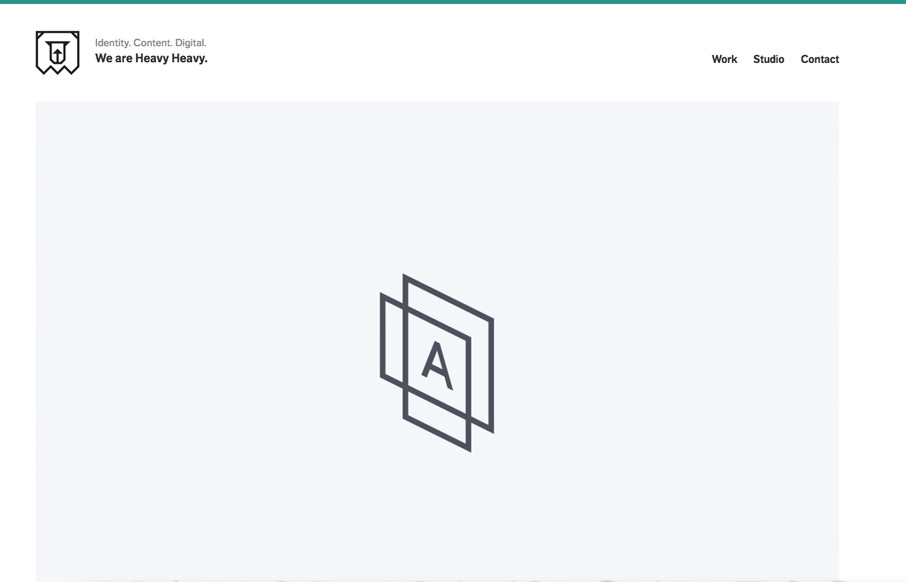
Heavy Heavy
The ironic thing about Heavy Heavy's website is that it is light. And in this case, light is heavy. Um.. that means that you can make a strong impact with a light and simple site. Instead of having a thousand animated gifs and CSS spinners, you can make a simple and...
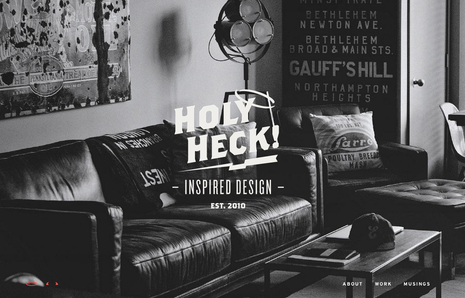
HeckHouse
Portfolio website for Bethany Heck. Ex-Columbia, SC pixelworker and we're proud to say we're friends! Great work to feast your eyeballs on and the website design ain't half bad either. Enjoy! Submitted by: Bethany Heck @eephusleague Role: Designer This is a responsive...
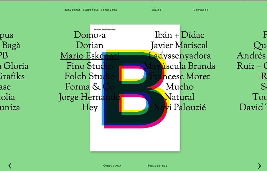
bbb.cat
A compelling visual way to navigate a site like this. I like that it's different and it somehow actually feels like it helps feed into the literary vibe of the site too.
friends.houseof207
Fun, it's that simple. Great visuals and great execution. I just like to sit here and scroll the page. It's like cats, i'll watch it again and again.
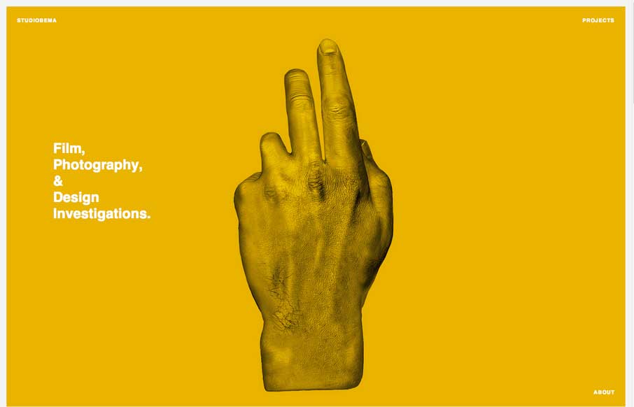
Studiobema
I love beautifully simple stuff. Like the Studiobema site design. Simple and satisfying. Love it.
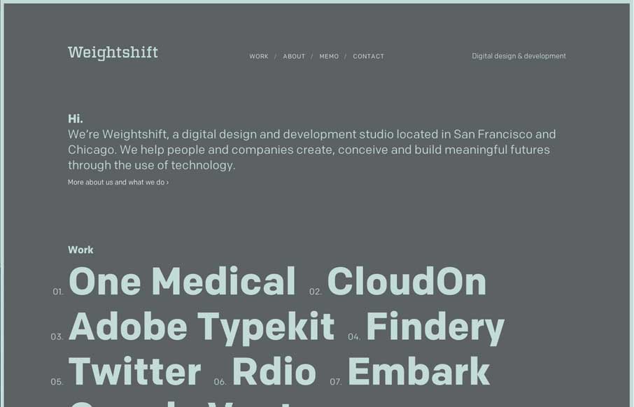
Weightshift
As always, beauty from the redesign of Weightshift. We've been fans of their work for a long time and this new iteration of their business' site is great. My favorite part is the way the portfolio/case studies are presented inside the words/links visually. Classic...
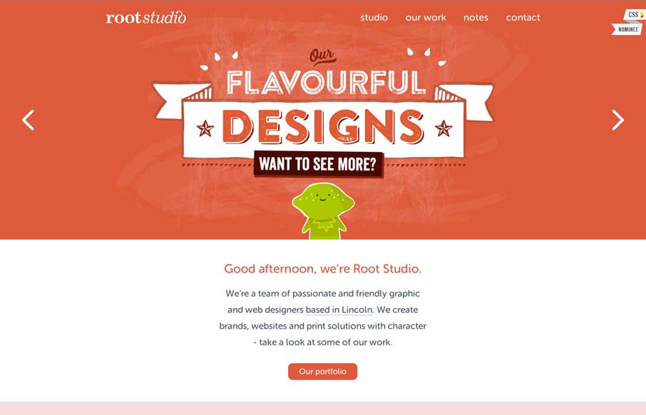
Root Studio
Fun. It's something that a lot of people can't do well. This site can. The Root Studio site is full of fun looking visuals which lead you to think they're fun people. Bam, the brand has won. Good stuff.
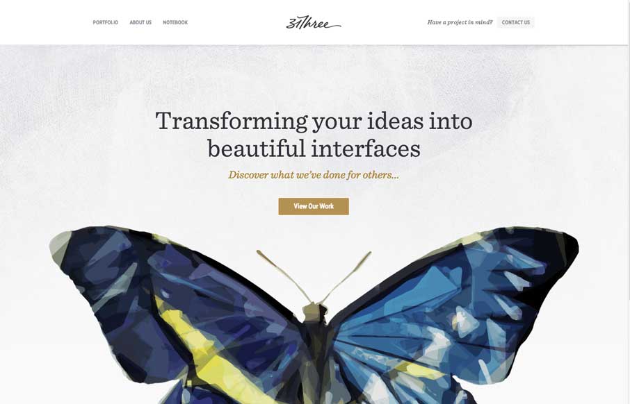
31three
Really beautifully designed website from 31three- hint: their sites always are... I love the butterfly and how it's used and the soft deckled edges under the main nav bar. Nice simple responsive design FTW.
Pan Fried Pixels
I love this design. It's simple yet deep enough visually to not come off overly so. I like the project planner design a lot. The way the projects are displayed and are animated via the mouse over is well placed within the experience too. I dig it.
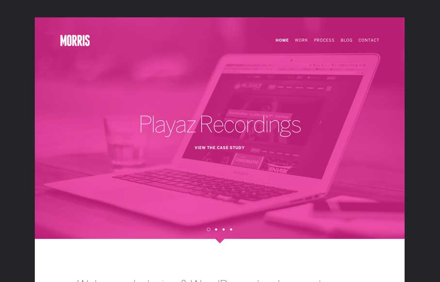
Morris
Cool vibe to this site design for Morris. I like the colors and they way the elements are presented. It feels kind of fresh and has that "mobile" vibe to it visually. Pretty neat.
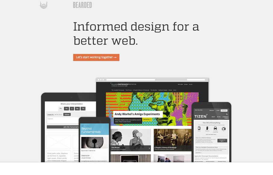
Bearded
New Bearded. 'nuff said. But really, it's super slick and simplified beauty. It's this type of thing that makes me really love hate these guys. They even had the gaul to give us a pretty good write up about the redesign too: I’m constantly reminded of a Hemingway...
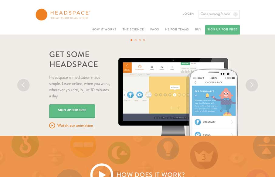
Headspace
I love the look of this site. It has hard edges and a rigid typeface but it still keeps a soft feel to it all at the same time. It's party color and imagery and rhythm that keeps it feeling open and inviting. Great work all around visually on this.
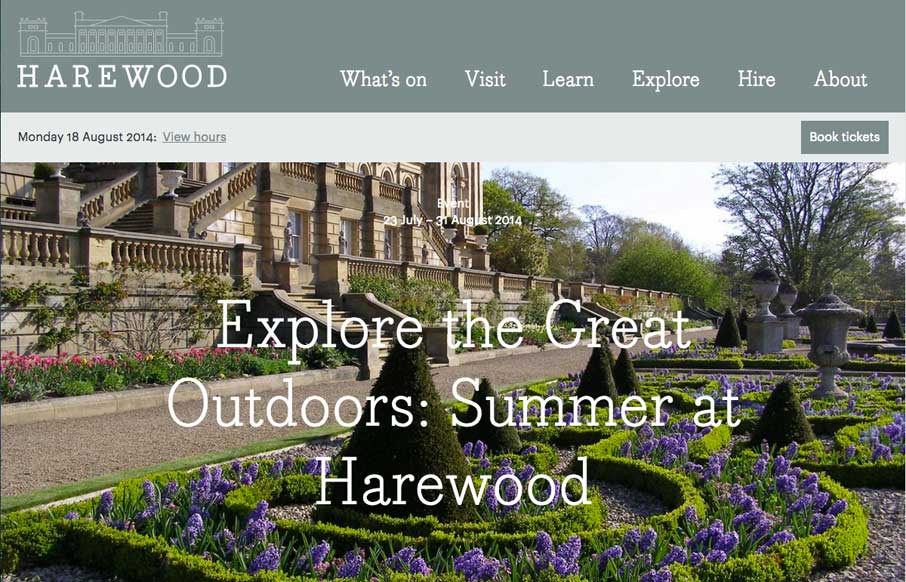
Harewood
The Harewood site is a great example of how to deliver something that's responsive and still have that "RWD look" but also elegant at the same time. I like a lot of this design and at the same time sniff several tried and true visual RWD patterns at work here.
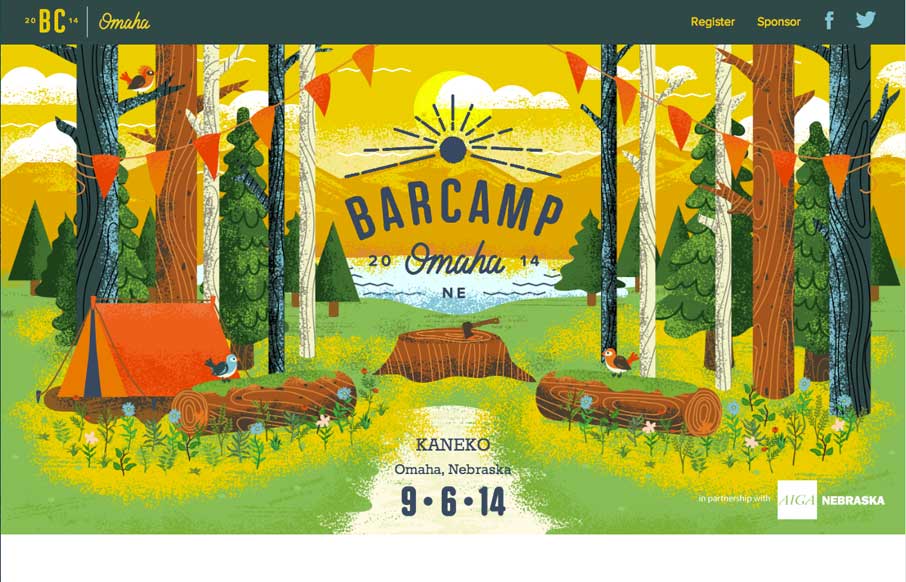
Barcamp Omaha
The Barcamp Omaha website is just beautiful. I love just about every aspect to it, but the thing that I dig most is the illustration work that sets the tone. It promises a pretty well organized Barcamp; quality is driven home via the visual branding. I only wish I...
I’m Sonny
Fun site. I love the animated pieces worked into the site design. It's a clean subtle design underpinning everything that lets the fun stuff be delivered so successfully here too. Submitted by: Sonny Chen Role: Designer & Developer It is my design portfolio...
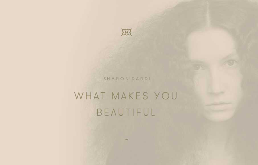
sharondaddihair.com
What a unique design for this salon. I feel like it's really something different for what most people experience with their salon's website. It's subtle and very smooth feeling as you go through it to me.
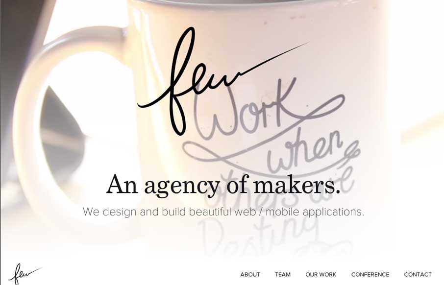
few.io
Really beautiful and wispy design for the few.io site. I really dig the open vibe to the design and just about everything else that goes with it. Also, that is some epic beardage across the team there.
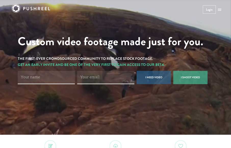
Pushreel
Looks like a pretty useful project, backed up by a nice simple and well designed page. I really dig the signup form elements and the way the nav works with the site overall. Smart stuff. Submitted by: Michael Moran @mike_moran_ Role: Designer & Developer Beautiful...
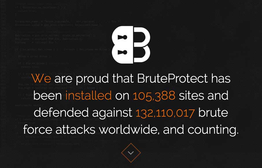
BruteProtect
There's a lot of well tread design patterns in play on the BruteProtect site, but they're done pretty well and that goes a long way. The sections are also broken up in interesting ways, like the use of the visual timeline for example. The best part is the contact form...
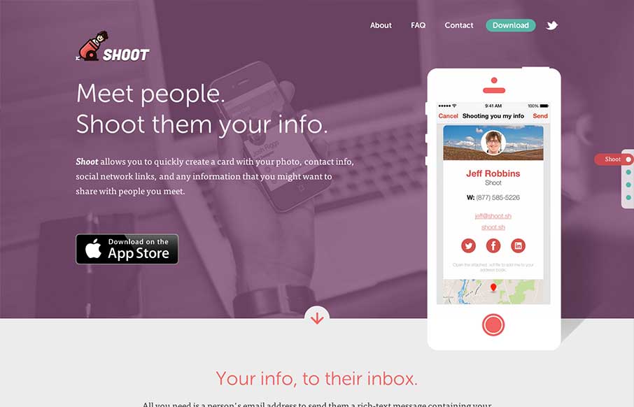
Shoot
The team from Lullabot have released an app called Shoot. Pretty neat concept for an app. The website for it is top notch. Shows off the app, takes mobile into consideration heavily (you'd be surprised...) and is just plain neat to check out on it's own. Great work...
EMAIL NEWSLETTER
News & Articles
CSS Summit 2012
![]() Reviewing the 2012 lineup for the CSS Summit with Christopher Schmitt. We’re also giving away 2 tickets to the event – comment to be picked randomly to win.
Reviewing the 2012 lineup for the CSS Summit with Christopher Schmitt. We’re also giving away 2 tickets to the event – comment to be picked randomly to win.
Using jQuery to leverage HTML5 data attributes
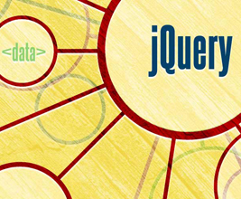 Sometimes, it seems like HTML5 was designed to make tools like jQuery unnecessary. Not so, courageous reader! Let me show how HTML5 gives jQuery a whole new layer of awesome.
Introducing BizCraft
 Introducing the BizCraft LIVE podcast show with Carl Smith and Gene Crawford. You know you wanna know what this is all about…

HARD WORK. CLEAN FUEL. NO EXCUSES
Use “WARRIOR2023″ for 10% off.