Web Design Inspiration Curated
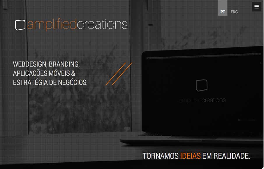
Amplified Creations
I like a lot about this website. It's simple, single page, minimal color palette. But it communicates what they do and has some bells and whistles to show off to potential clients. Submitted by: Pedro Thomaz @PTthe13 Role: Designer Clean and modern single page website...
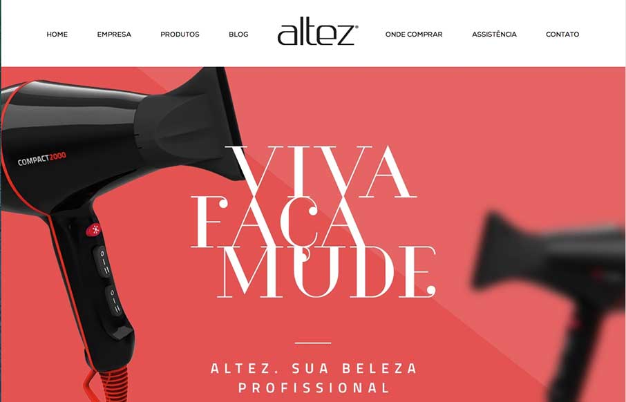
Altez
I like the trend that Altez follows - sites associated with the beauty industry have the hi-fidelity of slick industry magazines. It plays well for this site. My only suggestion is on the map - since the site is full-width (which adds to it's appeal), it make...
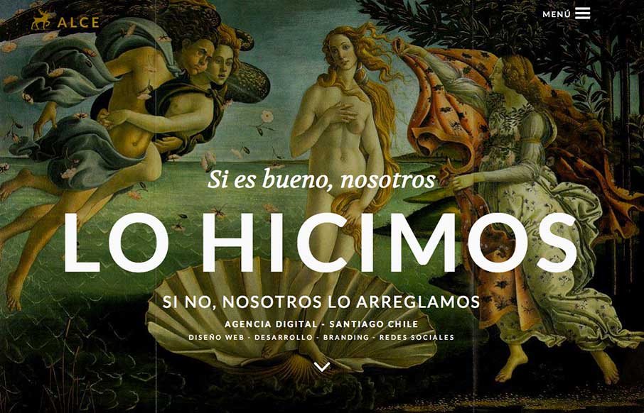
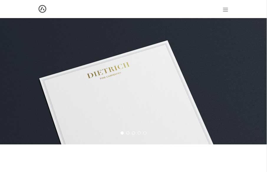
ALCE
Super rich visual design. I love the slight movement on each section as you get to it based on how you're scrolling. The nice big services list and descriptions is nice. You don't typically see that and I like it here, it'll help educate new people when they load the...
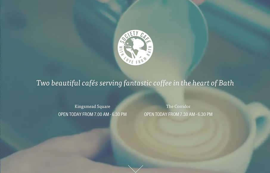
Society Cafe
What a beautiful and soft feeling site design for Society Cafe. I love the soft colors and thin line work used across the page. The video in the background is a good touch to keep a kinetic vibe going as you scroll down the page too.
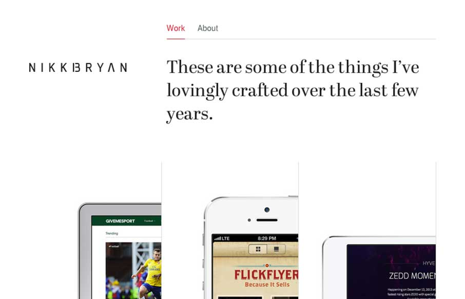
Nikki Bryan Enriquez
Really slick display of work here. I love how the design is unique in it's work display, showing it on devices and in an interesting visual way. Also very nice responsive tweaks. Submitted by: Nikki Bryan @nikkibryan Role: Designer & Developer
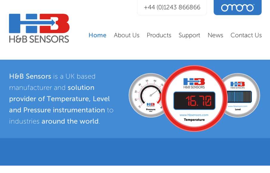
H&B Sensors
Really beautifully done animations, strong layout with a decent narrative about the company. It also has really nice responsive tweaks too, things feel natural and fit well on most screen width sizes here. Bravo. H&B Sensors is an intuitive, visually striking and...
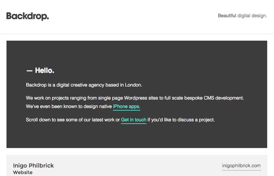
Backdrop
Neat layout and approach. Show some work, show what's next, boom. I like it.
Daniel Chi
I love this site design. I like the simple and clean nature of it. I like the hero graphics and the way the other sections are displayed. I can't understand why the initial load of the page would hide the main nav under the hamburger icon though. Is it mainly to make...
Seth Addison
Very nice, clean and precise display of work and design expertise. Keep it sharp and keep it concise and you're golden, just like Seth Addison. Submitted by: Seth Addison @sethaddison Role: Designer Seth Addison is a brand and identity designer with a focus on clear,...
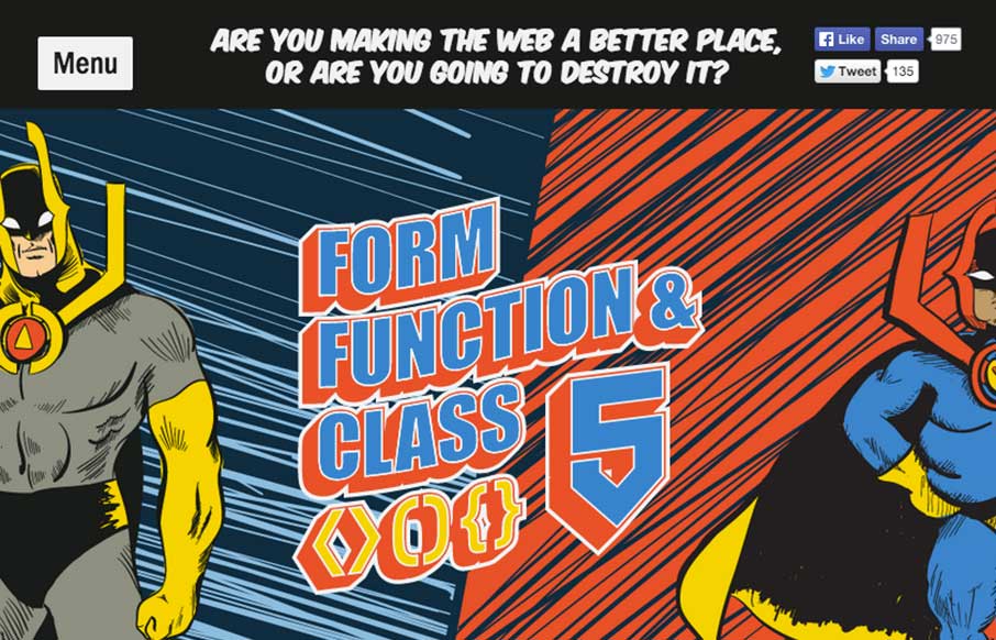
FFC 5
Very neat design. I like the hero/comic book vibe and bold approach. I also really dig the ken burns effect on the main hero image area. Fun and inviting. This is our* conference site for the year, designed by Aceler Chua of The Missing Bulb and Angello Alarcon. We...
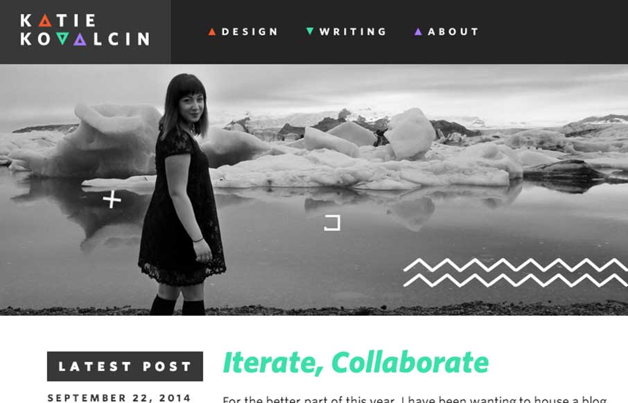
kovalc.in
I love website designs like this where the artist's vibe comes through into the design of the page. Really fun approach and clean production at the same time. Bravo. The talented @katiekovalcin relaunches her portfolio, embracing a responsive, geometry-accented look:...

Rdio
New design for Rdio. Brilliant stuff. I really like the layout and how it uses the static images in the background and an almost parallax effect as you scroll down the page. The little interaction 'device' in the top right corner that lest you sort through the...
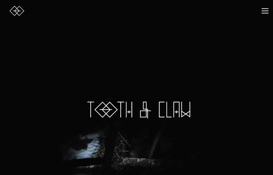
Tooth & Claw
Very 'story telling' centric design with Tooth & Claw. I like this aspect of it, keeping you focused on this aspect seems important for these guys. Some of the nav elements are a little hard to see and get to, but in the end i'm not so sure that's as big a deal...
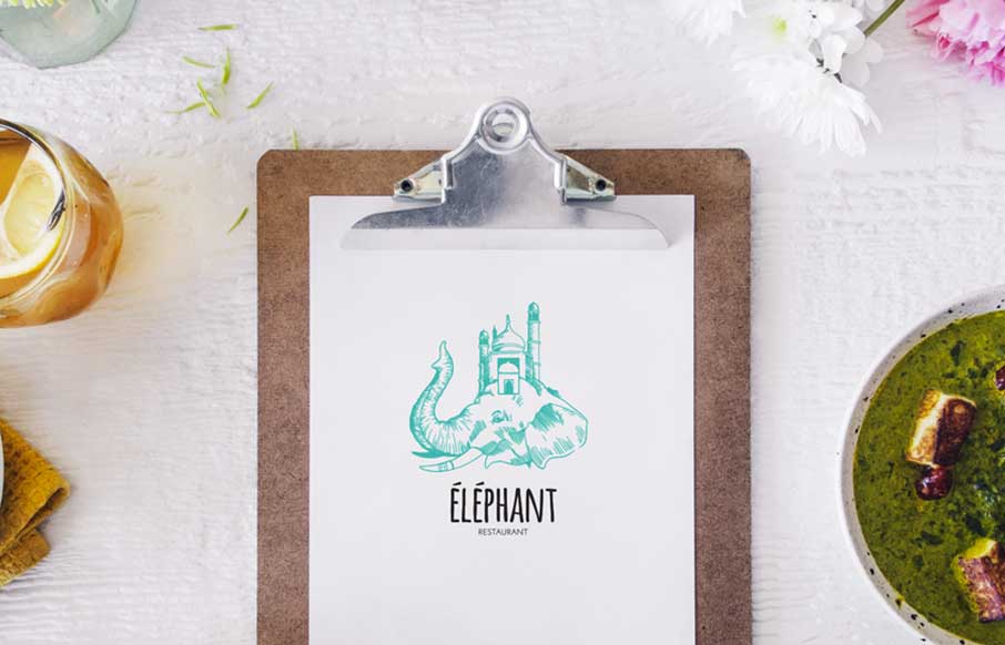
Éléphant
Some nice little details and inviting design make this site for Éléphant a really great restaurant website. Submitted by: Pier-Luc Cossette Role: Designer & Developer Éléphant is a indian food restaurant situated in Québec, Canada.
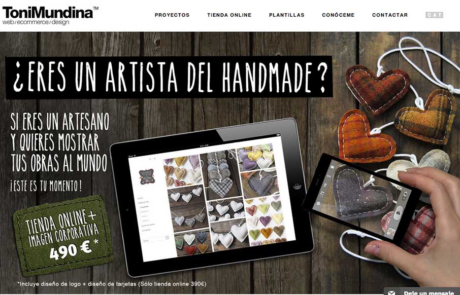
Toni Mundina
It's a standard clean style layout that has good responsive adaptations applied to the design. What I like most is the work put into the imagery, it takes time to get stuff like that to show off in a way that's compelling. Submitted by: Toni Mundina Role: Designer I...
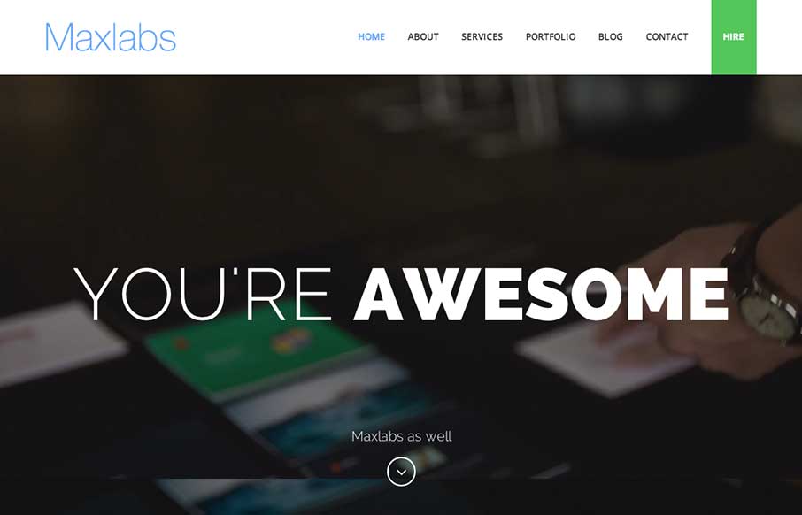
Maxlabs
Kind of standard fair for content on the Maxlabs website, but the slight differentiation in the way each section is treated makes it stand out to me. I like the subtle changes in layout as you scroll and the 'just enough' interaction to pull you in a bit to read the...
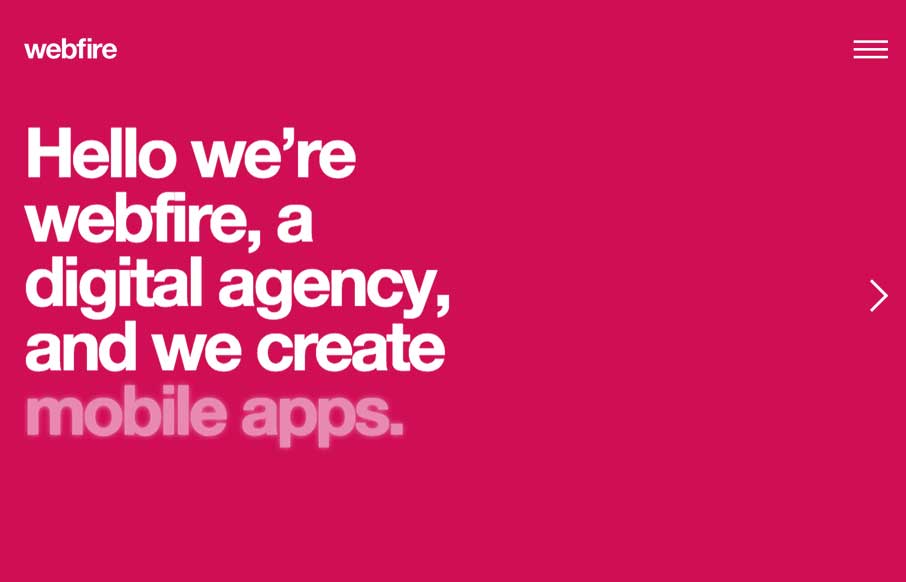
webfire
Nice easy way to deliver a message. I can't help but reminisce about splash pages when I see site's that utilize big entry overlay designs like this. Submitted by: Gareth Evans @webfireagency Role: Project Manager We've tried to do something different with our own...
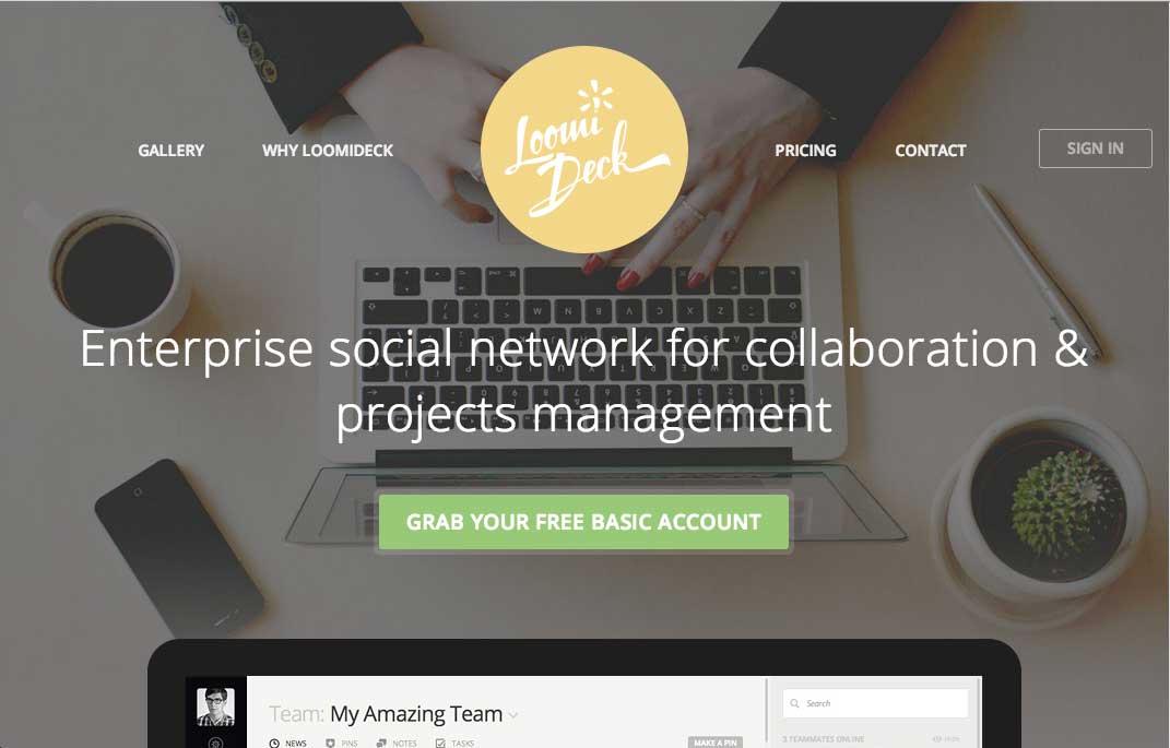
Loomideck
Man I love the animation detail work done on this home page. The way the logo shifts and the way the other icons are timed to fire off animations as you scroll down works really great and is super engaging.
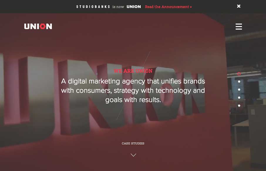
union
Here's a good example of a site pretty much hiding everything except a few links to case studies/work examples under a fly out overlay nav. I gotta assume this is by design. I do like the idea of keeping most people focused on your work like this btw.
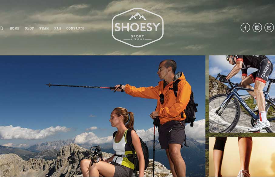
Shoesy
Nice vibe to this design. I love the photography and the responsive work is pretty decent too. Nice seeing a lot of these patterns we see on other designer site's employed successfully on client end-type websites. Submitted by: Carla Sartori @carlasartori23 Role:...
EMAIL NEWSLETTER
News & Articles
BizCraft Episode 2
 Episode 2 of the BizCraft podcast with Carl Smith and Gene Crawford. Recorded live on June 29th.
Chat Session: Chris Coyier
 It’s time to catch up with Chris Coyier to see what he’s been doing. It’s been a big couple of weeks for Chris with CSS Tricks and the launch of CodePen.io. Not to mention the success of The Shop Talk Show Podcast.
The San Francisco Sessions
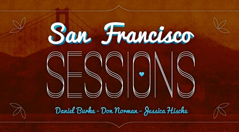 Visiting San Francisco has been a wonderful experience, but our trip had a definite purpose. We came here to collect content and to talk to some amazing people.

HARD WORK. CLEAN FUEL. NO EXCUSES
Use “WARRIOR2023″ for 10% off.