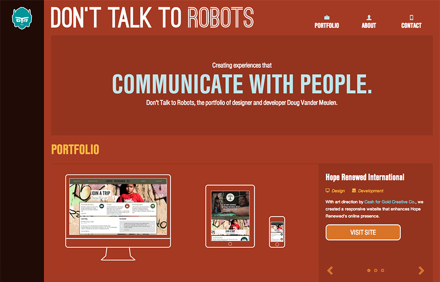
by Gene Crawford | Dec 10, 2012 | Gallery, Portfolio, Screencast Review
Submitted by: Doug Vander Meulen @dt2r Role: Designer & Devleoper Don’t Talk to Robots is the portfolio of designer and developer Doug Vander Meulen. The responsive design highlights various web design and print projects via re-sizable slideshows. The site...

by Gene Crawford | Nov 28, 2012 | Gallery, Music, Screencast Review
We don’t normally post a lot of coming soon pages or signup form pages like this. However, the Jukely interactions are well done and actually spur on the desire to use the signup form. It’s fun and inviting and creates a nice little moment of delight all...
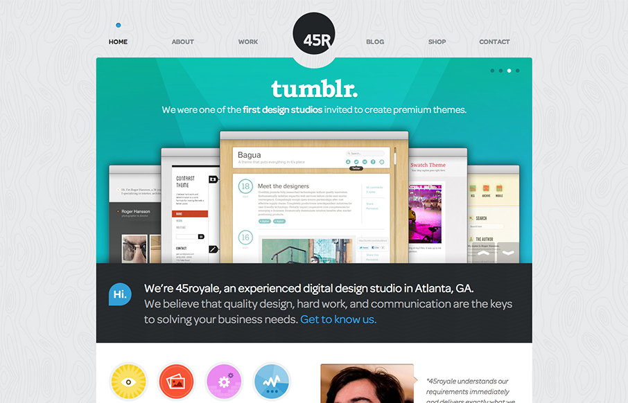
by Gene Crawford | Oct 3, 2012 | Design Firm, Gallery, Screencast Review
There’s so much design goodness here it’s making me giddy. From the rich colors, the way the home page slider has been designed to the custom photography it’s just a super high level effort. Check out the more in depth video review above or at this...
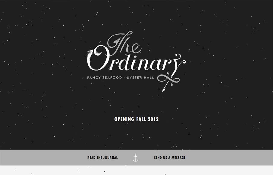
by Giovanni DiFeterici | Sep 11, 2012 | Food and Beverage, Gallery, Screencast Review
I have to say that I think this is an great site. It has just the right mix of texture, art and typography. My favorite part of the design is the speckled background, which does a great job of softening and activating the negative spaces without making the design...
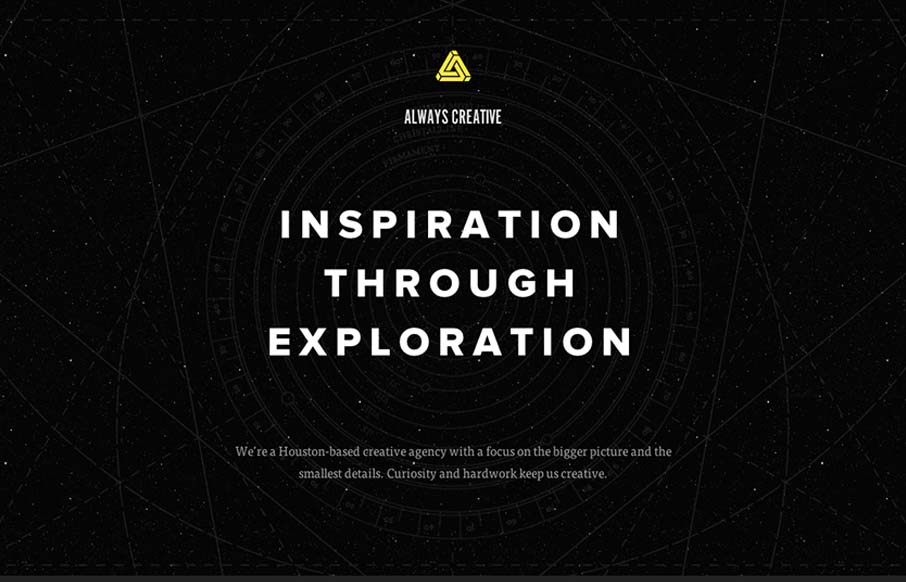
by Giovanni DiFeterici | Sep 10, 2012 | Design Firm, Gallery, Screencast Review
This site is beautifully wide open, with subtle animations and a complex mix of textures. It is somewhat narrative through a combination copy about exploration and imagery of space. Their vision is simply stated, which I like, and the design is super-clean (which I...

by Giovanni DiFeterici | Sep 5, 2012 | Gallery, Screencast Review
Damn, this site is fun! It’s all about animation and storytelling, both of which it handles beautifully. Here’s a case where the art is the content. It shows how clever Neil can be, as well as his skill set. One of my favorite personal sites to date....