UXChat.me

UXChat.me

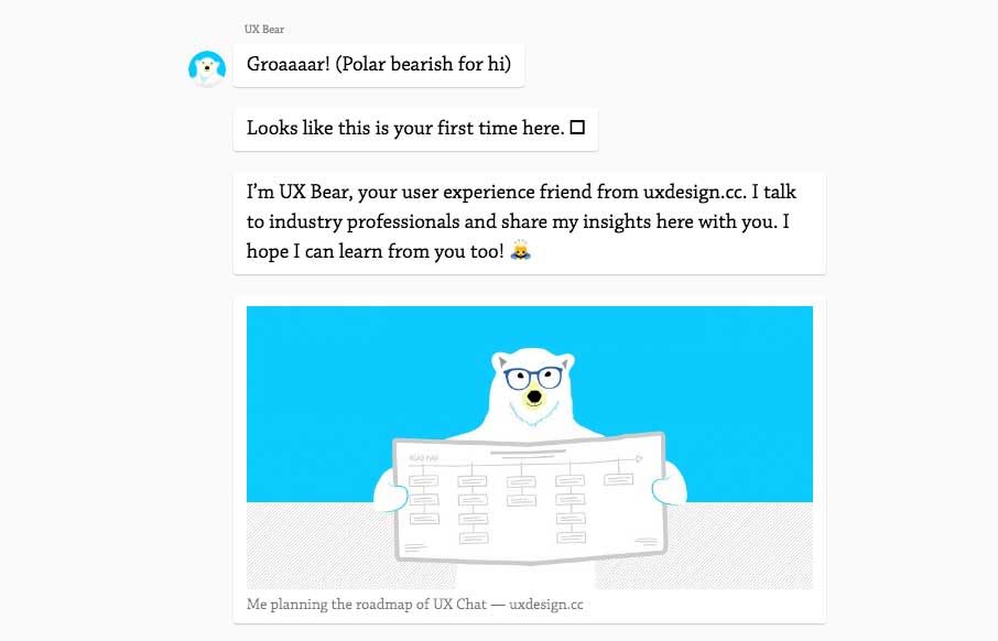
I kind of dig this idea. A chat, back and fourth, to get you through the content. Pretty clever and really shows they're thinking about UX and what it means. Good stuff to ponder. From the designer, here: In April, I turned my website into a chat. The reactions were...

Zoocreative

Zoocreative

Pretty cool, just mostly a single column layout. There's some cool mouse-over type interaction on the large imagery that make up the case-study sections. Love it. From the Designer: Lovingly curated portfolio of Zoocreative, an Irish design studio that specialises in...

Designed by Few

Designed by Few

Super fun website for Designed by Few. I really like the horror aspect to the look & feel. Music, the mouse cursor and all that. Very cool. From the Designer: Designed by Few is a friendly, high-paced design competition and party hosted by the Made by Few conference....

Alessandro Giammaria

Alessandro Giammaria

I really like the openness of the website here for Alessandro Giammaria. It has a nice vertical rhythm and mostly minimal approach overall. ubmitted by: Alessandro Giammaria Twitter: @agiammaria Role: Designer & Developer Country: Italy

nclud

nclud

Man, I really dig this site design for nclud. I like the vibe and all the over states on the nav items here and there. Super rad color palette too. Solid work! Submitted by: Kerry Gunther Twitter: @nclud Role: Designer & Developer Country: USA

likelikelike

likelikelike

Super rad layout and interactions here on likelikelike. It doesn't "feel" like other websites i've visited, but man it's super simple in it's execution. I love that the most about it. Simple, fundamental, smart.

CSS Conf

CSS Conf

Really smart looking site for the 2016 CSS Conf website. I love the shapes and how they layer as you scale the browser down. Something for us Frontenders to dig on. Overall straight forward layout too, dig it in a big way.

Machine Learning

Machine Learning

Pretty great example of scroll-jacking gone right. Give it a spin and see what you think?

Michael Ngo

Michael Ngo

Pretty fun personal/portfolio site for Michael Ngo. I really love the video loop and then the feet at the bottom. 🙂 Pretty sweet graphic design flourishes too.

Fine Line

Fine Line

Beautiful example of some great editorial design. I love the detail work and the video placements. Bravo!

Copenhagen Economics

Copenhagen Economics

Solid grid, solid typography and a really great vertical rhythm. The Copenhagen Economics website is beautiful from top to bottom. The mobile screen view is just as solid too. Check this one out for sure.

Scrooser

Scrooser

Really cool looking design for Scrooser. I really like the detail on the "order now" button. The interaction there to break it out into two buttons for "order" and "ride" is really clever, it makes you focus on it and notice it. It doesn't appear to be as successful...

develora

develora

Nothing earth shatteringly brilliant here, but it's just a great example of simple and straightforward good working design. I love the illustration work and the overall approach. Solid.

Mark Goldstein

Mark Goldstein

Brilliant visual design here on Mark Goldstein's portfolio website. I love the bold colors and overall visual approach. Some really great animation/video placement in that super cool looking grid as you scroll down. Badass work!

Mahno

Mahno

Man, there's a ton going on with the Mahno website. Tons of interaction stuff and some nice timed-scrolling moments too. You need to pick around through it to get the full effect, give it a whirl.

Vault Pizza

Vault Pizza

Brilliantly simple website. Bold typography that's easy to get around on. The menu is in a PDF format, which isn't 100% perfect, but I totally get why it's like that. It still all works seamlessly enough.

Fresh Kids

Fresh Kids

Pretty cool site design. I dig the product and the approach visually. It's actually fairly simple in it's presentation but made to look deep with the illustrations and other visuals. Good stuff.

Grey Friars

Grey Friars

Pretty slick graphic design all over they Grey Friars stuff. Pretty slick and trendy vibe on the website too. I dig it. Visually it puts these guys in a class all their own. No stodgy corporate vibe, but a little newness and a bit corporate, added all up and it's a...

Not Studio

Not Studio

I love the minimal approach to Not Studio's website. The way you interact with the list and the image displays is solid.

W&CO

W&CO

W&CO has that masonry vibe. I dig how it's basically just a list of stuff with a cool layout. Simple and powerful will always win out.

Space Ape Games

Space Ape Games

Fun. Simple. Perfect. I love this Space Ape Games website. It's fun with that spaceship illustration and how it moves as you scroll. It's simple in that it's overall layout is pretty straight forward, nothing too fancy and it's not needed. Perfect in that it...

Deximal

Deximal

Smooth. That's what I think of when I check out the Deximal website. Nice dark background design approach and some nice smooth visual elements.

The Nero

The Nero

Man oh man. Once in a while I come across a site design that really speaks to me. This one is one of those. I love everything about this. It's got that vibe of being a top-shelf design effort as well as being sort of innovative visually at the same time. Like I said...

Make Weird Music

Make Weird Music

What a great project and great website. I love the split layout that makes up Make Weird Music here. I also love the illustration for each section. Great stuff.

Bookani

Bookani

Brilliant layout. I love how the header/logo layers over the rest of the website. Then the off-kilter elements and product displays as you scroll down keep you engaged visually. Lovely website.

Hound Studio

Hound Studio

Man what a fun design for Hound Studio. I love how they use the medium their selling to sell their medium. That's a simple, no duh, statement but I'm constantly surprised at what folks create to sell their stuff. Lovely work here.

Sehsucht

Sehsucht

I like how this design for Sehsucht blurs the lines between graphic design and art. It's not responsive, yeah I know, but it's gorgeous. Get some inspiration from something kinda different from it. Enjoy!

Delete

Delete

Brilliant graphic design for Delete here. Solid layout on the website with some pretty slick little interaction work here and there. I like the cleverness of their layout and design approach for their site.

Drift

Drift

Pretty cool design studio and of course they have a good lookin' website. I dig it, it's simple but classy at the same time. Rad work too.

enigma

enigma

This enigma website is gorgeous. I love the header and the way it moves and contracts as you scroll down. Brilliant visuals, yet simple, as you make your way down the page. The light line work is so clean and lovely.