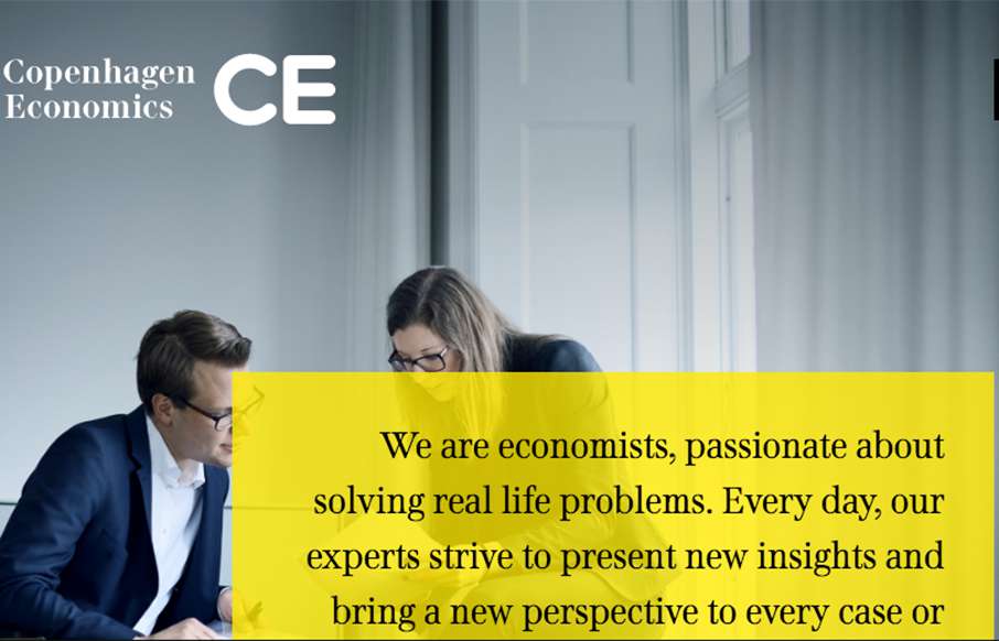
Solid grid, solid typography and a really great vertical rhythm. The Copenhagen Economics website is beautiful from top to bottom. The mobile screen view is just as solid too. Check this one out for sure.
Glassmorphism: The Transparent Design Trend That Refuses to Fade
Glassmorphism brings transparency, depth, and light back into modern UI. Learn how this “frosted glass” design trend enhances hierarchy, focus, and atmosphere, plus how to implement it in CSS responsibly.


0 Comments