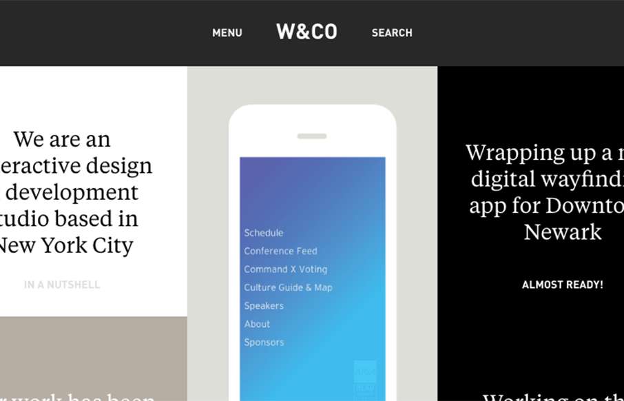
W&CO has that masonry vibe. I dig how it’s basically just a list of stuff with a cool layout. Simple and powerful will always win out.
Glassmorphism: The Transparent Design Trend That Refuses to Fade
Glassmorphism brings transparency, depth, and light back into modern UI. Learn how this “frosted glass” design trend enhances hierarchy, focus, and atmosphere, plus how to implement it in CSS responsibly.


0 Comments