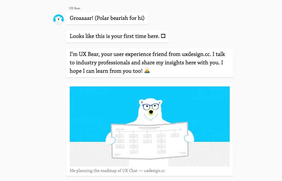
I kind of dig this idea. A chat, back and fourth, to get you through the content. Pretty clever and really shows they’re thinking about UX and what it means. Good stuff to ponder.
From the designer, here:
In April, I turned my website into a chat. The reactions were fascinating. At first glance, my website looks like a simple portfolio-hack: a conversational way to introduce myself and my work. But there is a bit more to it…
The website includes an easter egg. A quartz-like conversational experience for UX related news. It was a lean way to answer a question that has been on my mind for some time now…


0 Comments