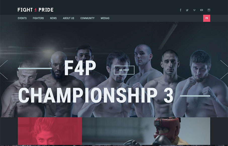
by Aaron Griswold | Mar 16, 2016 | Gallery
Great looking site for Fight 4 Pride out of Quebec, created by Phoenix. Excellent coloring and font work. Really like the Fighters landing and detail pages too – laid out very well.

by Aaron Griswold | Feb 16, 2016 | Gallery, Product, Shopping
We get a lot of agency sites submitted to us – all tricked out, with enough time spent to question whether they do any client work at all. And.. their client work is never up to par with their own site… So – it’s great when we get a site like...
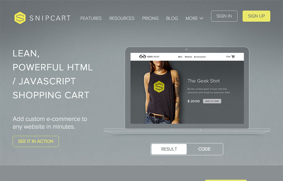
by Aaron Griswold | Dec 21, 2015 | Gallery, Shopping
Decent site from Snipcart out of Quebec – one thing I like is the mega-dropdown in the nav – keeps the site cleaner. Also like the line illustrations on each page (and in the nav) – cool. From the Designer: Complete marketing website for Snipcart, a...
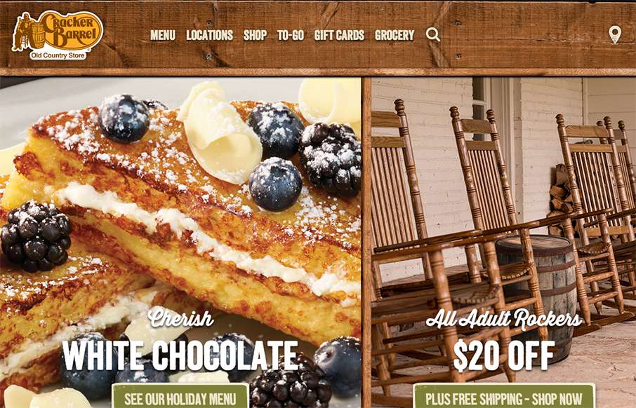
by Aaron Griswold | Dec 14, 2015 | Food and Beverage, Gallery
Whenever we hit the road to put on a conference (like ConvergeSE / BDConf / FrontEndDesign Conf / or Grok – shameless plugs…) you can guarantee that around 6am on the first leg of the trip, we’ll stop at a Cracker Barrel. After being in many, many...
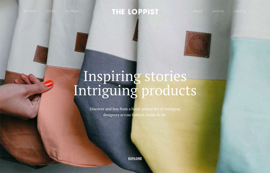
by Gene Crawford | Sep 30, 2015 | Gallery
The Loppist is a great example of a website with a “mega” drop-down navigation design. I really like this and how it shows more info before you drill down into the site. It’ll help that pogo-sticking thing that people get into on a product...