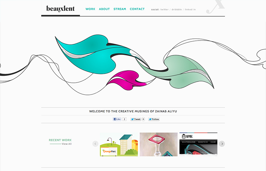
by Gene Crawford | Dec 6, 2012 | Gallery, Portfolio
It’s a pretty standard and simple layout but accentuated by that nice leaf illustration. That illustration is the central focus of the design and makes you really start your visual journey around the page there in the center of the page almost.
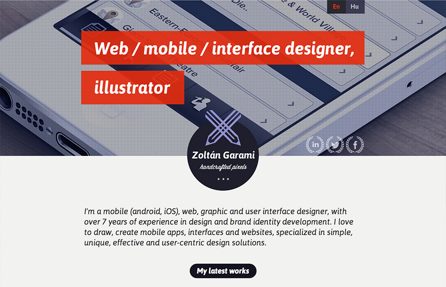
by Gene Crawford | Dec 4, 2012 | Gallery, Portfolio
Submitted by: Zoltan Garami @garamiz Role: Designer I like the placement of the red behind the white text that’s over the monochromatic image. I know it’s simple and been done before but it’s nicely done here and I just like it. The logo is nicely...
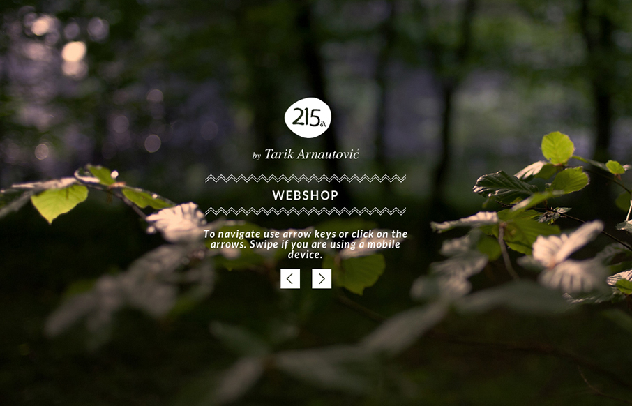
by Gene Crawford | Dec 3, 2012 | Gallery, Portfolio
I love subtle design and this site is a perfect example of that. The left right arrows that match up with the keypad, then the simple placement of interactions/controls. Like when you click on menu and the big X is over the content of the previous page/view. Love it....
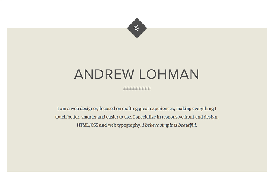
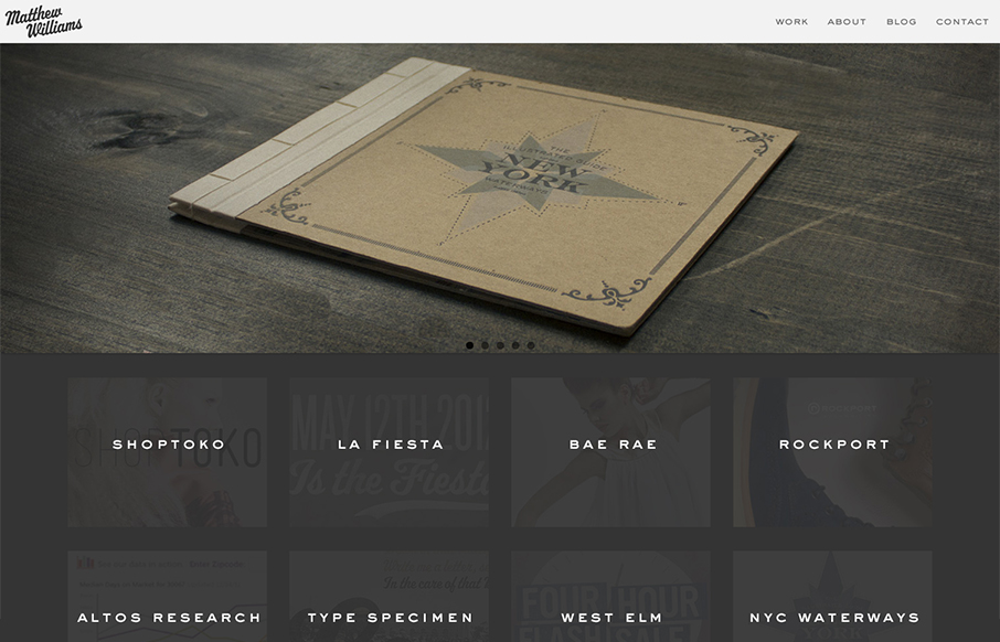
by Gene Crawford | Dec 3, 2012 | Gallery, Portfolio
Submitted by: Andrew Lohman @ajlohman Role: Designer & Developer A simple responsive personal site with some nice little details. Really brilliantly simple design. I love how the logo stays put as you scroll down the page, disappears behind the portfolio section...

by Gene Crawford | Nov 27, 2012 | Gallery, Portfolio
Submitted by: Shane Prendergast @webknit Role: Designer & Developer I kind of like this take on having a splash page. The top portion with the animation basically works as a splash page, then you scroll down to immediately see the portfolio – thus negating...
by Gene Crawford | Nov 27, 2012 | Gallery, Portfolio
Maybe it’s the colors or the photos that are used in the main slideshow but this design just feels “hand-made” (like, I know it was made by someone, but i’m talking about that hand-made aesthetic). It’s really well done, with the...