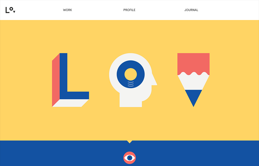
by Giovanni DiFeterici | Mar 8, 2013 | Gallery, Portfolio
lorenzoverzini.com is great. I love this site. Don’t get me wrong, it’s not the most groundbreaking design: minimal, super-flat, graphic, and spare. However, the balance of color, content and style is superb. I love the small SVG animations. They activate...
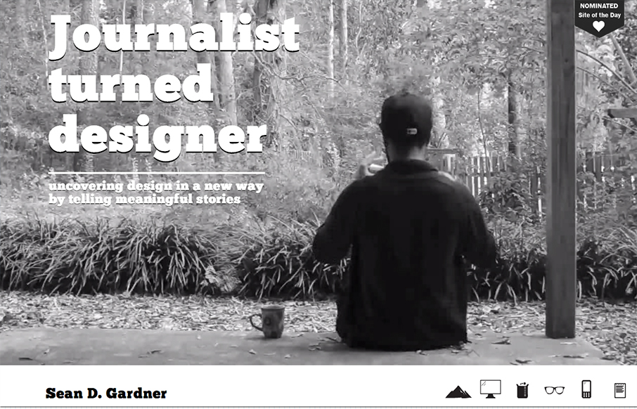
by Gene Crawford | Jan 21, 2013 | Gallery, Portfolio
I love the freshness in this design. The soul of this website feels like exploration, from the video background to the navigation design using icons like it does, it just feels fun.
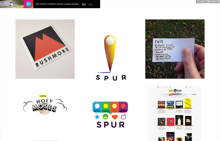
by Gene Crawford | Dec 12, 2012 | Gallery, Portfolio
Poring over @pieratt’s new site. Lots of beautiful and thoughtful work here: dmall.me/Udbqtz— Dan Mall (@danielmall) December 4, 2012 Super simple and minimal design for Ben Pieratt’s portfolio website. It’s a Tumblr site too, I always love it...
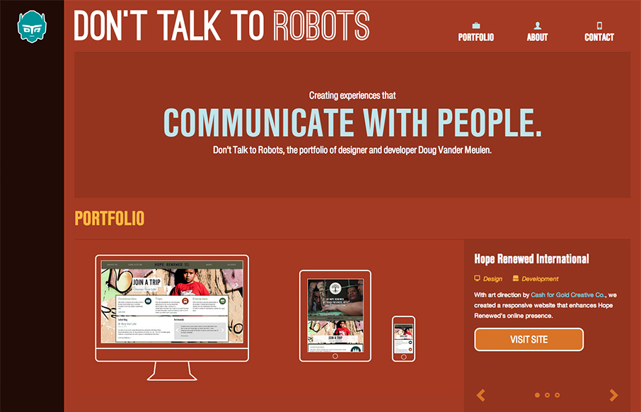
by Gene Crawford | Dec 10, 2012 | Gallery, Portfolio, Screencast Review
Submitted by: Doug Vander Meulen @dt2r Role: Designer & Devleoper Don’t Talk to Robots is the portfolio of designer and developer Doug Vander Meulen. The responsive design highlights various web design and print projects via re-sizable slideshows. The site...
by Gene Crawford | Dec 7, 2012 | Gallery, Portfolio
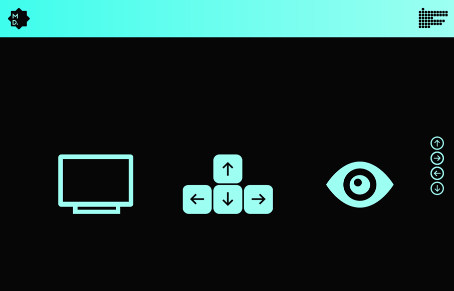
Marked by some really fun interactions with they keyboard, this portfolio site for Michel Doudin is well done. It’s an interesting way for sure to serve up your work visually to others.
by Gene Crawford | Dec 7, 2012 | Gallery, Portfolio
Damn, I love websites that just embrace their purpose and put it front and center to the core of what it’s all about. This website is a portfolio, so make that the home page. Brilliant! I also love the “A bit more about me…” part of the about...