
by Gene Crawford | May 30, 2013 | Gallery, Portfolio
I think what I like most about this design is that it’s “flat” – just kidding. Was that funny? Seriously, what I like most is the vertical rhythm of the site as you scroll down. The way the pieces of the layout are positioned feel very nice and...
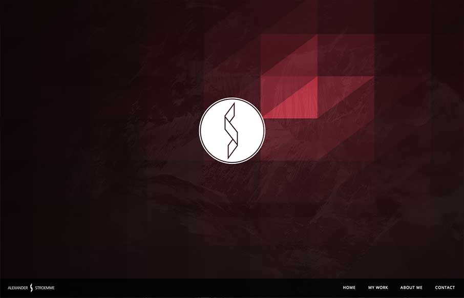
by Gene Crawford | May 23, 2013 | Gallery, Portfolio
I’m seeing a few new design trends like this one, where there’s basically a splash page but it’s executed as an oversized header area. Pretty clever, like this one, which reminds me of a cylon’s eye for some reason. That alone is enough to make...
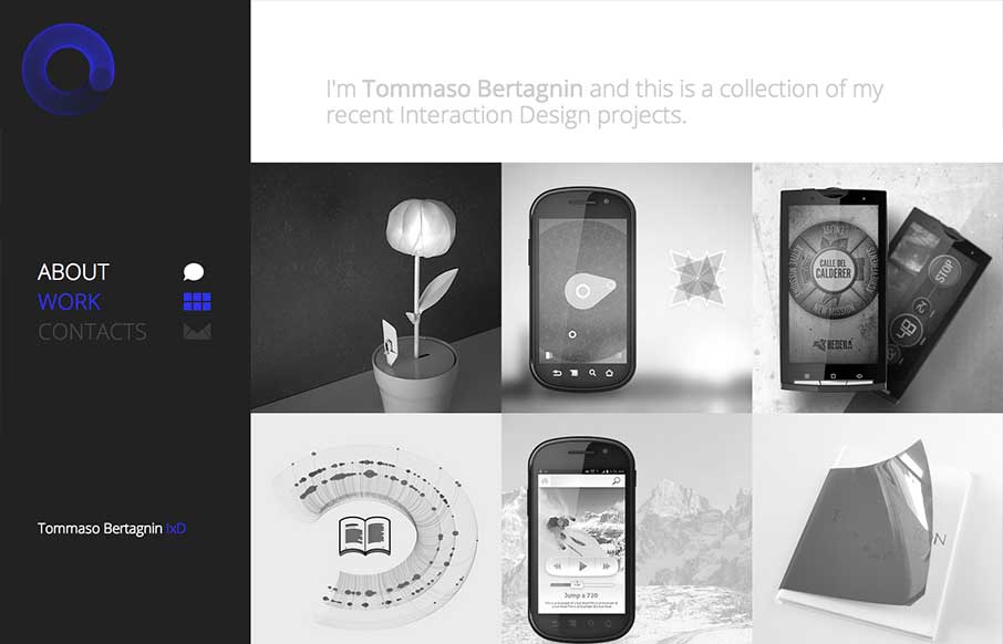
by Gene Crawford | May 15, 2013 | Gallery, Portfolio
Deceptive simplicity. I love this stuff. This site is one of the first i’ve seen that goes from it’s initial layout to something almost completely different as you get to the smaller screen sizes. Going from the left nav to a top nav like that is just cool...
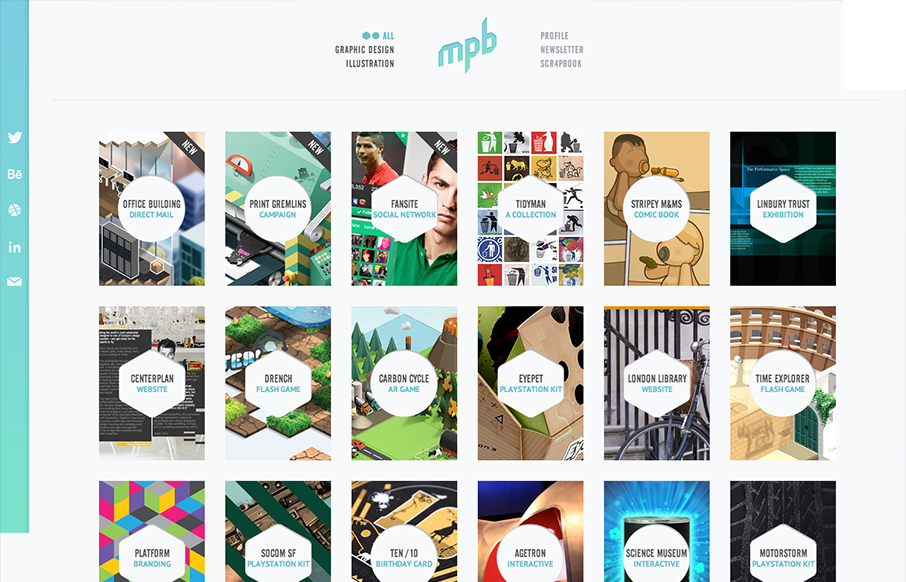
by Gene Crawford | Apr 16, 2013 | Gallery, Portfolio
Nice simple display of the artist’s work with a clean grid and minimal color palette. But it’s the little details, the RWD and the interactions on the title shapes that complete the design and make it feel so finished and polished. Great work here....

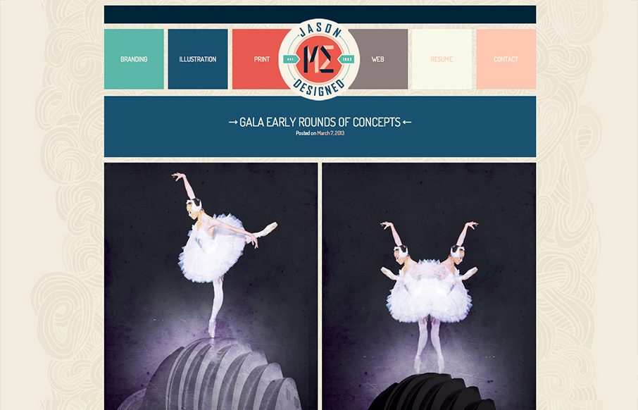
by Gene Crawford | Apr 8, 2013 | Gallery, Portfolio
This site feels pretty smooth/slick to use. I like the slider on the home page and the way the nav slides up to be fixed in position. Then all the sub pages are well designed and cleanly executed. I like this less is more approach to the layout with the nice...
by Gene Crawford | Mar 13, 2013 | Gallery, Portfolio
Overall pretty simple design. I just like scrolling and looking through the work, in a way it’s almost minimal in this aspect, but the color palette is pretty expansive so i’m not quite sure I can give it that moniker. It scales down to support smaller...