by Giovanni DiFeterici | Feb 24, 2014 | Gallery, Portfolio
This is a great site with beautifully simple interactions. The hover overlays on the work are really soft and lovely and the flat art is engaging without being distracting.
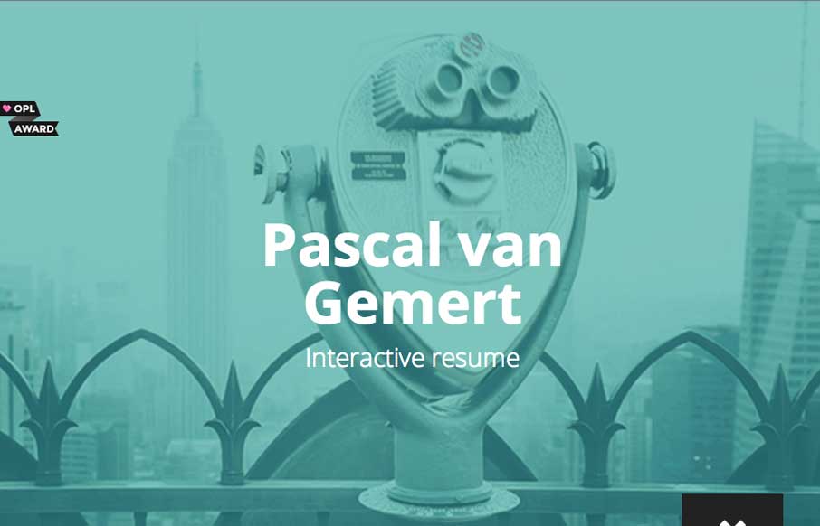
by Gene Crawford | Feb 19, 2014 | Gallery, Portfolio
Very beautiful and cleverly designed resume page. I really dig how the down arrow in the bottom right turns into the page’s navigation. There’s some really subdued interaction design with the starts and icons as you make your way towards the bottom of the...
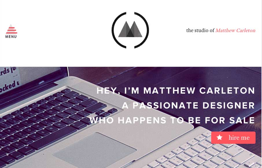
by Gene Crawford | Feb 18, 2014 | Gallery, Portfolio
I really dig the vibe of this website both visually and the content. It’s a fairly simple design but just chock full of spit and polish. That’s what makes it so damn beautiful.
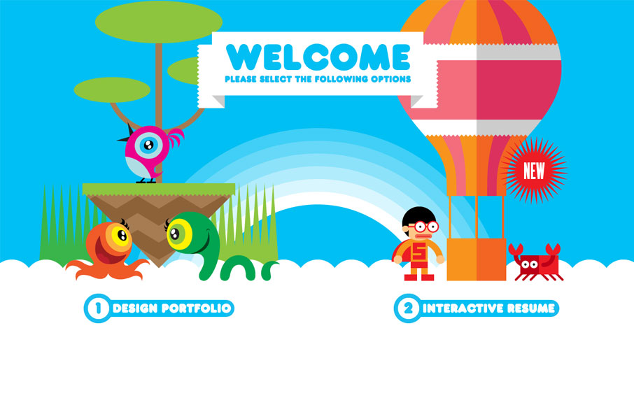
by Gene Crawford | Oct 30, 2013 | Gallery, Portfolio
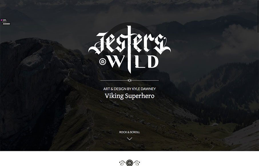
Both his portfolio and resume are cool, but mainly go check out the resume page of this site. Fantastic stuff. This is a really neat take on a single page website design that employs scrolling as primary navigation across the site. Great illustration work and cool...
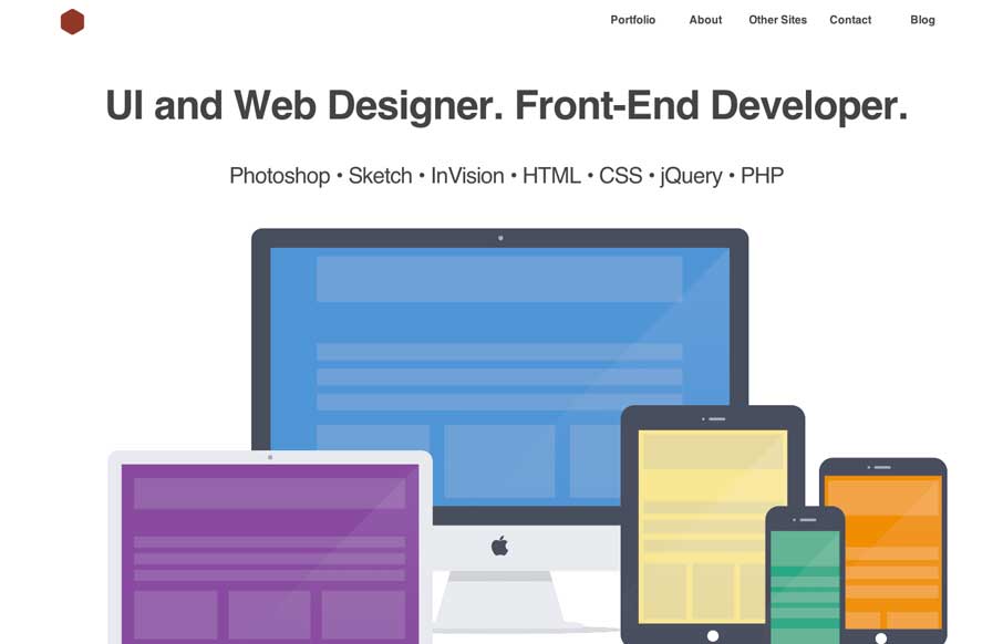
by Gene Crawford | Oct 21, 2013 | Gallery, Portfolio
Really simple execution and layout for this portfolio site but overall I really dig it. Slight animation on the text and then the slight parallax on the top most background image give it some really nice details. Down to the bottom with the skills graph – this...
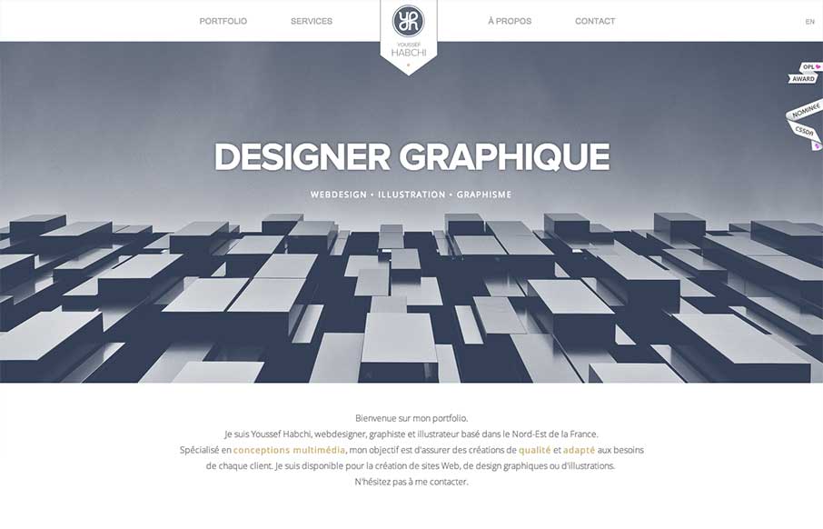
by Giovanni DiFeterici | Jul 15, 2013 | Gallery, Portfolio
While I’m not a hug fan of loading screens, youssef-habchi.com is a really nice responsive portfolio site. It balances low contrast grays beautifully and incorporates a fast, animated transitions that polish the interactions nicely. The splashes of color in the...