
by Gene Crawford | Mar 12, 2014 | Gallery, Portfolio
The latest version of Frank Chimero’s personal website is just great. I love that it’s largely traditional in that the nav is just there on the left, in text form, for anyone to see and click. It’s this kind of understated beauty that reminds me why...
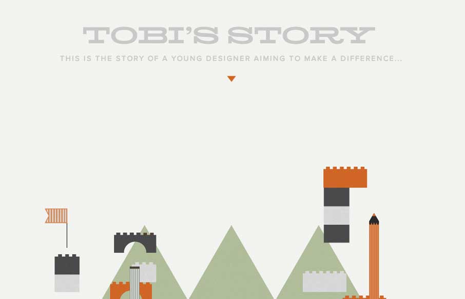
by Gene Crawford | Mar 10, 2014 | Gallery, Portfolio
The Toby’s Story site is just fun. There’s really no functional aspect to it, like a call to action or newsletter signup but you know what I don’t care. It’s cute and exists solely just to be a fun little experiment. I always love seeing that...

by Giovanni DiFeterici | Mar 6, 2014 | Gallery, Portfolio
The Adam Woodhouse website is clearly a design intended to impress with lush, complex animations and a strong graphical sensibility. Not responsive, but beautiful nonetheless. Plus, Bender.
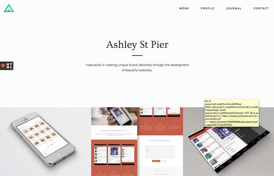
by Giovanni DiFeterici | Mar 3, 2014 | Gallery, Portfolio
Ashleystpier.com is big and beautiful. This kid is drinking the minimal Kool-Aid and it is working. Very nice portfolio site with minimal detailing and superb balance.
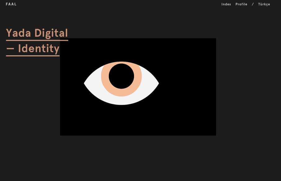
by Gene Crawford | Feb 28, 2014 | Gallery, Portfolio
Very nice portfolio site. I really dig the dark design and the simple way the title of the work is presented overly large like that. Very cool.
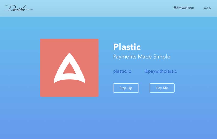
by Gene Crawford | Feb 25, 2014 | Gallery, Portfolio
Drew Wilson’s portfolio site is a delightful experience. From the first few examples of products down to just digging through his project timeline it’s smart and easy to take in. Well done sir.