
by Aaron Griswold | Feb 1, 2016 | Gallery, Portfolio
Portfolio of Isaias Mulatinho out of Brazil – I like the red and white on the black – and the cool logo. From the Designer: This is a release of my works during the last years, branding, designing and marketing. Thank you for appreciating. Submitted by:...
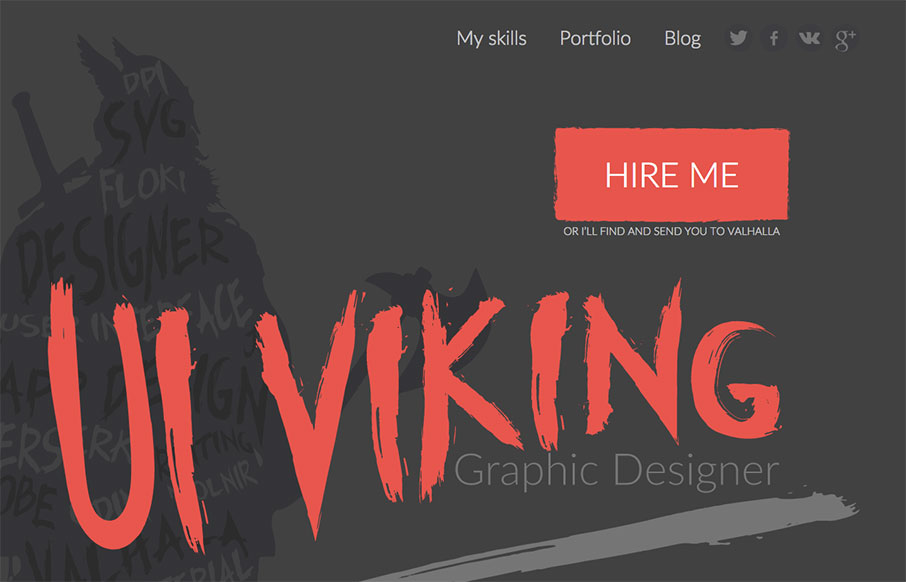
by Gene Crawford | Jan 7, 2016 | Gallery, Portfolio
This. Site. From top to bottom I love. It’s a great exercise in branding and keeping your message through every single detail. It’s also super well done and beautiful. Also, I like Vikings. Seriously, go spend time on the site and enjoy the details. From...
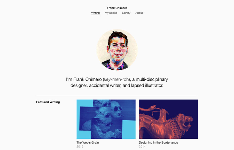
by Aaron Griswold | Jan 4, 2016 | Gallery, Portfolio
I happened to be listening to Beastie Boys while writing this review – shout out to Brooklyn – where Frank Chimero is from. New Year – new Frank portfolio site. It’s clean and crisp, minimal, and is featuring his writing. The Library page is a...
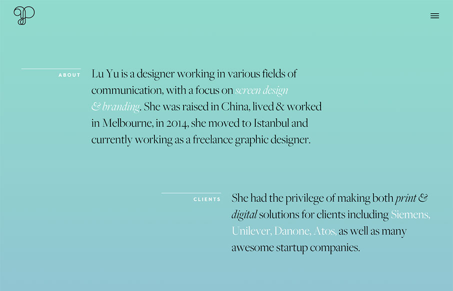
by Aaron Griswold | Dec 28, 2015 | Gallery, Portfolio
This is a good, quick portfolio for graphic designer, Lu Yu, out of Istanbul. It looks like it was built on Semplice – but it also looks like Yu works with Semplice. I like the off-set sections of the home page, and how the project names are attached to the...

by Gene Crawford | Dec 1, 2015 | Gallery, Portfolio
Leandro Lima, out of Barcelona has some great work highlighted here – especially the illustration side of the site. I also like the look and motion of the hamburger drawer on the left.
by Aaron Griswold | Nov 18, 2015 | Blog, Gallery, Portfolio
Many designers skip straight to their Work on their portfolios, and the art of the Blog is been pushed to the background. So I like how Viljami Salminen’s portfolio site does the opposite. Sometimes – if you have good posts – this can be a more...