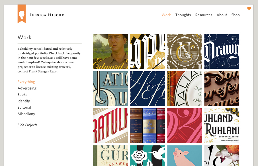
by Gene Crawford | Jul 3, 2012 | Gallery, Portfolio
Launched a new version of my website! jessicahische.is I think you’ll find lots of new goodies + it’s a lot easier to navigate— Jessica Hische (@jessicahische) July 2, 2012 The new Jessica Hische website is fantastic. Yeah yeah I just posted her wedding...
by Gene Crawford | Jul 3, 2012 | Gallery
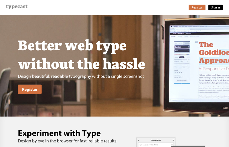
Aside from what looks like a brilliant app. The typecastapp.com website is very well produced. I like asymmetrical layout a lot, the right side is heavy with visuals and it really helps to draw you down the page more. Keeping your eyes focused on that right side...
by Gene Crawford | Jul 2, 2012 | Blog, Gallery
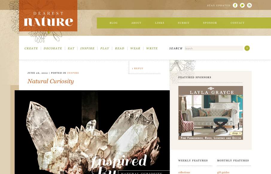
Posted by: Donaville Herrick @dearestnature This site was 5 years in the making. The original concept behind the site arose while working on niche publications for my previous employer from 2007 – 2010. It wasn’t until 2011 that I hunkered down and mapped...
by Gene Crawford | Jul 2, 2012 | Gallery
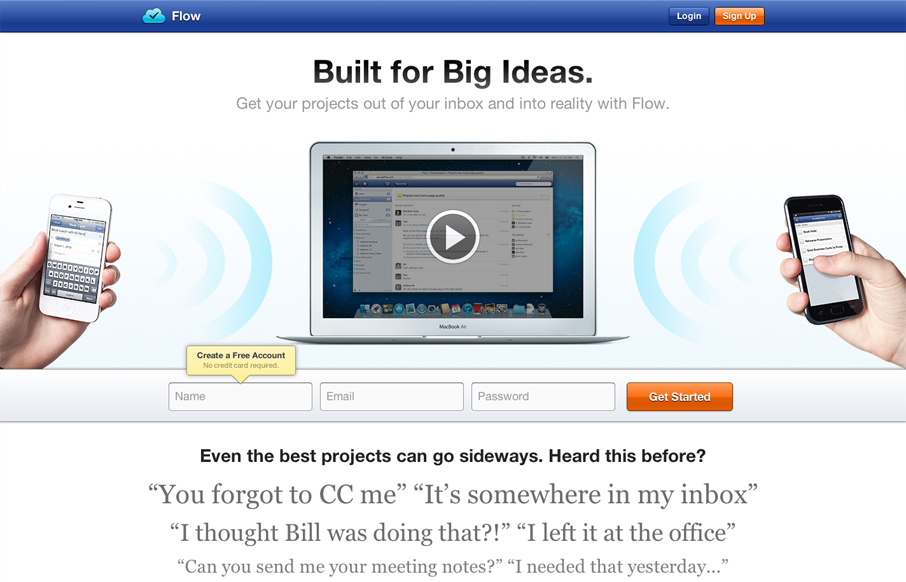
Really great looking/working website. I dig the bold colors, they kind of burn into your retina in a good way. I also like the small animation on the initial page load from the two hands holding the iPhones. The thing I like the most is the multiple chances to get...
by Maria | Jul 2, 2012 | Design Firm, Gallery
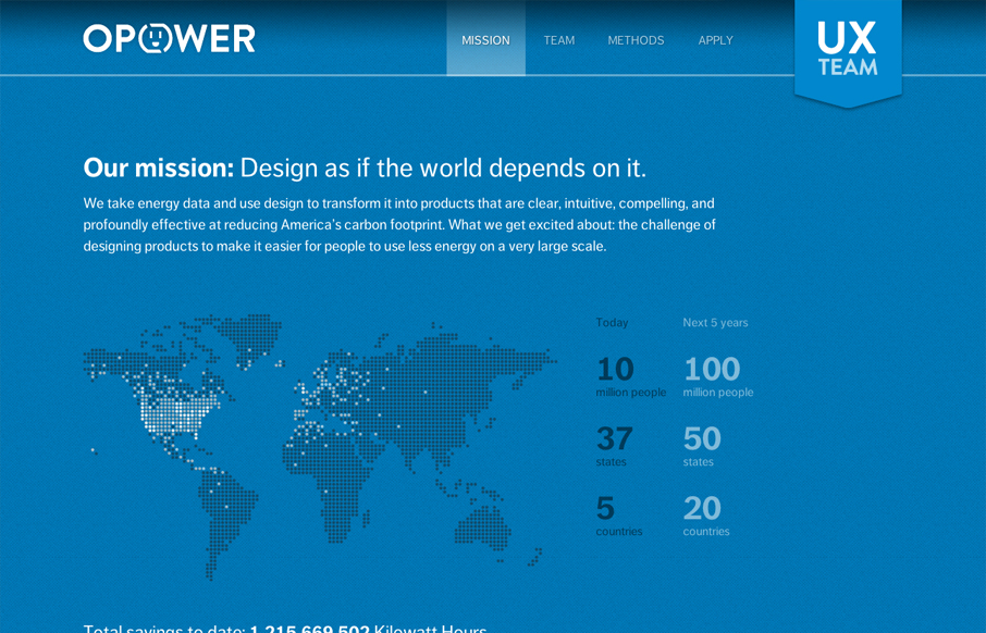
Digging the new Opower UX team site bit.ly/LBtazr with fun facts & some friendly energy savings competition (cc: @jimjones) — Samantha Warren (@SamanthaToy) June 27, 2012 This is a nice representation of the Opower UX Team from their collective mission down to...

by Gene Crawford | Jun 28, 2012 | Gallery
This is the wedding invitation/announcement website for Jessica Hische and Russ Maschmeyer. There is a lot of beautiful illustrations and just purely joyful feeling effort put into this website. There are some neat little easter eggs you can find in the site too, I...