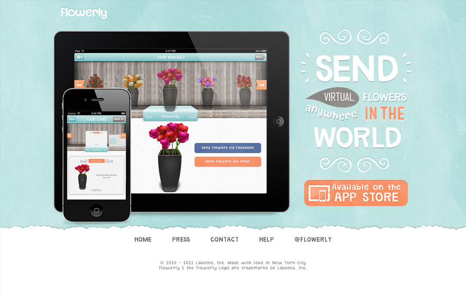
by Gene Crawford | Jul 19, 2012 | Gallery
I like the simple way in which this design shows off how to use the app and what it does with drawings of the hands using it. It’s straight forward and feels simple enough. The design is plush with textures and that plays nicely off the iPhone photo really well....
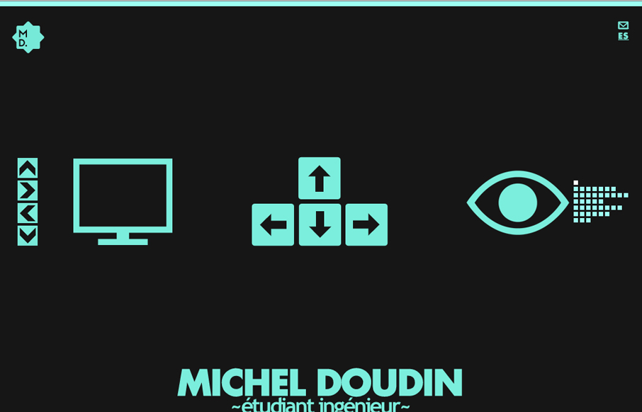
by Gene Crawford | Jul 19, 2012 | Gallery
Pretty crazy interaction here, I like the mix of arrow keys and the little navigation matrix to the right as well as the up and down arrow buttons. Covers all the bases to make it easy to understand what to do. Then the movement is so crazy and neat to watch as the...
by Gene Crawford | Jul 19, 2012 | Gallery
For once I almost like a loading screen, it doesn’t take too long on this site which is good but it’s entertaining too. I think the monochromatic color scheme pulled out of the main photos and just the single blue. I also dig how the slider is done with...
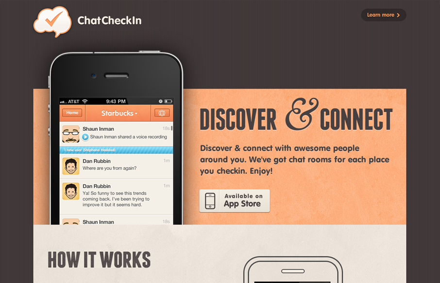
by Gene Crawford | Jul 18, 2012 | Gallery
Great looking single page iPad/iPhone app site. Custom lettering FTW too! I love it, that block of text on the right side is immaculate. Down to the custom lettered “app store” button. I’m not entirely sure why there’s a “home”...
by Gene Crawford | Jul 18, 2012 | Gallery
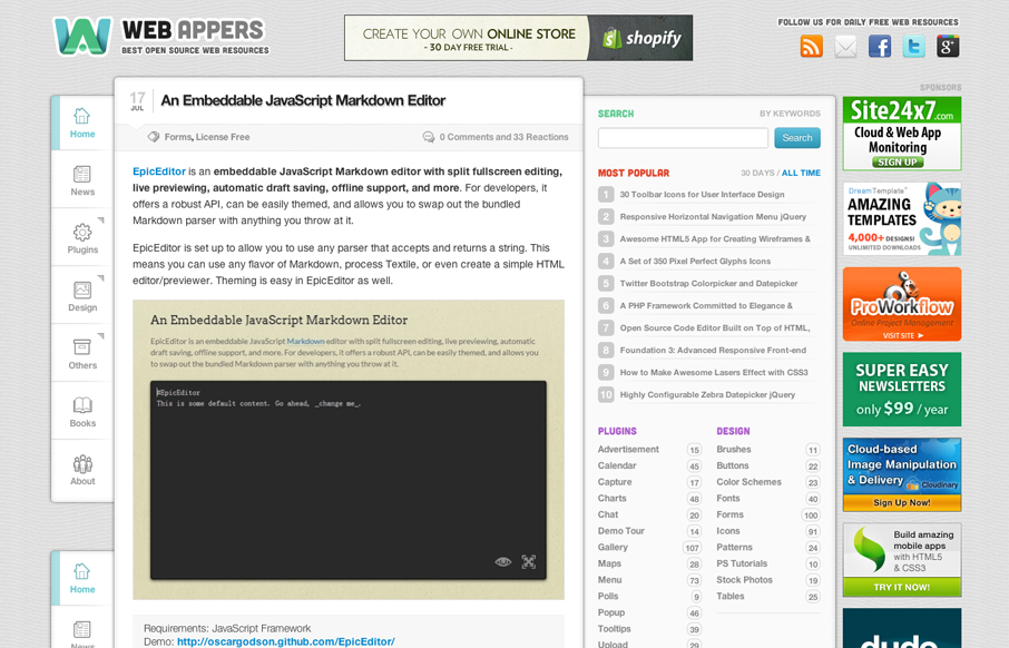
Aside from being a top-notch resource for web development stuff the design of webappers.com is well done. It’s a nice study to compare how the different screen size designs are treated here vs. how Smashing Magazine has handled theirs. They’ve had to...
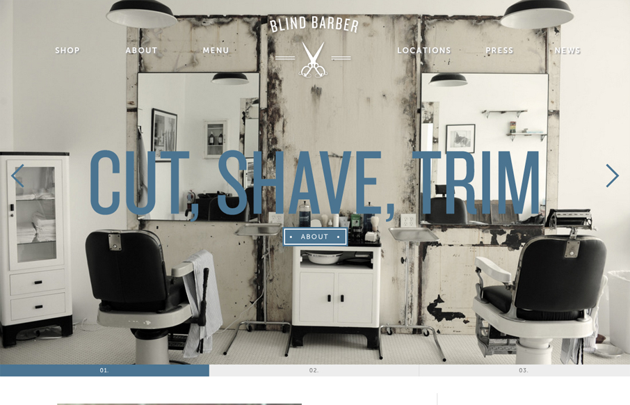
by Gene Crawford | Jul 18, 2012 | Gallery
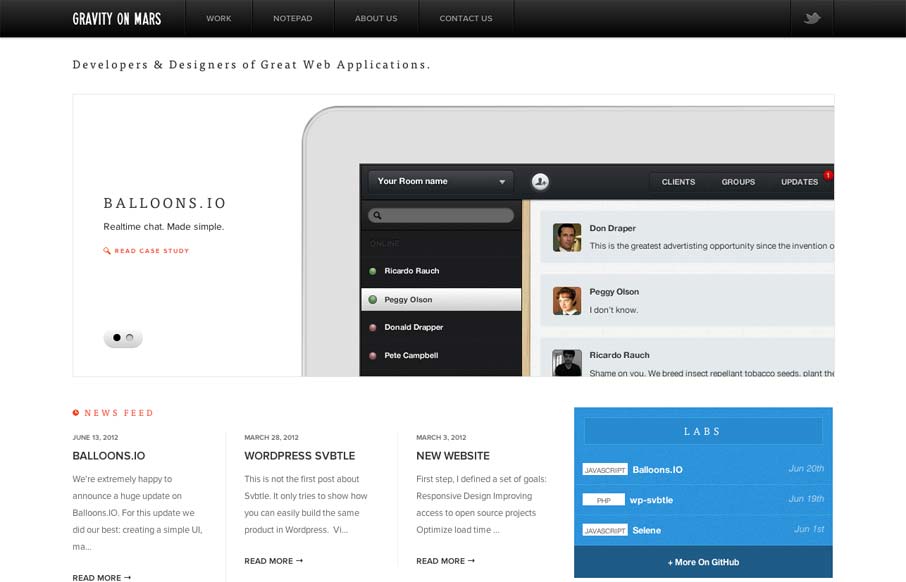
Sharp looking minimal(ish) site design. I really like the cropping of the main image slideshow a lot. It gives a good sense of the apps and shows them in context on the iPad but it’s not overpoweringly large. The delicate lines and typography are matched up...