
by Gene Crawford | Jul 17, 2012 | Conference, Gallery
Super simple yet clean and open looking conference website. I like the green & gray color palette too.
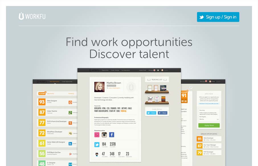
by Gene Crawford | Jul 17, 2012 | Gallery
Really minimal product site design. I think the way they’re showing the product screens off is superb like this. I also like the way they’re treated as you size the screen down too. Super simple signup process too using twitter. I’d love to hear how...
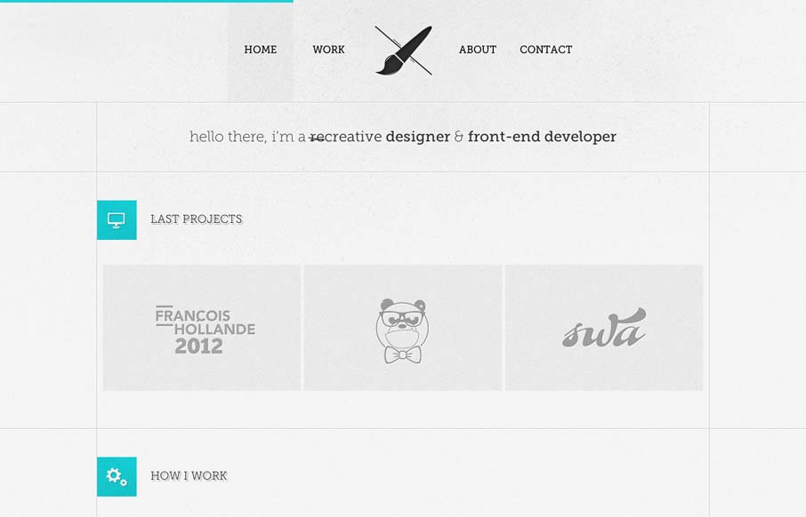
by Gene Crawford | Jul 17, 2012 | Gallery
I like the lines that the designer has used to support the grid in this layout. The flat/vector graphics also tie in very nicely with the overall vibe of the page. I really like that contact form design too, nice touch on the icon swapping out when I mouse over...
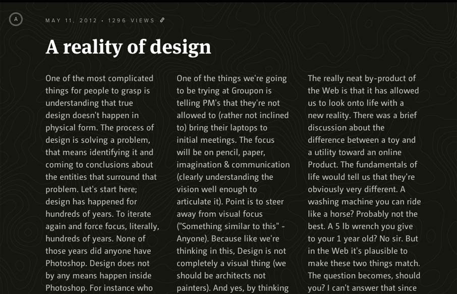
by Gene Crawford | Jul 16, 2012 | Gallery
What a beautifully designed experience here. I love the approach of something kind of unstructured yet totally integrated like this. The page jumps right into copy then plops you into some very swell looking info-graphic like sections. You gotta check ’em out as...
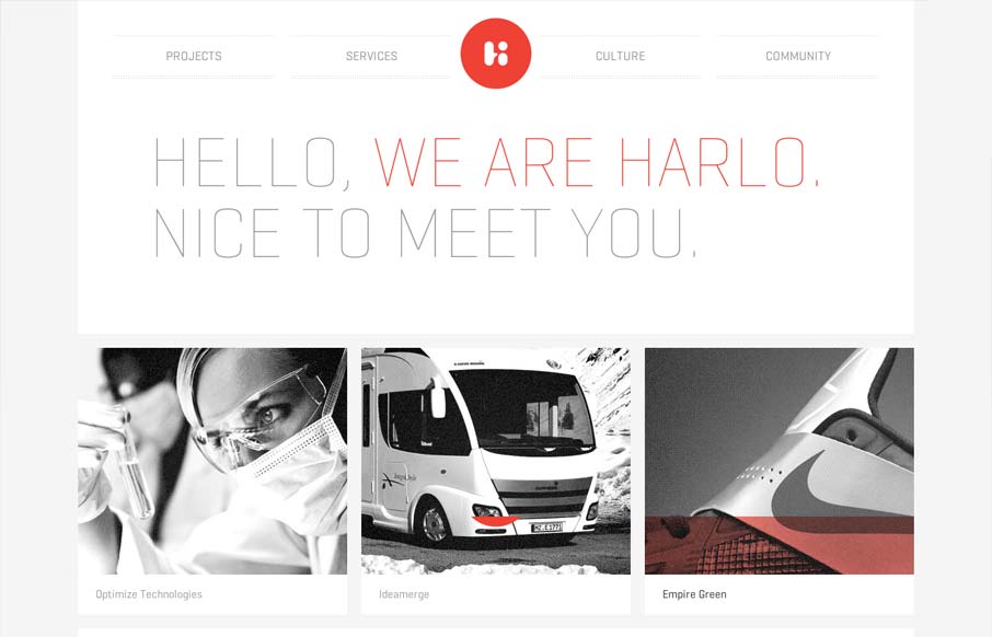
by Gene Crawford | Jul 16, 2012 | Gallery
Very thoroughly designed experience on this website design. I really dig how it’s consistent and clean yet feels fresh on each page. The layout is just enough different on each page to keep you engaged with the content. Perhaps it’s the header that...
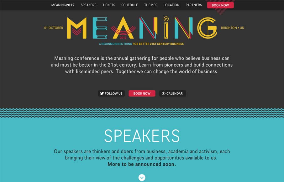
by Gene Crawford | Jul 16, 2012 | Conference, Gallery
Nice clean conference website design. I like the mix of the green and dark grey. The “book now” button is very clearly/obvious by being red and they also designed that little triangle pattern behind it. The sections are clearly marked with wavy lines and...