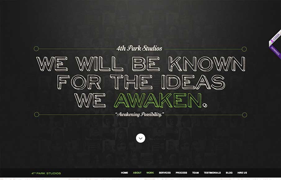
by Gene Crawford | May 22, 2013 | Gallery
The 4th Park Studios site is a great design. There’s a great feeling for timing as you scroll down the page, which makes it feel very complete. The site looks like it’s based on this theme, but they’ve changed it out and used it as a base. Overall...
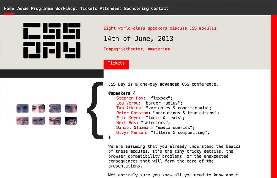
by Gene Crawford | May 21, 2013 | Conference, Gallery
What a great simple concept for a conference website. It’s super appropriately designed for the audience and for the subject matter. I LOVE stuff like this. I’ll also let Cameron Moll’s quote do the explanin’: Also, click the speaker’s...
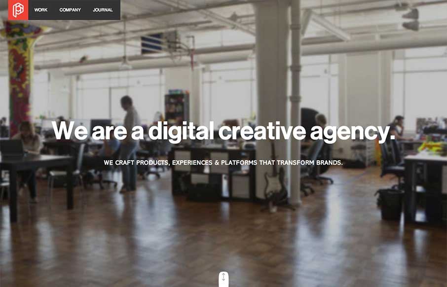
by Gene Crawford | May 21, 2013 | Design Firm, Gallery
Wonderfully worked animations as you scroll down the home page. They keep it responsive as well which is great. I like the article on how they created their new brand for Playground as well.
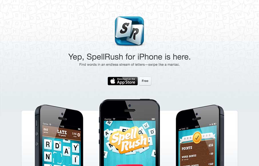
by Giovanni DiFeterici | May 17, 2013 | Gallery
I’ve always liked well executed microsites. This one has a very Apple appeal, which makes sense. They are selling to a specific platform. Everything is clean but tight. The site is a good billboard/magazine ad. It presents the product beautifully, it sells the...
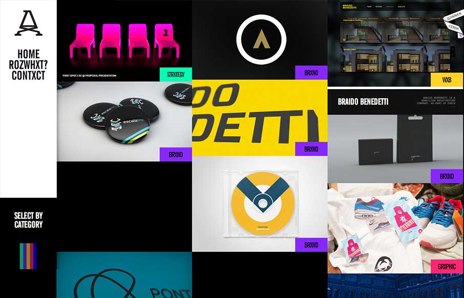
by Gene Crawford | May 17, 2013 | Gallery
Submitted by: Advan Shumiski @shumiski We are a creative studio based on Sao Paulo, Brazil. Here we think that all is about people. Design is just a tool, humans are the subject. Really interesting interactions for this website. I like how the categories sort the art...
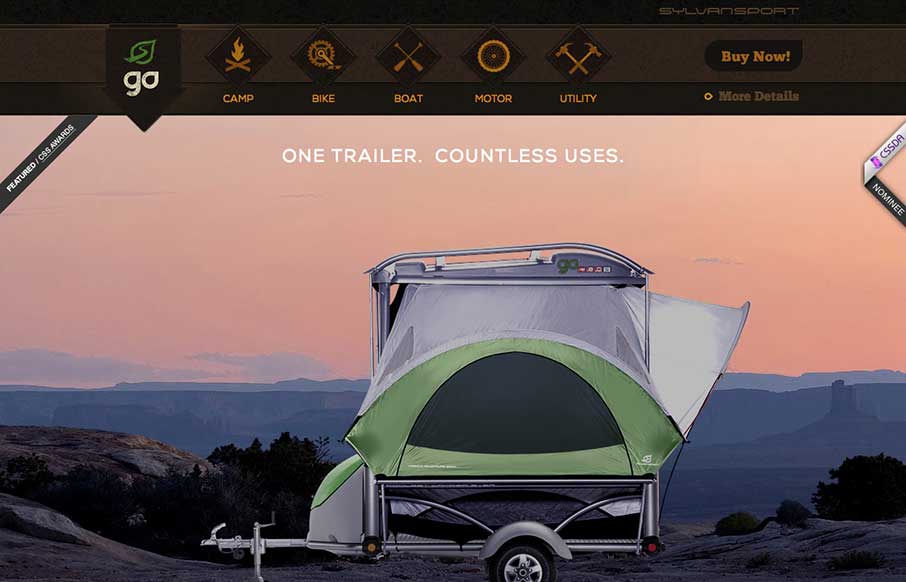
by Gene Crawford | May 16, 2013 | Gallery, Sports/Recreation
Submitted by: Justin Bernard @fleeangrybear Role: Designer & Developer Damn, I love detail like this. The slight parallax on each image of the products down the the animations on the main navigation before you scroll it to the fixed layout spot. Lovely. The...