
by Giovanni DiFeterici | May 16, 2013 | Education, Gallery
This is about as beautiful a timeline as I’ve ever seen. The content is presented clearly and concisely. It’s linear presentation is perfect for telling a story and the mix of images, video, and text creates a rhythm that punctuates the high points of...

by Giovanni DiFeterici | May 15, 2013 | Gallery
Hopskoch is joyful and simple. It’s subtle animations are perfectly appropriate for selling the brand and pair nicely with the easter color palette. I really dig how the main product image scrolls up a little and fades out as you scroll down the page and the...
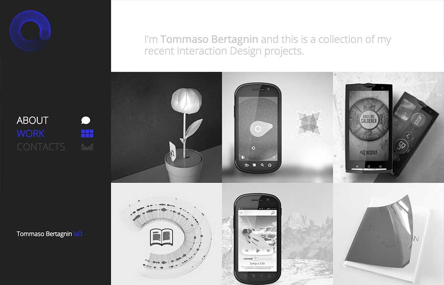
by Gene Crawford | May 15, 2013 | Gallery, Portfolio
Deceptive simplicity. I love this stuff. This site is one of the first i’ve seen that goes from it’s initial layout to something almost completely different as you get to the smaller screen sizes. Going from the left nav to a top nav like that is just cool...

by Giovanni DiFeterici | May 14, 2013 | Gallery, Shopping
Okay, lots of things to love about the Ditto site. 1. Super clean, beautiful design with no fluff. Gets the job done with style. 2. Awesome product. Haven’t tried out the service but looks super cool. If anyone has gone through the camera thing, let us know how...

by Gene Crawford | May 14, 2013 | Design Firm, Gallery
There is a lot of good looking design scattered across this website. Each page looks like it has had the same amount of love and attention paid to it as the home page has. I love it when I come across a site design like that, that’s so thorough and finished...

by Gene Crawford | May 13, 2013 | Gallery
Website by Viget The Paint Drop is a paint store on wheels offering color consultation, paint and supplies on site. Whew! What a finely crafted visual design and executed website for Valspar. I love the responsive design decisions and how that’s been executed....