
by Gene Crawford | Feb 5, 2014 | Gallery
Just a fun addition to the gallery here. I love the parallax vibe connected to the mouse movement. Fun stuff all around.

by Gene Crawford | Feb 5, 2014 | Gallery
I lurrrrve the new Focus Lab site design. It’s full of minimal beauty and some very thoughtful interactions. Simple stuff, like the “get started” form link on the footer, check out that dropdown to start off the conversation on working with these...
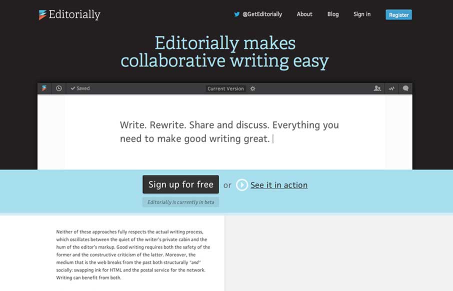
by Gene Crawford | Feb 4, 2014 | Gallery
This may not sound like the smartest review; but I love websites that are mostly words and wind up feeling like they are graphically rich. The Editorially site does just that. It’s a website selling and app that’s built for writing where all the crud of a...
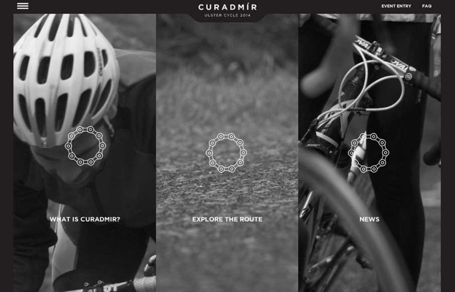
by Giovanni DiFeterici | Feb 4, 2014 | Gallery, Sports/Recreation
Curadmir is a whole lot to take in at one glance. It has a lot of visual moving parts and is filled with little visual treats that pop up as you interact with the content. It also utilizes video to nicely create a bit of narrative to the content. It’s also kind...

by Gene Crawford | Jan 28, 2014 | Gallery, Shopping
The Jewelry Wise website is a great example to study if you’re considering one of those mega-navs. This design utilizes it quite well on both the desktop and mobile versions of the design. The page also has good rhythm and leads you down the page in a succinct...
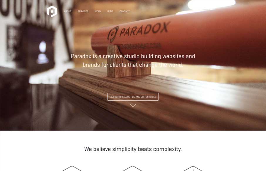
by Giovanni DiFeterici | Jan 23, 2014 | Design Firm, Gallery
Paradox is beautifully minimal design with a clear focus on funneling potential clients into a conversation. The site is clearly conceived and simple in execution. The differentiator is the quality of the work. Minimal design at its best.