
by Giovanni DiFeterici | Jan 21, 2014 | Gallery
Animate all the things. Love the clean and bright look of this site. The narrative created by the animations is just wonderful. I love simple designs that feel easy and light, but clearly took some savvy. It’s just enough sex to be awesome.
by Giovanni DiFeterici | Jan 9, 2014 | Gallery
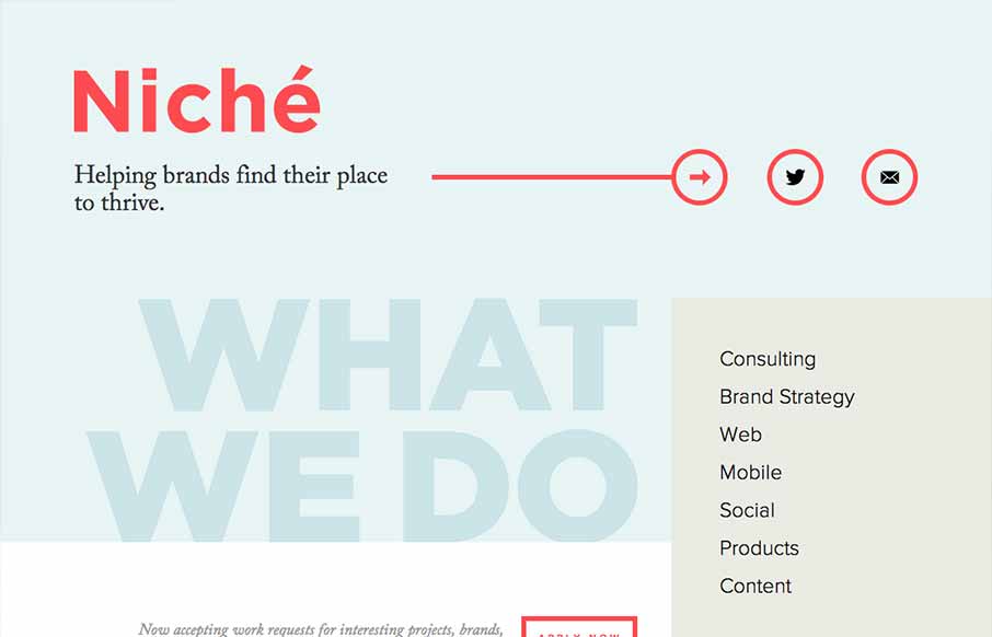
Niche Creative is ultra minimal. It’s minimal design, minimal interaction, and minimal content. You can’t get more minimal than that, and yet, the site feels complete and useful. The beautifully soft colors are wonderful. If their list of services looks...
by Gene Crawford | Jan 9, 2014 | Design Firm, Gallery
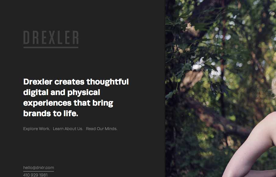
The Drexler website is both minimal and highly interactive. There’s plenty of javascript here for everyone but it’s not overly distracting. Things move around smoothly and it’s still fairly easy to generate a good mental picture of what’s going...
by Gene Crawford | Jan 8, 2014 | Gallery
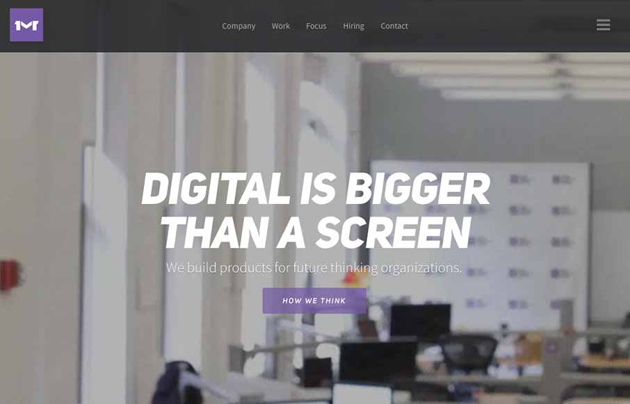
I like the first pass minimal look to the One Mighty Roar website. However once you start to click through the site you find that the pages are lengthly and deep with content and imagery. I also like how they’ve used the hamburger icon to show you what’s...

by Giovanni DiFeterici | Jan 8, 2014 | Gallery, Sports/Recreation
Fitstar is a beautiful site that uses animations to quickly focus the viewers attention on the most important content in the viewport. The effect is engaging and varied enough to stay interesting. Each transition and animation is appropriate the the content and...

by Gene Crawford | Jan 6, 2014 | Design Firm, Gallery
The new Adaptive Path website is “as always” a thing of beauty. There really is a lot going on here when on the surface it looks like a simple design. From the slight movement of the top header/navigation, to show you it’s there, down to the overall...