
by Gene Crawford | Oct 21, 2014 | Gallery, Portfolio
Really slick visual style for this portfolio site. I really dig that header/hero area photo, good stuff. The icon work and vector feel across the page is real nice. Hire this guy for some projects!
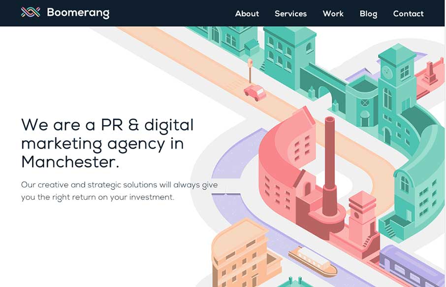
by Gene Crawford | Oct 21, 2014 | Gallery, Marketing Company
The visual style of this site is really slick. I love the colors and vector icon work as well as that main illustration/animation of the factory. Smart, smart work here. Event the pictures have been color corrected to fit into the overall colors of the page, subtle,...
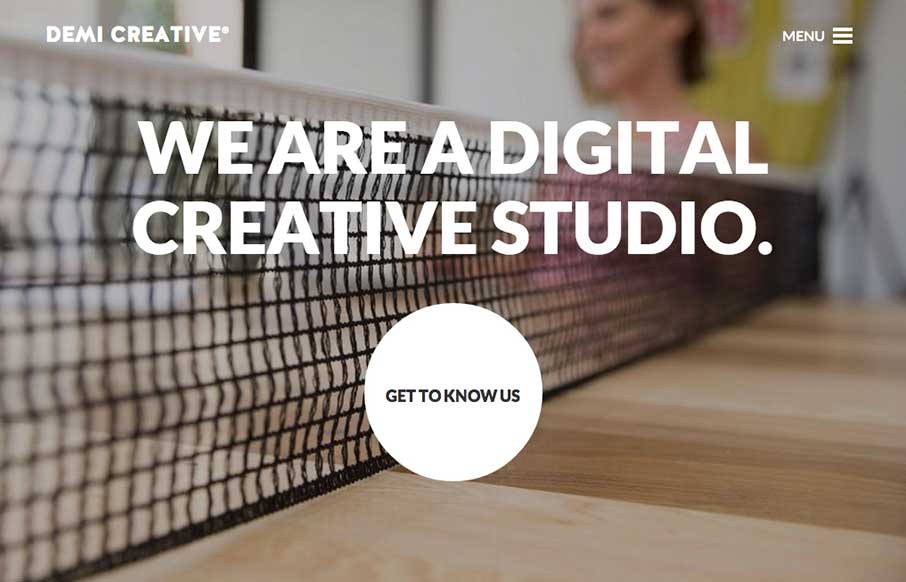
by Gene Crawford | Oct 21, 2014 | Design Firm, Gallery
Big bold visual style for Demi Creative. I dig it. I like the simplicity implied into the site design, the main link is the “get to know us” call to action and it draws you in. The nav under the hamburger icon feels slightly lost but once you dig into the...
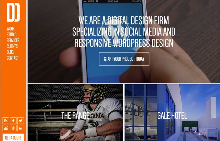
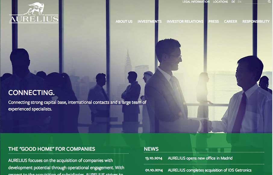
by Gene Crawford | Oct 20, 2014 | Gallery
You don’t see many site designs that have that fixed nav bar layout anymore, it’s not part of what’s trending. But when you find a site with it done and done well, it’s good stuff indeed. I really dig this layout, it’s very intuitive and...
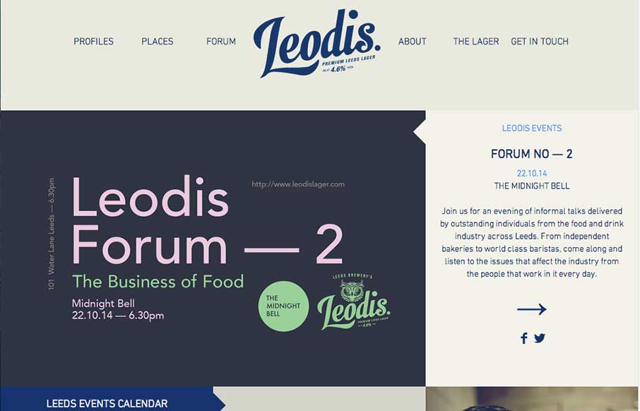
by Gene Crawford | Oct 20, 2014 | Food and Beverage, Gallery
Man I love this layout. It feels very unique to me and trust me when I say that I see a ton of website designs… Love that header interaction and the way the rest of the content is laid out. Very smart design, spend some time here guys.
by Gene Crawford | Oct 20, 2014 | Gallery
Really cool usage of transparency across sections of the layout here. I really dig how that header’s background fades into white then back out as you scroll back up. Smart details make this site really stand out to me. Submitted by: Marc Hinse @MadeMyDay Role:...