by Gene Crawford | Oct 23, 2014 | Gallery
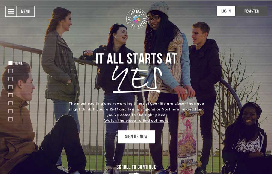
Loose visual style and stark graphic type and colors make up a site aimed at young people to signup for service. It’s a smart design in many ways but the strongest part is it’s mobile friendly enough to get the right audience looking at it. Submitted By:...
by Gene Crawford | Oct 23, 2014 | Design Firm, Gallery
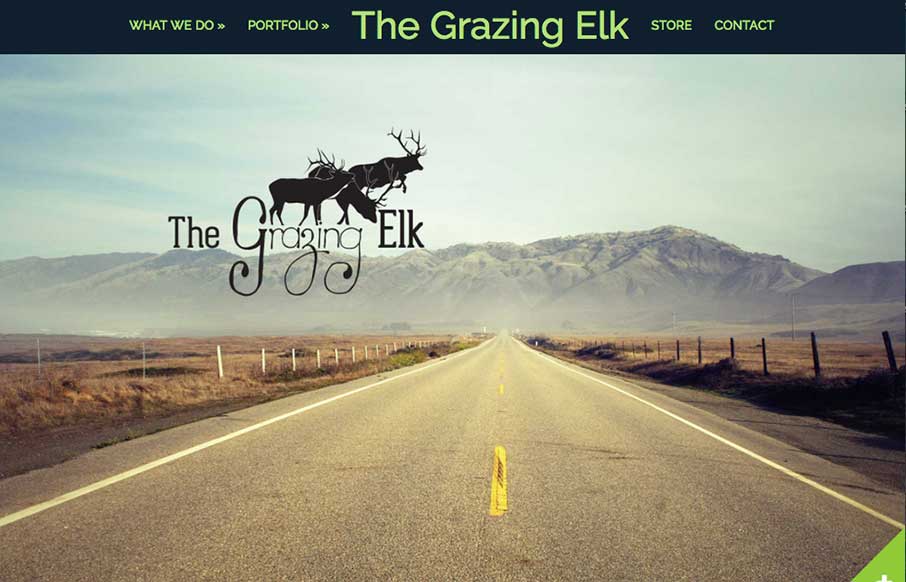
I’m always intrigued when I come across a side scroller website. Rarely are the done well, this one is the exception to that. I totally dig it. Somehow they make it feel like a unique interaction. Good work. Submitted by: Lara Stephenson @thegrazingelk Role:...
by Gene Crawford | Oct 23, 2014 | Gallery
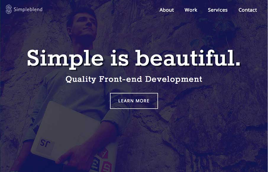
Pretty much standard fare when it comes to design patterns of a portfolio site. However, the soft feel of the colors and design work and some details in the interactions, like the work samples section make this site work well enough for me to keep digging into the...
by Gene Crawford | Oct 22, 2014 | Gallery, Portfolio
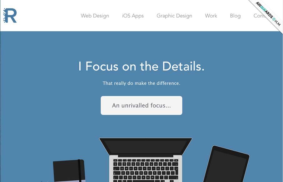
Super nice illustrations to kick the page off with, then followed up with some nice detail work and good copy. Love this straight forward but thoughtful approach.
by Gene Crawford | Oct 22, 2014 | Gallery
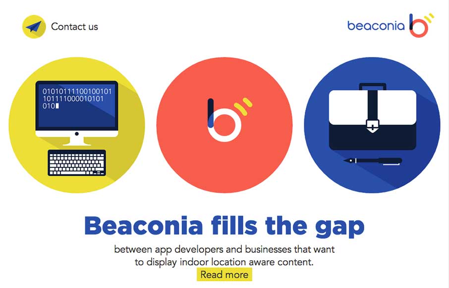
Very slick details. I love the mix of illustration/icon work and the photos. Add in that nice little interaction with the animation and i’m thinking you’ve just grabbed people’s attention. Good work. Submitted by: Darius Krisiunas Role: Designer...
by Gene Crawford | Oct 22, 2014 | Gallery, Medical
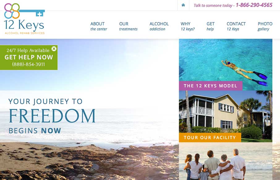
There’s a lot going on on visually with this page, lots of content and sections. The overlay with the help line number is good and smartly placed. I do wish the page was responsive too. 12 Keys Alcohol Rehab Services provides a retreat for those suffering from...