
by Aaron Griswold | Nov 26, 2014 | Gallery, Software
Great flat site with really great illustrations through out. Make sure you also check out their blog: blog.thrivesolo.com – the artwork alone is worth it.
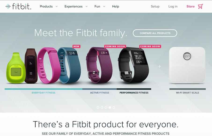
by Aaron Griswold | Nov 26, 2014 | Gallery, Product
So… the home page for fitbit really doesn’t do the rest of the site justice. I actually held off on this review because of my first glance at the home page. Head to the big drop-down menu, or click on these links: www.fitbit.com/surge, www.fitbit.com/flex,...
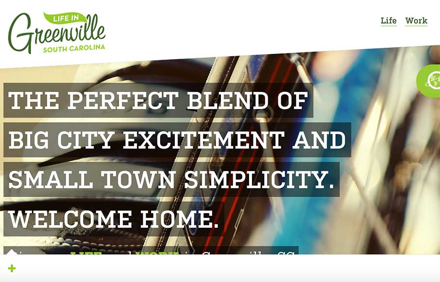
by Aaron Griswold | Nov 25, 2014 | Gallery, Government, Travel
Super nice site design for “Life in Greenville SC”. I believe this is a community driven/created website which is awesome. So much detailed design work here in this site, just go spend some time with it and I think you’ll agree.
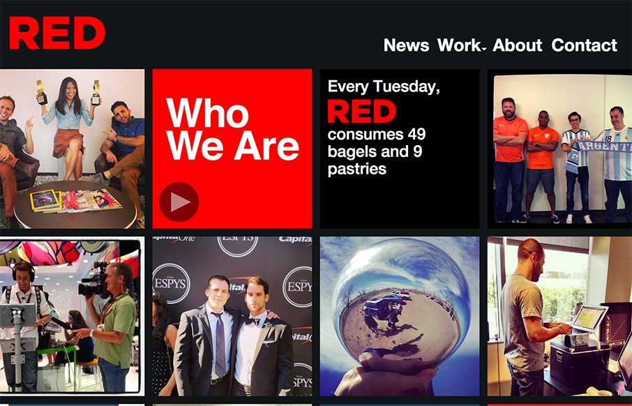
by Aaron Griswold | Nov 25, 2014 | Design Firm, Entertainment, Gallery
The way the site is built out of squares that adapt to the width of the browser screen (see what I did there?) is really neat. It’s simplicity but not overtly done. The nav reflects the simple approach to the layout too which is nice and clear.
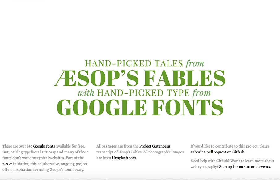
by Aaron Griswold | Nov 24, 2014 | Gallery
I’m not sure that I can do this site justice with a few short words… but it looks like some cool people got together and are doing some cool things here and in the 25×52 Initiative. Check the page out – and the people that are behind it, and...
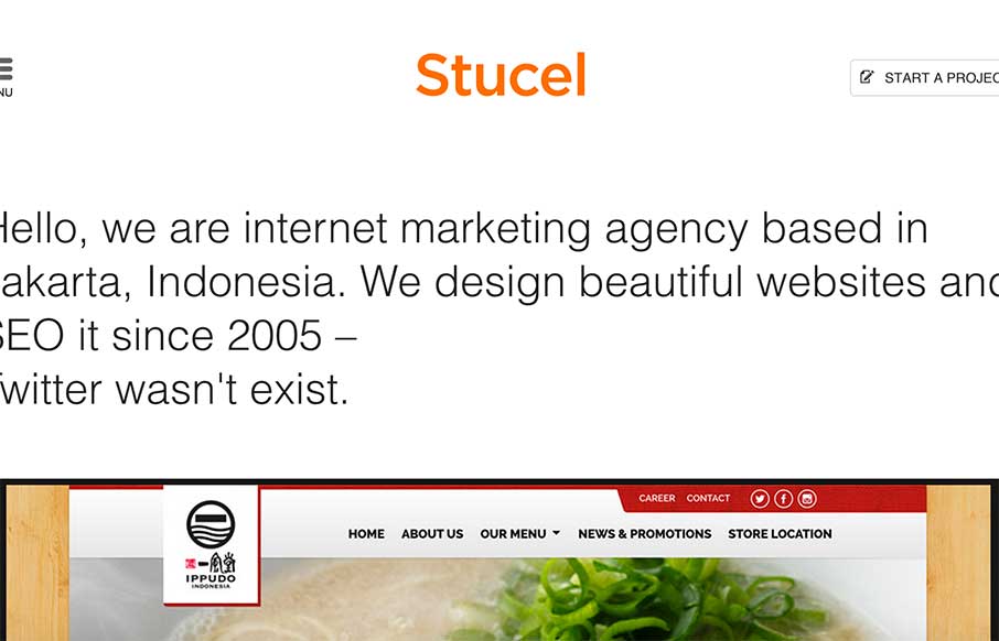
by Aaron Griswold | Nov 24, 2014 | Gallery
Good looking site out from Stucel out of Jakarta. Good illustrations and a different look on the About page (hover over each of the employees). Plus – anyone that can get good copy with more than one language is ahead of the game.