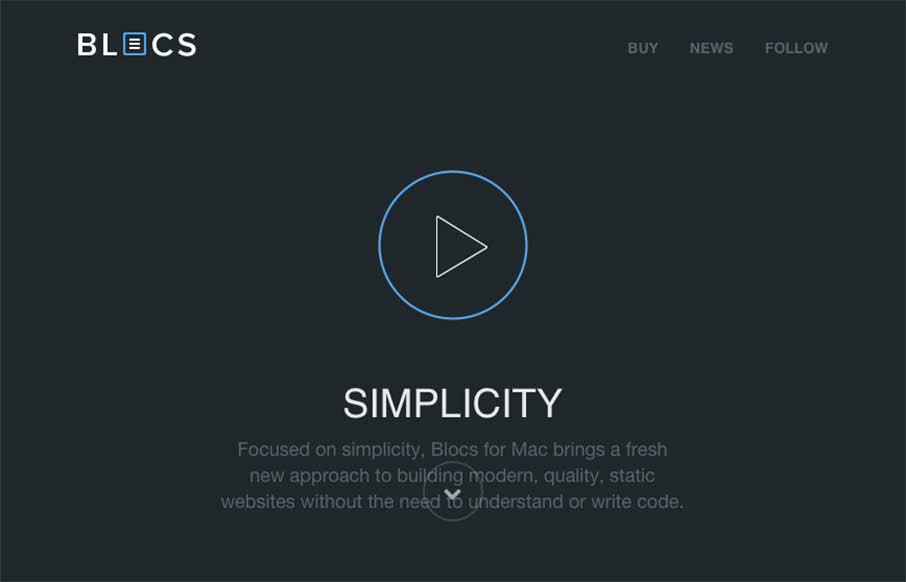
by Aaron Griswold | Dec 4, 2014 | Gallery, Software
If you’ve read any of my reviews – then you’ll probably notice that the word “simple” comes up about every other review. Simple is a term of endearment in my world, because for me, it means cutting to the core / heart / bones – and...

by Aaron Griswold | Dec 3, 2014 | Gallery
Solid looking portfolio site from Ash Stallard-Phillips out of Southampton, UK. Has cool flat illustrations and fly-ins that give the light site some depth… (yeah, I just said the flat illustrations give depth…)
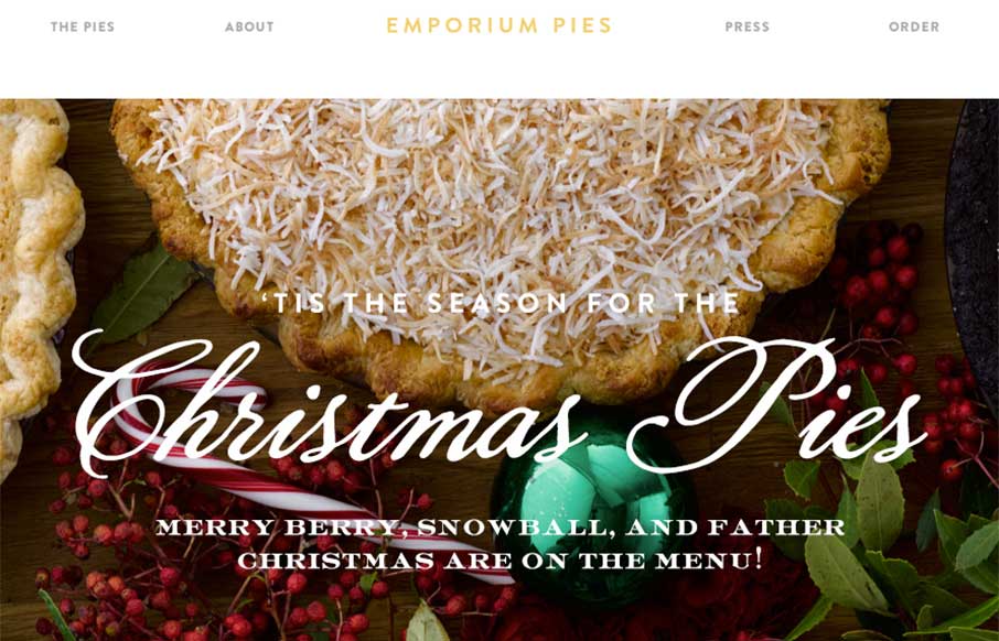
by Aaron Griswold | Dec 3, 2014 | Food and Beverage, Gallery
My co-worker and I have been staring at this site for a few minutes going “mmmmm…. pie” as if we were two Slingblades sitting in a hipster office staring at pies… I know – sad visual… but the Emporium Pies site is a very good...
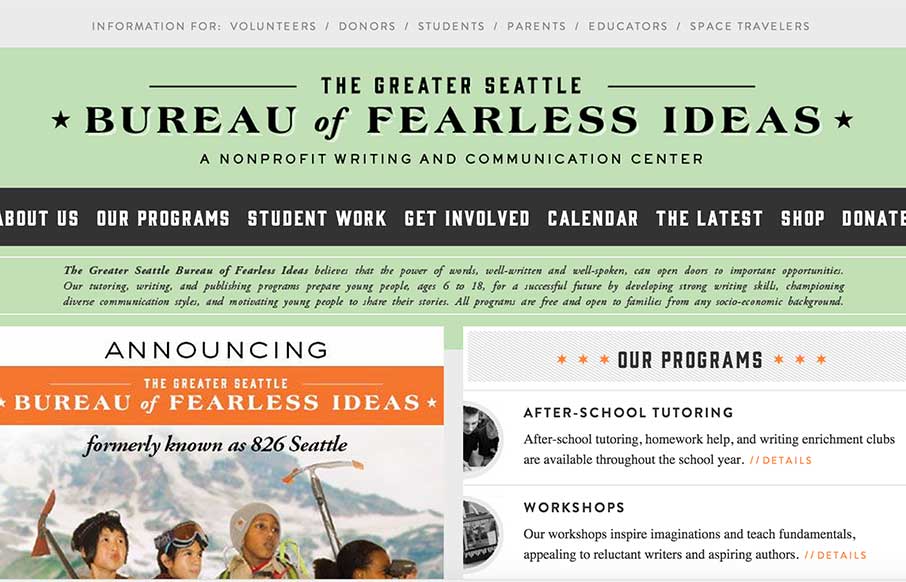
by Aaron Griswold | Dec 1, 2014 | Gallery, Social Cause
I’m sure every generation says this about the ones coming behind them – but kids today don’t seem to have the communication and writing skills of their future predecessors (see what I did there?). I’m saying this as a father of three children...
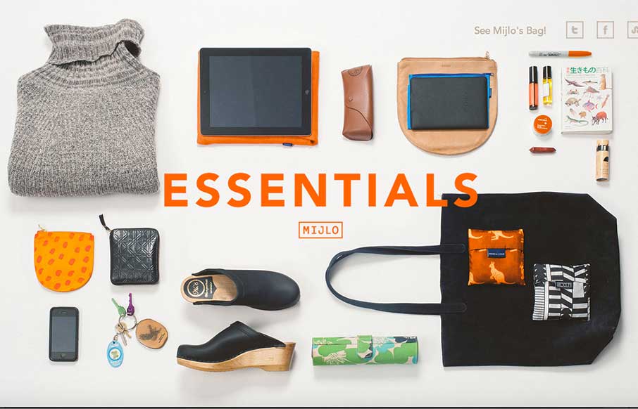
by Aaron Griswold | Dec 1, 2014 | Gallery, Shopping
Something a little different – this is a splash site from Mijlo.com, based on their Kickstarter campaign for a sustainable backpack. MIJLO reached out to a select group of global creatives to curate a collection of essential items – with one caveat –...

by Gene Crawford | Dec 1, 2014 | Gallery
Over the years, we’ve used what seems to be all manner of tools to collaborate between designers, developers, and the pesky client. Atomic.io (from the video) looks to have some firm solutions, and some features that you just go – yep, need em –...