by Aaron Griswold | Jan 5, 2015 | Design Firm, Gallery
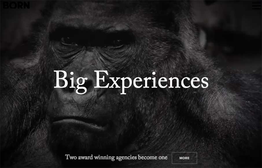
OK – let’s get the New Year started right! Here’s a great site from the Born Group out of New York and London. Great contrast throughout the site that’s exemplified with the video background of the 800 pound gorilla to start you out. Good...
by Aaron Griswold | Dec 30, 2014 | Gallery, Shopping
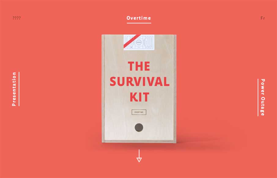
Fun and maybe appropriate way to end the year with Montreal’s Phoenix Creative Studio’s Agency Survival Kits. Basically – our normal MO during the last two weeks of the year for our client services part of our business, Period Three, we go minimal,...
by Aaron Griswold | Dec 29, 2014 | Entertainment, Gallery, Gaming
New Years is a time of new beginnings. Each year at this time, billions of people try to re-ground themselves, decide what they’ll focus on for the upcoming year (or couple of weeks…you know what I mean), and grow into that new person they want to be. So...
by Aaron Griswold | Dec 29, 2014 | Gallery
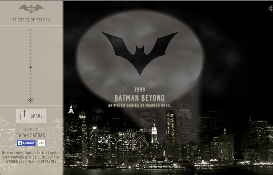
I was working on some Top 10 posts for the end of the year, and stumbled onto Tapan Babbar’s site: 75 Years of Batman. @tapanbabbar He made all of the Batman logos using CSS, with a little parallax thrown into Gotham itself. Pretty cool! And… if this and...
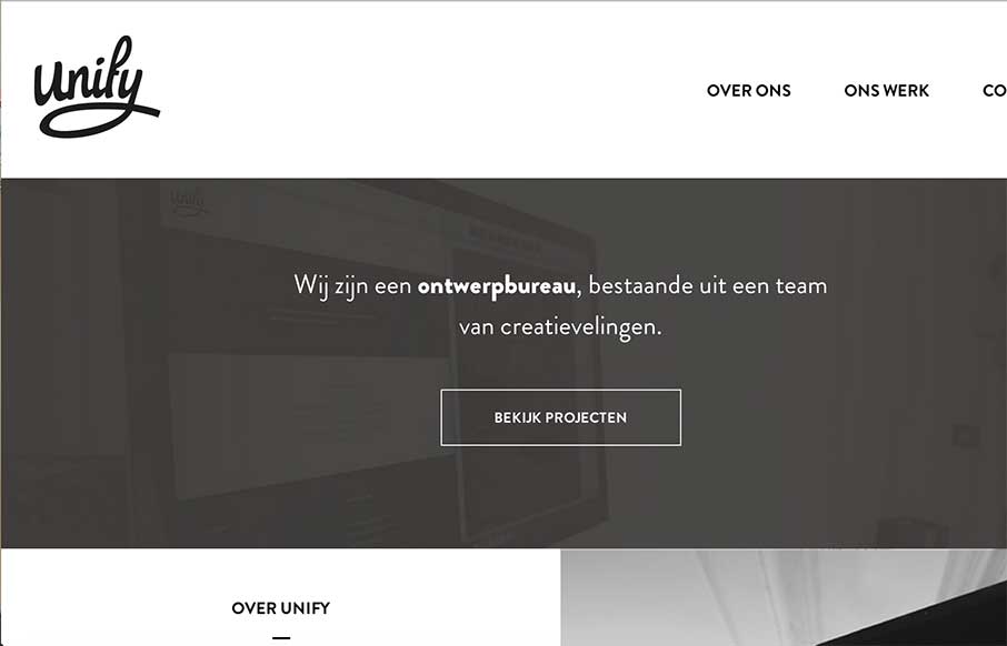
by Aaron Griswold | Dec 29, 2014 | Gallery
Very simple, clean, minimal site from Unify out of the Netherlands. What I really like is on their portfolio detail pages – they’ve posted they color palette and font’s they used. Would be cool if they named the fonts too – but this way you can...
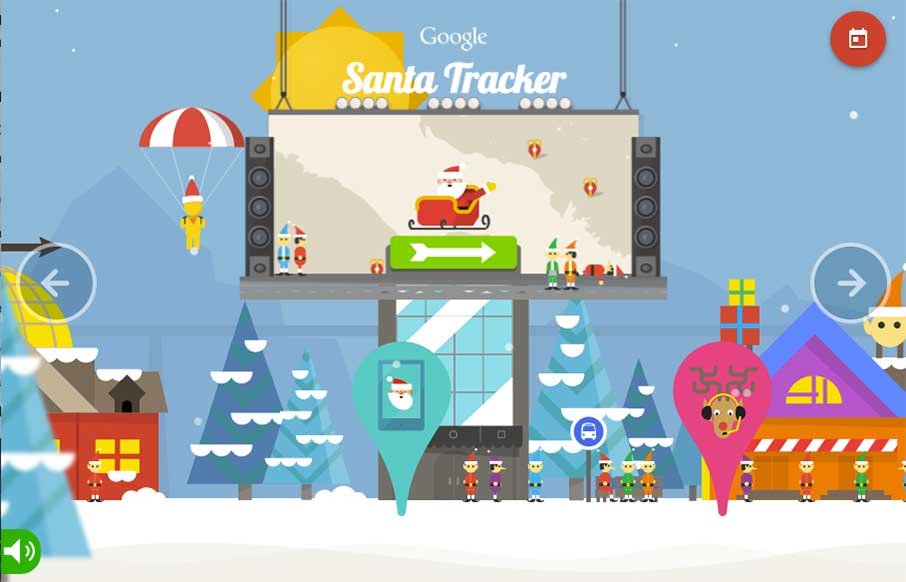
by Aaron Griswold | Dec 24, 2014 | Gallery
No matter what you celebrate, or where you live, we here at UnmatchedStyle wish you the safest and warmest of holidays, and are looking forward to a great 2015 with all of you! In the website world – two of the most popular websites today, December 24th are the...