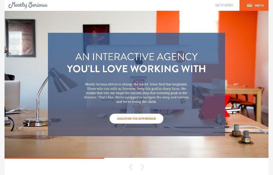
by John David Hunt | Jun 23, 2015 | Gallery
Many agency sites use large photos to bring out the human nature of their company and give us a glimpse to their habits and personalities. Others showcase their skills heavily and give no hint of who or how their work is done and practiced and whether there are humans...
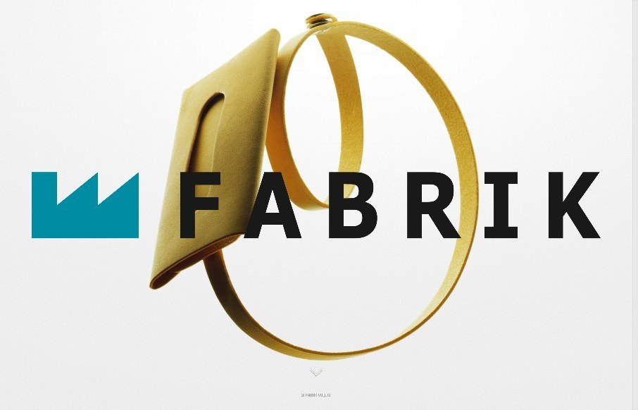
by John David Hunt | Jun 23, 2015 | Gallery, Product
I love the straightforward minimal approach of this site, coupled with it’s easy to use interface for filtering by product type and color it brings me closer to the product than most other product pages I visit. The grids of colorful rows are just magical in...
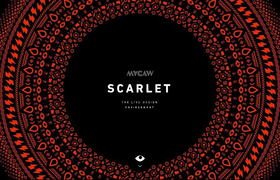
by Aaron Griswold | Jun 22, 2015 | Gallery
I met with a VC during ConvergeSE that was meeting with Macaw, and was asking what we as designers thought of something like Macaw’s Scarlet – something to disrupt Dreamweaver… I, uh, as someone who builds “by hand” – honestly, I...
by Aaron Griswold | Jun 22, 2015 | Gallery
Boom. Sometimes that is just what you should say with a site review. Boom.
by Aaron Griswold | Jun 22, 2015 | Gallery
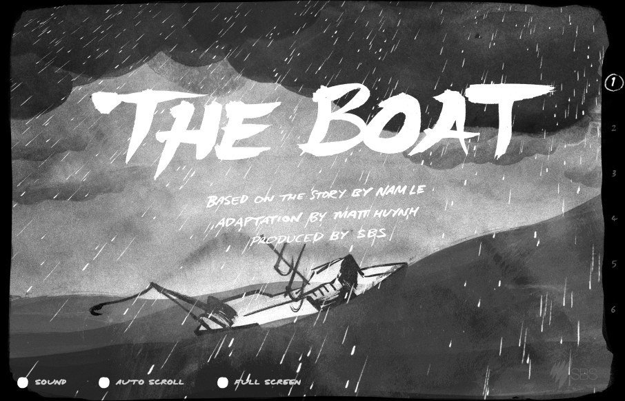
SBS out of Australia has produced a website called ‘The Boat’ – which is an interactive graphic novel about escape after the Vietnam War – based on the story by Nam Le. Incredible use of scroll jacking and on-scroll actions in a parallax web...
by Aaron Griswold | Jun 19, 2015 | Education, Gallery
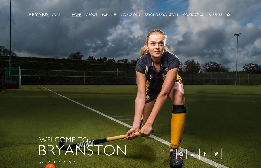
Great images permeate throughout this site for Bryanston School in the SouthWest UK – which is really good. I think the most interesting decision they made of the site was maybe for accessibility – there’s a link in the footer to see the “High...