by Aaron Griswold | Jul 31, 2015 | Gallery, Radar
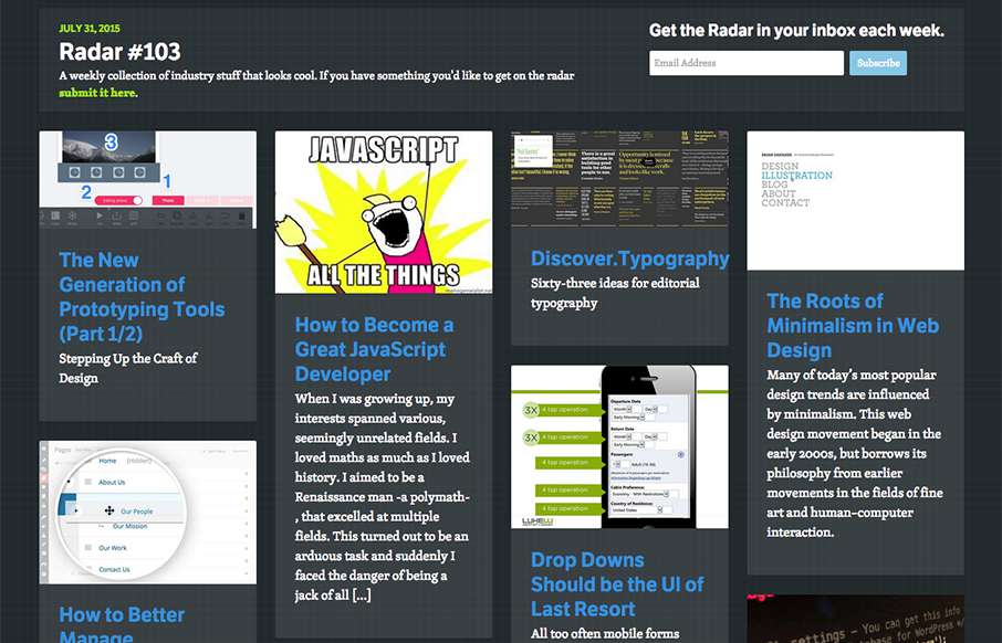
In this week’s 103rd Radar: The New Generation of Prototyping Tools (Part 1/2) How to Become a Great JavaScript Developer Discover.Typography, The Roots of Minimalism in Web Design Drop Downs Should be the UI of Last Resort How to Better Manage WordPress Pages...

by Gene Crawford | Jul 30, 2015 | Gallery, Sports/Recreation
Pretty nice site for Conor Mcgregor the UFC fighter. Typically sport specific athlete websites are horrible, this one is not. It’s simple and minimal and has really good photography and typography. I like just about every aspect to it. Good show of restraint on...
by Gene Crawford | Jul 30, 2015 | Gallery
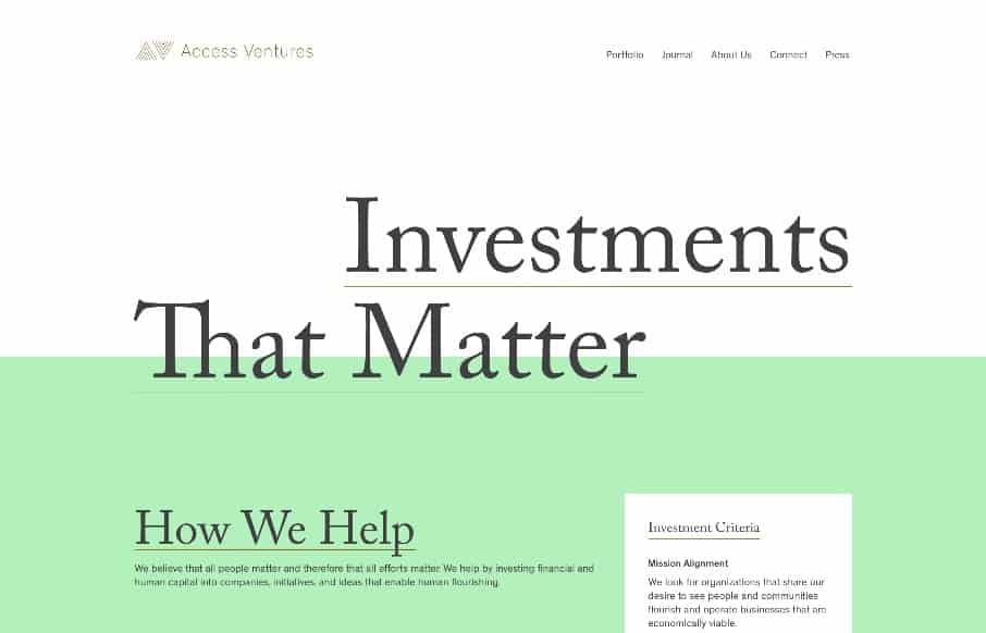
I love the strong typographic approach to this website’s design. It’s quite nice and feels very unique to me. I especially like how it retains it’s asymmetrical layout in the header area. From the Designer: The site was designed by Fuzzco, and Access...

by Gene Crawford | Jul 30, 2015 | Gallery, Portfolio
Really nice minimal design for this single page portfolio website for product designer Ryan Johnson. I love the main hero image, how he’s done some neat type work and interplaying it with the photo too. Then it’s just all business, showing work in context,...

by Gene Crawford | Jul 29, 2015 | Gallery
There is so much going on with the Fixed Group website that it just makes me smile. It’s a fairly simple look and feel but all the interaction and nav design leaves you really blown away. I really dig the main nav interactions a great deal. The colors and...
by Gene Crawford | Jul 29, 2015 | Gallery
Man, this site blows me away visually. I love that logo/display type and the colors, man. I love the header and how it slides away from being a large hero area and keeps itself there in the fixed header, but still has that slight parallax slide vibe. Strong stuff....