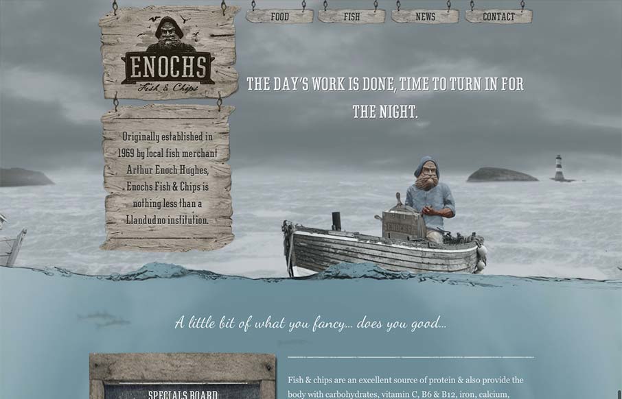
by Gene Crawford | Sep 20, 2012 | Food and Beverage, Gallery
An unexpected responsive design here. It’s one of a few sites i’ve seen recently that takes a lot of the same RWD patterns and adds a layer of decoration on top of it (with the ship captain/fisherman theme) and pulls it off really well. I love the hook...
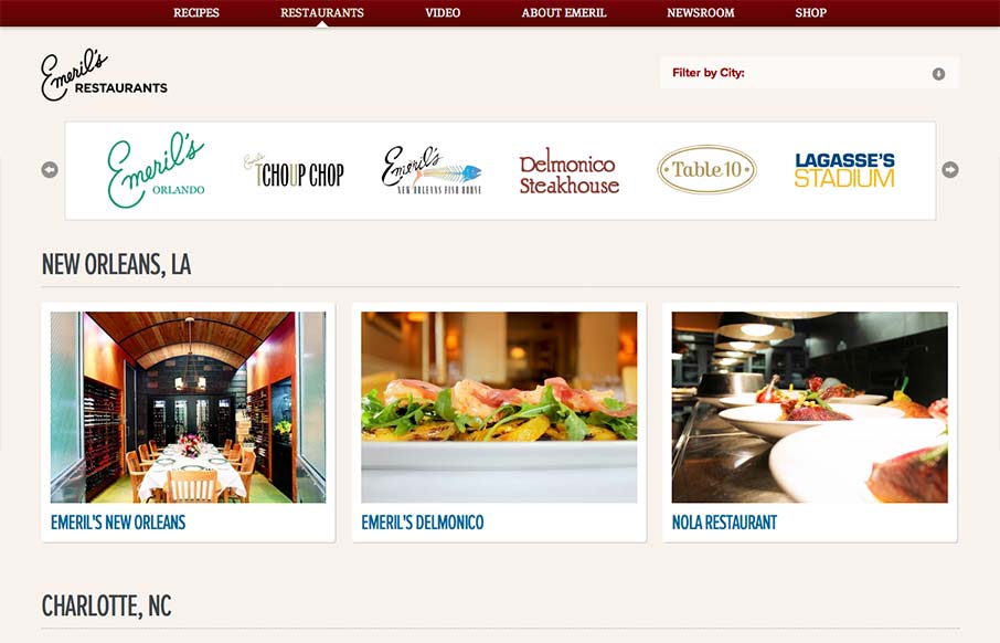
by Maria | Sep 13, 2012 | Food and Beverage, Gallery
Aside from the oddity of having different sites/URLs in the main nav, the restaurant “site” is really nice. It has a clean design with gorgeous imagery (cuz let’s face it, Emeril’s food is a dream) and a great layout of information. It’s...
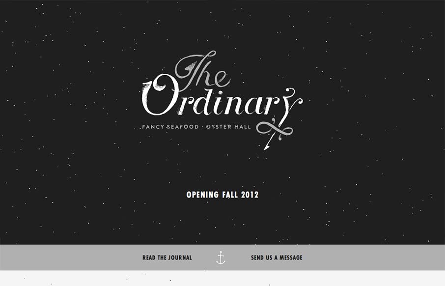
by Giovanni DiFeterici | Sep 11, 2012 | Food and Beverage, Gallery, Screencast Review
I have to say that I think this is an great site. It has just the right mix of texture, art and typography. My favorite part of the design is the speckled background, which does a great job of softening and activating the negative spaces without making the design...
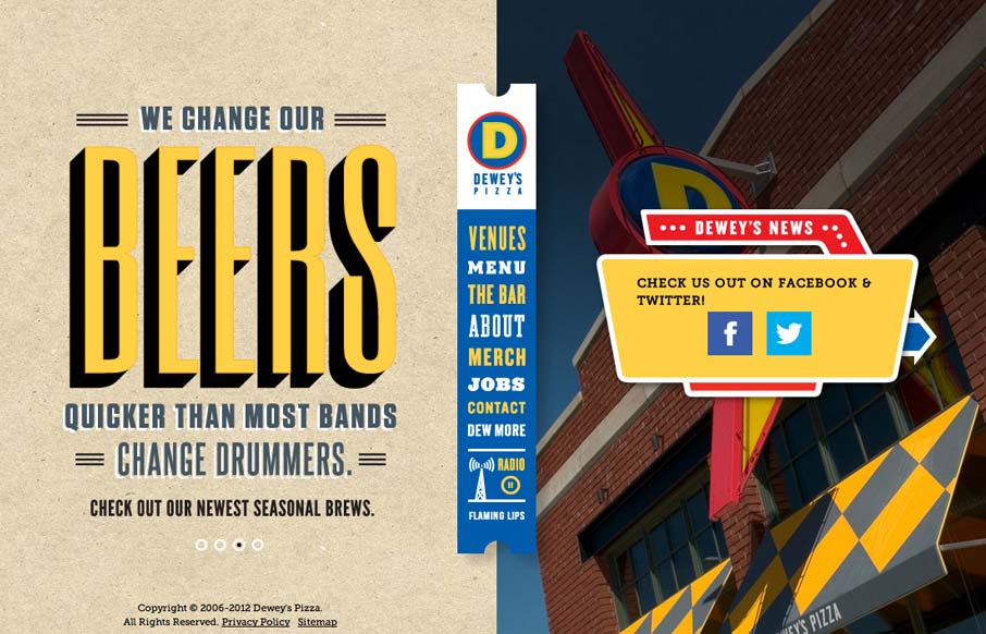
by Giovanni DiFeterici | Sep 7, 2012 | Food and Beverage, Gallery
I usually hate when websites hit me with a ‘site soundtrack’, but in this case I really think it helps to complete the experience. The colors, texture, and typography go really well with the music. It took me a little while to realize that the center...
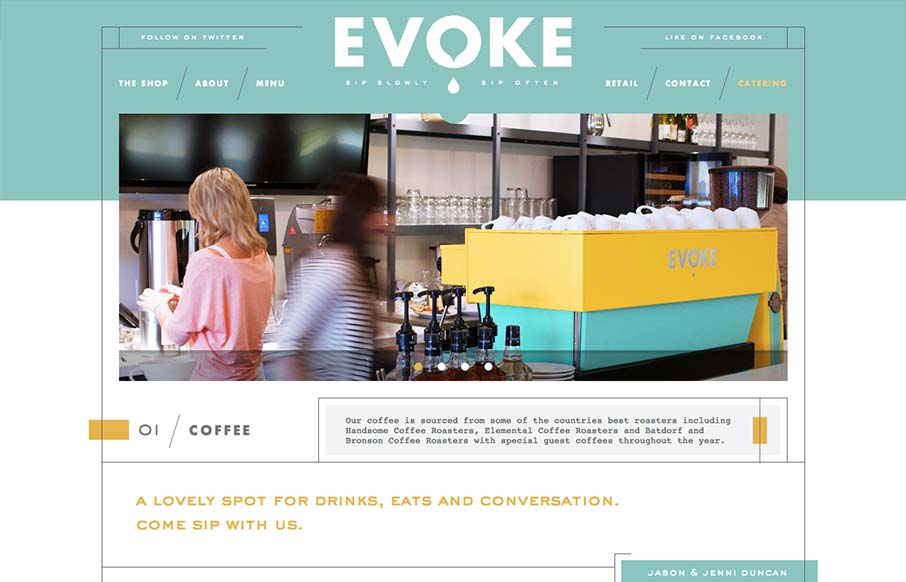
by Gene Crawford | Sep 6, 2012 | Food and Beverage, Gallery
What a great vibe this website has. I love the lines and stark yet very soft graphic feel to it. It’s amazing how this shows off hard edges and soft colors at the same time. Truly creating a harmony of the two. It’s also a superbly designed adaptive...
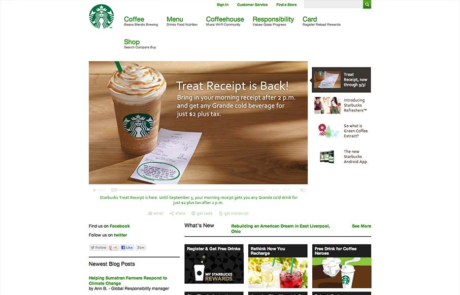
by Gene Crawford | Aug 30, 2012 | Food and Beverage, Gallery, Screencast Review
Pretty much have to include the new(ish) responsive Starbucks Coffee site in here. It has some neat sections of it’s design that are worth studying for sure. Like the different views for different screen widths on the big slideshow slider. We’ll take a...