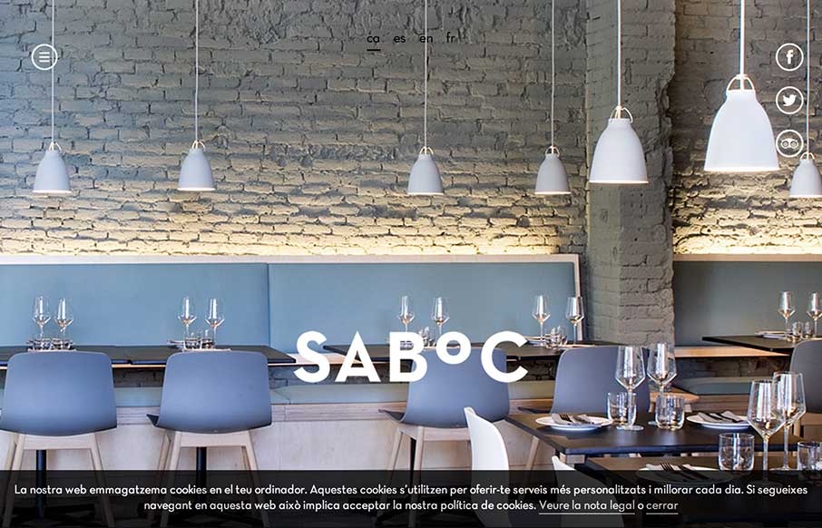
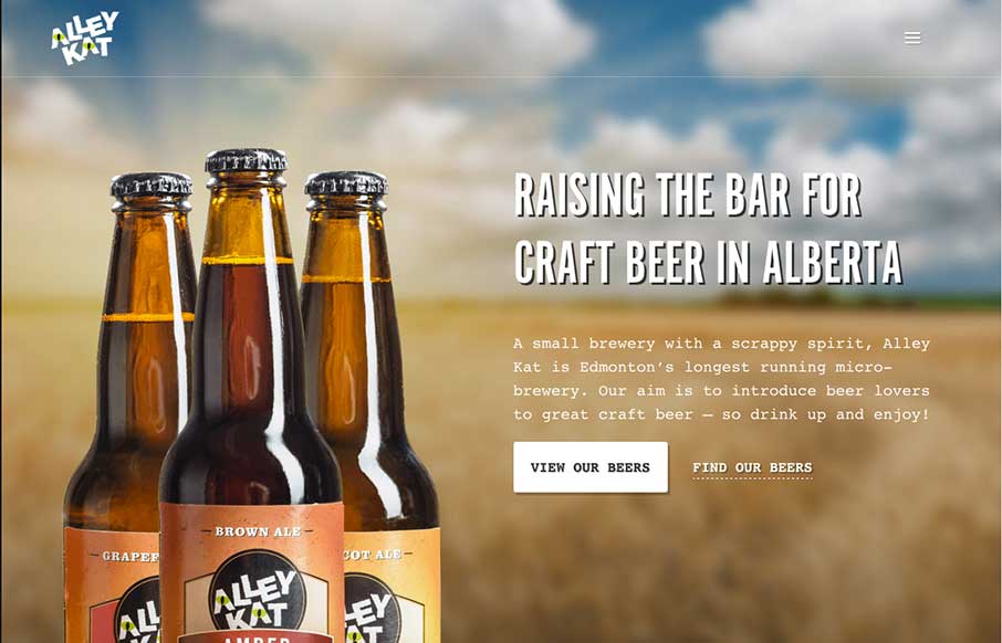
by Gene Crawford | Oct 10, 2014 | Food and Beverage, Gallery
Cool site design. I like the vibe of this single pager. The hamburger icon is in play here, but it’s really just for anchors along the page. Nice use of that in this instance IMHO.
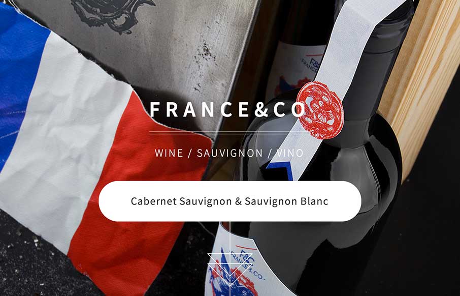
by Gene Crawford | Oct 6, 2014 | Food and Beverage, Gallery
Looks like a simple site – but some nice background image, slight parallax feel in the scroll. A little confused on the copy translation and repeats, and the social icons that go nowhere. But the design itself is vibrant, and seems to get the brand’s image...
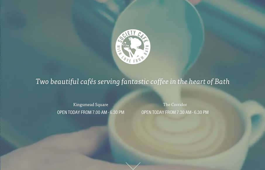
by Gene Crawford | Oct 1, 2014 | Food and Beverage, Gallery
What a beautiful and soft feeling site design for Society Cafe. I love the soft colors and thin line work used across the page. The video in the background is a good touch to keep a kinetic vibe going as you scroll down the page too.
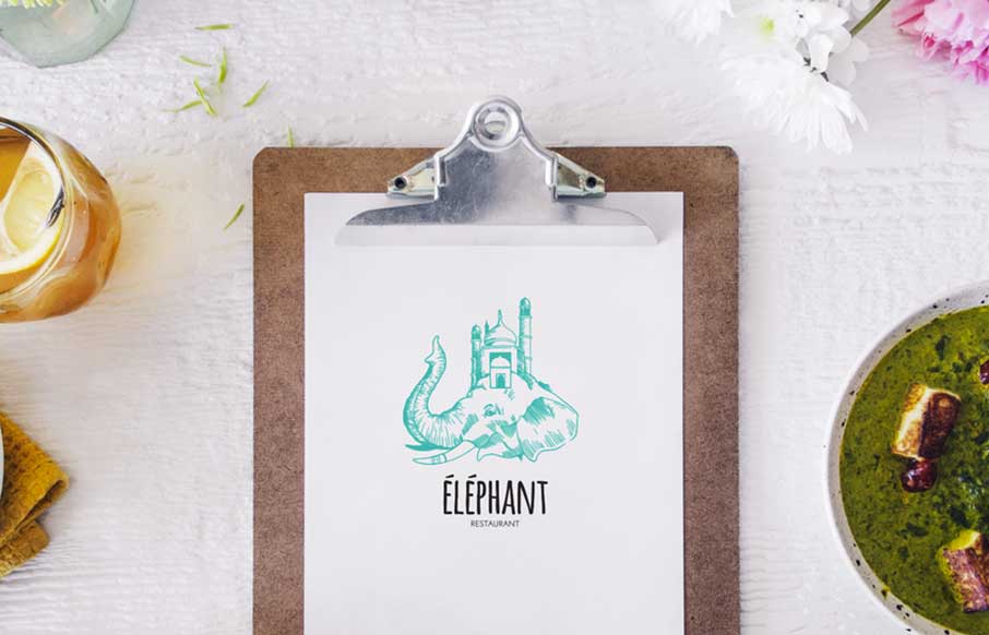
by Gene Crawford | Sep 26, 2014 | Food and Beverage, Gallery
Some nice little details and inviting design make this site for Éléphant a really great restaurant website. Submitted by: Pier-Luc Cossette Role: Designer & Developer Éléphant is a indian food restaurant situated in Québec, Canada.
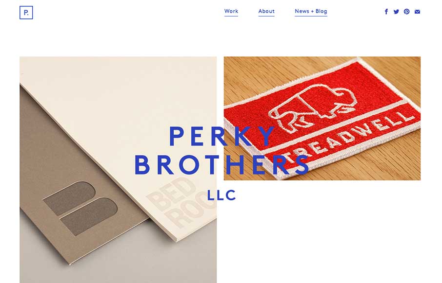
by Gene Crawford | Sep 18, 2014 | Food and Beverage, Gallery
Nice minimal design for Perky Brothers. I love the name. I also really like the overlay of the words that sit on top of the images and stay put as you scroll down the page.
by Gene Crawford | Sep 17, 2014 | Food and Beverage, Gallery
Nice design that feels “crafted” with some hand made looking sections, the type plays into this nicely. The site utilizes a Full Screen Overlay style navigation pattern which seems to fit aesthetically but not functionally too well.