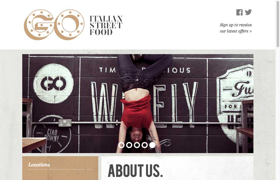
by Gene Crawford | Jan 8, 2015 | Food and Beverage, Gallery
Cool adaptive site design for GO Food. I dig all the illustration work and how it’s been worked into the layout to feel really hand made like it does.
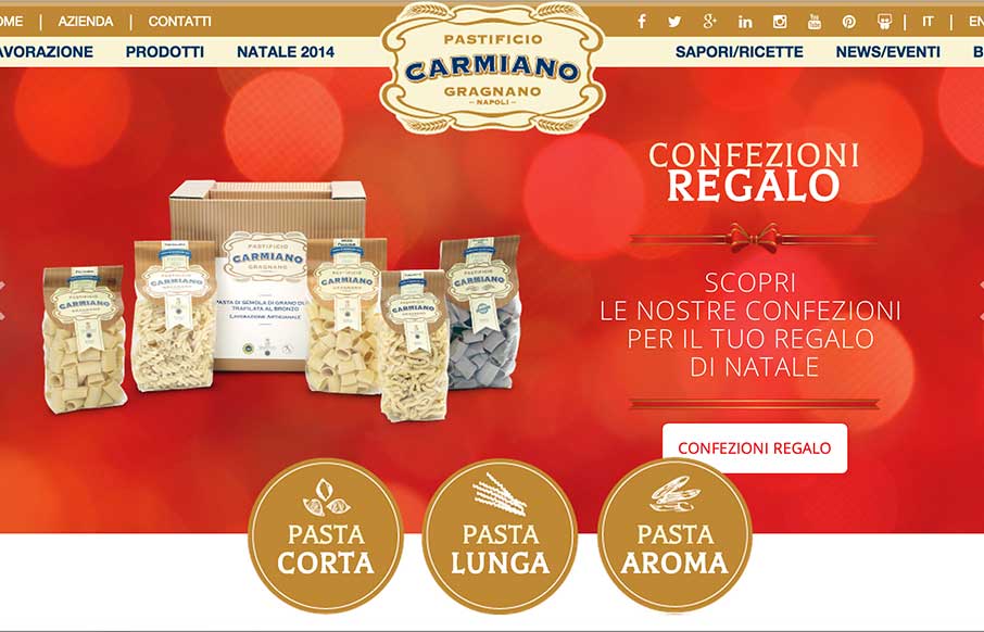
by Aaron Griswold | Jan 5, 2015 | Food and Beverage, Gallery
I keep telling myself not to write reviews of food sites before lunch… did it again. The Pasta Factory Carmarthen Gragnano (or Il Pastificio Carmiano di Gragnano)’s site out of Italy takes a grand tour of pasta – I didn’t know there were so...
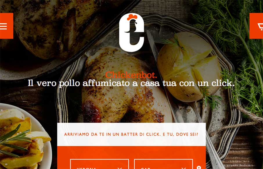
by Aaron Griswold | Dec 10, 2014 | Food and Beverage, Gallery
Note to self – don’t do website reviews on food sites three hours before lunch – especially when it looks as appealing as the Chickenbot website out of Italy… yes, Chickenbot. Great, savory images and pretty decent ordering functionality for...
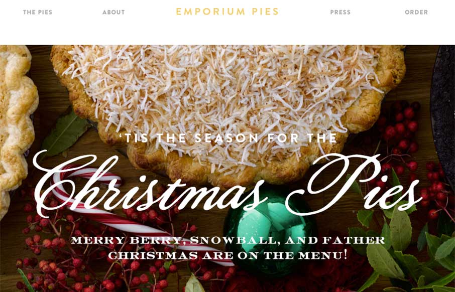
by Aaron Griswold | Dec 3, 2014 | Food and Beverage, Gallery
My co-worker and I have been staring at this site for a few minutes going “mmmmm…. pie” as if we were two Slingblades sitting in a hipster office staring at pies… I know – sad visual… but the Emporium Pies site is a very good...
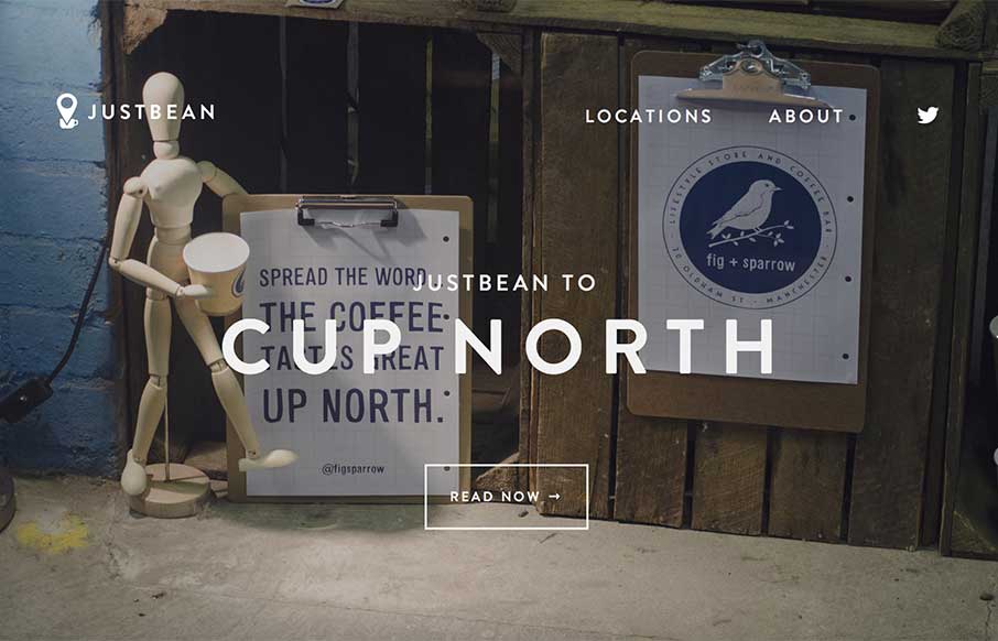
by Aaron Griswold | Nov 12, 2014 | Food and Beverage, Gallery
I’m on a small movie set right now with my jugged coffee from the caterer, in a styrofoam cup, with some International Delight French Vanilla creamers in it… and then I look at this site – I am envious, and want to be in Manchester, UK right now....
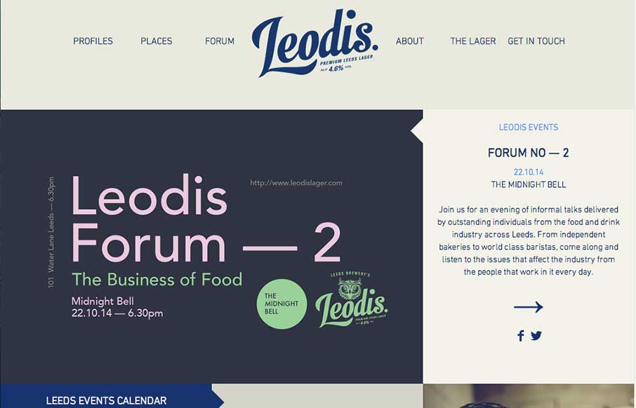
by Gene Crawford | Oct 20, 2014 | Food and Beverage, Gallery
Man I love this layout. It feels very unique to me and trust me when I say that I see a ton of website designs… Love that header interaction and the way the rest of the content is laid out. Very smart design, spend some time here guys.