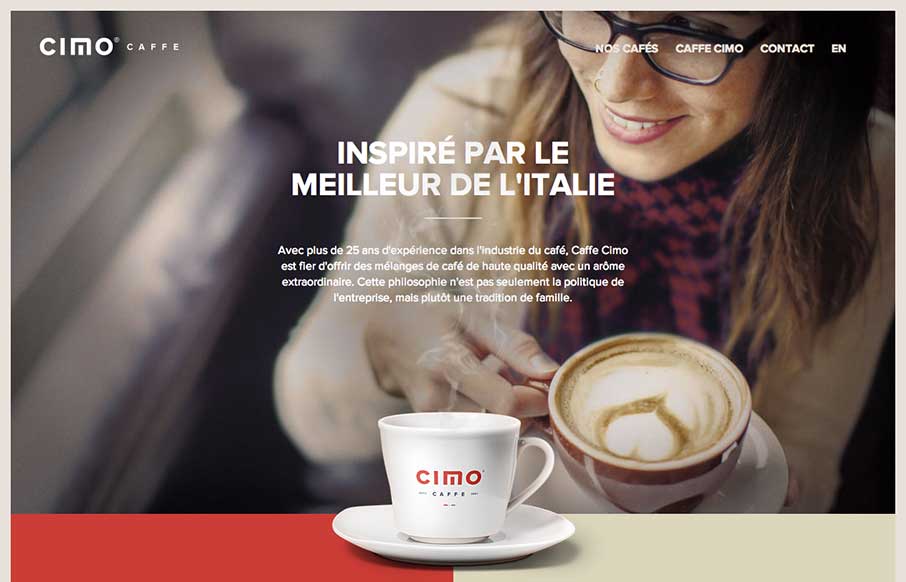
by Gene Crawford | Sep 12, 2014 | Food and Beverage, Gallery
Really nice use of contrast. I’m not just talking about colors, but the way they contrast the photos and real imagery of coffee bags with flat areas of color and blocky bold type and icons. Really gives this page a nice rich visual feel. Love it, now for some...
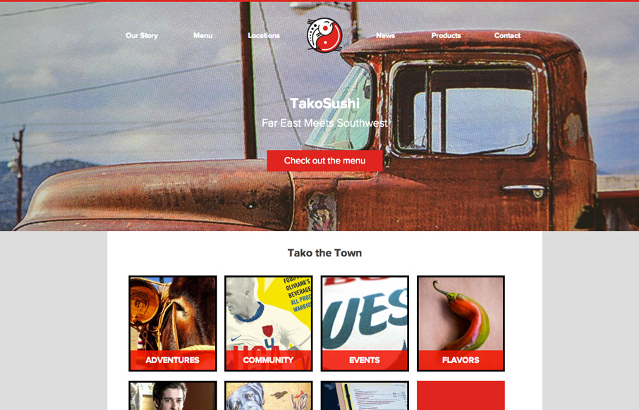
by Gene Crawford | Sep 10, 2014 | Food and Beverage, Gallery
It’s not often we come across a website for a restaurant in our home town of Columbia, SC that we love. We both love the food at this place and the website is pretty awesome looking too. It’s simple and effective and has some pretty badass branding to go...
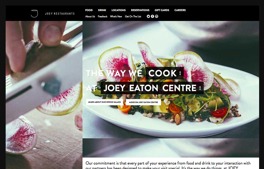
by Gene Crawford | Aug 11, 2014 | Food and Beverage, Gallery
Decent responsive effort on the JOEY Restaurant Group website, it doesn’t appear to scale all the way down past say an iPad width though. I like how they keep the home page short and succinct and stuff.
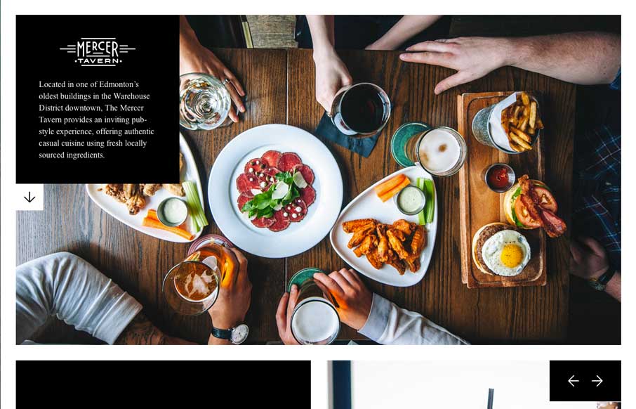
by Aaron Griswold | Aug 7, 2014 | Food and Beverage, Gallery
The majority of restaurant websites are awful. Period. Mercer Tavern’s website on the opposite side of the spectrum. They prove that you can make a great restaurant website, that is clean, cool, and small. The pictures make the site cool, and the literal white...
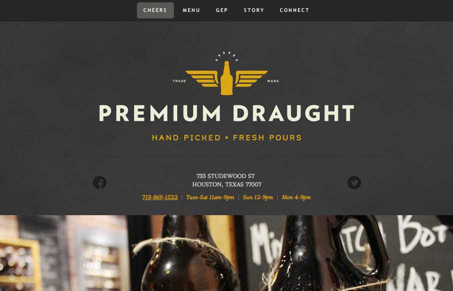
by Aaron Griswold | Aug 4, 2014 | Food and Beverage, Gallery
A good one page site that seems to be an extension of the growler fill station itself (making the site background / tecture look like the chalkboards in the store). In the mobile version, they’ve made the menu more accessible for your phone, without resorting to...
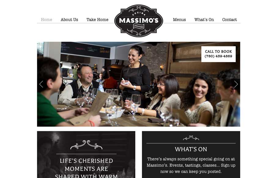
by Gene Crawford | Jul 29, 2014 | Food and Beverage, Gallery
We love websites that make great use of fonts, and Massimo’s Cucina Italiana uses a couple of different fonts, accent illustrations, vibrant pictures, and black, white, and gray to tell the story of their restaurant. Simple, and effective. Submitted by: Landon...