
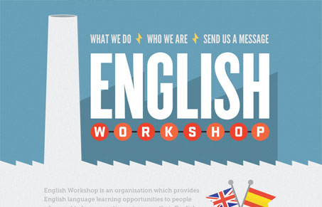
englishworkshop.eu is a sweet and simple design by Simple as Milk for the English Workshop. Its a site that paints in broad strokes, the text is big and the content areas as are the color separations. I wonder about hiding the bulk of the content behind artwork (the crates in the ‘what we do’ section) but enough little cues exist to let us know that we should pay just a little more attention. I love the muted blue, yellow and orange color scheme.




0 Comments