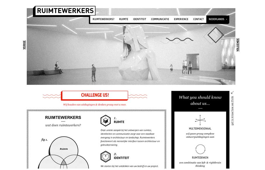
by Gene Crawford | Feb 28, 2014 | Design Firm, Gallery
I like the stark black and white box design of this website. Very simple and clean yet it almost feels gritty due to the way the boxes are used. That fixed nav section is pretty slick. I like how it just folds down to “nav” for mobile screen widths...
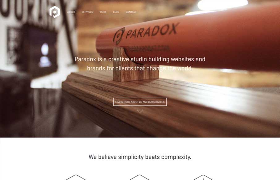
by Giovanni DiFeterici | Jan 23, 2014 | Design Firm, Gallery
Paradox is beautifully minimal design with a clear focus on funneling potential clients into a conversation. The site is clearly conceived and simple in execution. The differentiator is the quality of the work. Minimal design at its best.

by Gene Crawford | Jan 9, 2014 | Design Firm, Gallery
The Drexler website is both minimal and highly interactive. There’s plenty of javascript here for everyone but it’s not overly distracting. Things move around smoothly and it’s still fairly easy to generate a good mental picture of what’s going...

by Gene Crawford | Jan 6, 2014 | Design Firm, Gallery
The new Adaptive Path website is “as always” a thing of beauty. There really is a lot going on here when on the surface it looks like a simple design. From the slight movement of the top header/navigation, to show you it’s there, down to the overall...
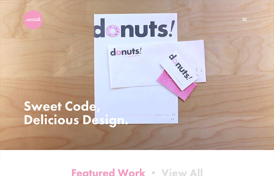
by Maria | Oct 21, 2013 | Design Firm, Gallery
I’ve always like the video on Social’s home page, so I’m glad they’ve found ways to utilize it with each redesign of the site. I especially like the consideration they take when the site’s viewed on a smaller device. It’s smartly...

by Gene Crawford | Oct 2, 2013 | Design Firm, Gallery
I love the simply stated yet perfectly executed design of the Lullabot website. The rhythm of this site is superb as you scroll down the page. Everything just queues up perfectly for you. The site starts off as a place to get into what type of work the firm does, then...