by Aaron Griswold | Apr 9, 2014 | Design Firm, Gallery
Nice scroll down/in movement on the main graphics. That kind of thing can hit home right away when you first visit a website. Claws, Jimi Hendrix… dern fellas.
by Gene Crawford | Apr 7, 2014 | Design Firm, Gallery
I really like this new pattern that’s emerging where the main nav changes slightly once you move past the initial page load. I do also dig the interactions placed with each of the main images on the home page too, very smart use of animations.
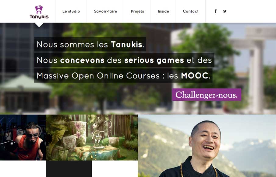
by Aaron Griswold | Apr 4, 2014 | Design Firm, Gallery
I like this nav design. It’s a different idea to include, pretty much, a sitemap as your main nav if you can (if the site is small enough). I also dig how the illustrations are used and interact visually with the copy.
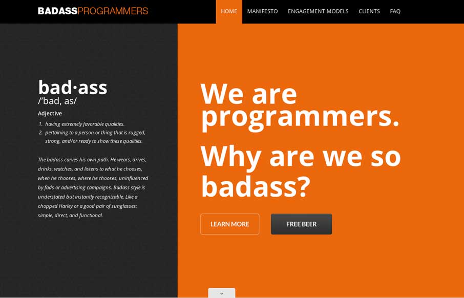
by Aaron Griswold | Apr 3, 2014 | Design Firm, Gallery
Pretty slick movement on the site as you scroll. I like the way the colors flip around too on interaction with the main nav. Clever stuff here.
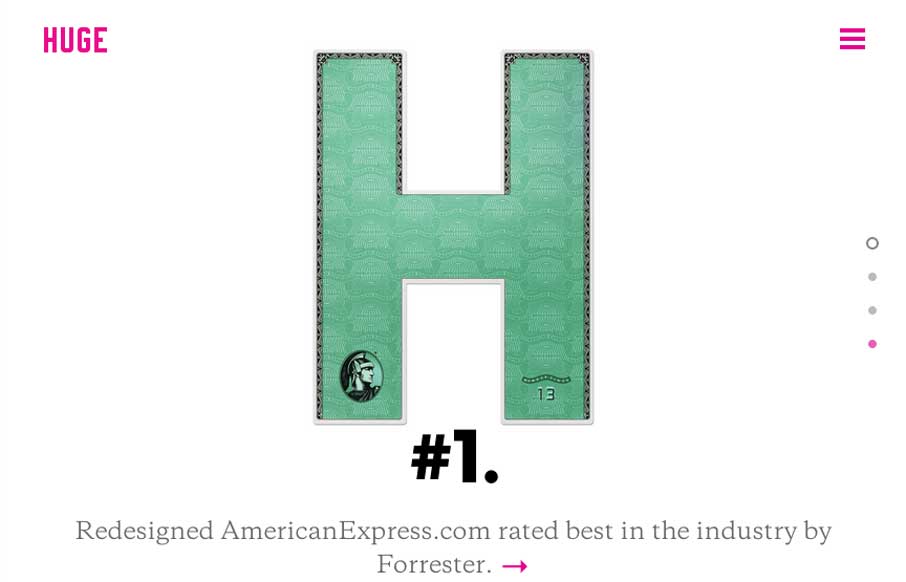
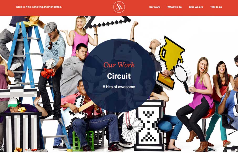
by Gene Crawford | Mar 24, 2014 | Design Firm, Gallery
Huge has always been about the experience. Their new website is nothing short of great expectations as far as i’m concerned. Good experience, and good mental model of the website – backed up by the overlay navigation. I also kind of dig the way the main...
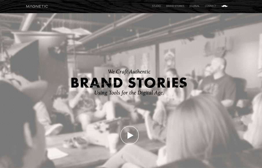
by Gene Crawford | Mar 10, 2014 | Design Firm, Gallery
Really cool looking mix of tight straight edges and hand made type treatments, mixed with the sepia colored imagery. This site has a nice hand made feel but also very high end. The slight movement of the images behind the type overlays add that extra little dimension...