
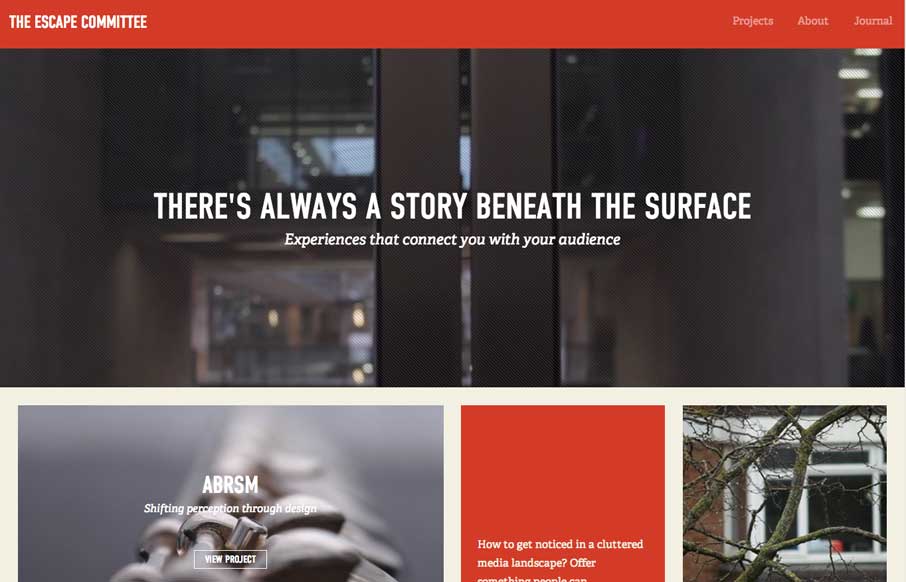
Really cool layout for the Escape Committee website. I really dig the sharp lines and boxes the design is based on. The typography fits exactly how it feels like it should too. Makes me want to read all the articles.


Fitts’s Law: Why the Easy Button Wins
Large, close targets are faster to hit than small, distant ones, that’s Fitts’s Law. A look at the 1954 rule behind buttons, prime and magic pixels, thumb zones, and dark patterns.


0 Comments