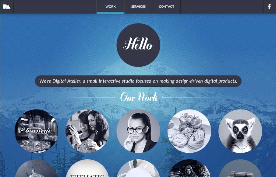
by Aaron Griswold | Jul 24, 2014 | Design Firm, Gallery
We like seeing sites that mix it up a little, but still keep a sense of simplicity. This one does that – horizontal transitions on top of a cool background image (get it… top… cool…?). Like the flipper that holds the page headline at the top....
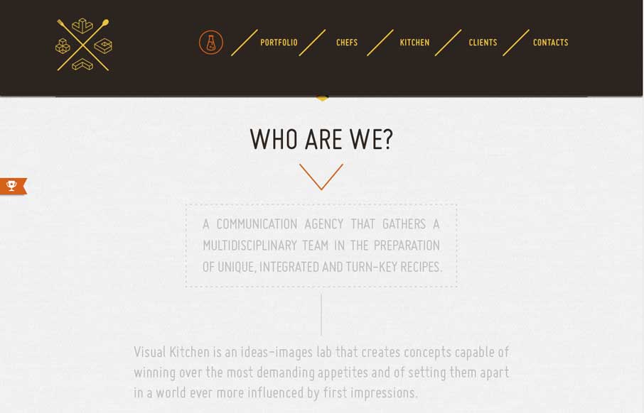
by Aaron Griswold | Jul 24, 2014 | Design Firm, Gallery
We’ve seen a lot of animated gifs – most of them are some crazy cat/dog/weird meme. Luckily, Visual Kitchen uses them to give a little bit of cool expression, coupled with a semi-transparent reveal of content as you scroll down. The drop-down header menu,...
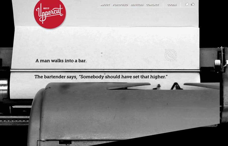
by Aaron Griswold | Jul 15, 2014 | Design Firm, Gallery
Really like the animated scrolling on the home page – want that Field Notes book for my personal collection. Great use of fonts, both on the page, and in the modals (which make the modals actually work well – like a placard o’ info). And someone...
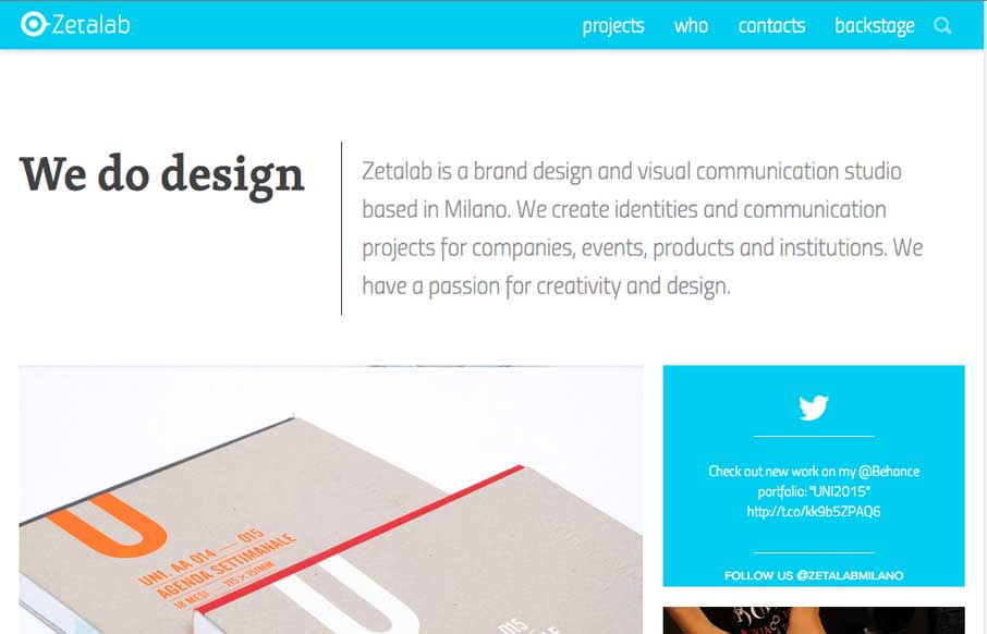
by Aaron Griswold | Jul 11, 2014 | Design Firm, Gallery
Zetalab is a clean and vibrant site showcasing this Italian / Brazilian agency’s work. We just worked on a site that had a similar interaction as the Projects page, and like how they did their tagging, but also included the infinite scroll (but definitely glad...
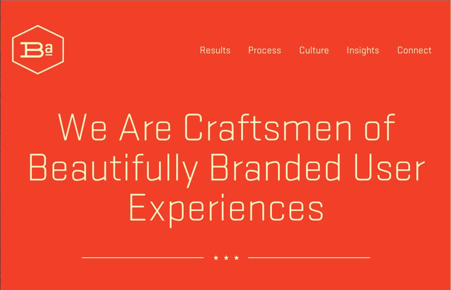
by Aaron Griswold | Jul 10, 2014 | Design Firm, Gallery
We’ll be in Nashville for BDConf in a couple of weeks, and I hope we run into these folks from Brand Aid Design. Their site proves that you can do don’t have to have all the bells and whistles on a site to make it effective. It’s simple and clean...
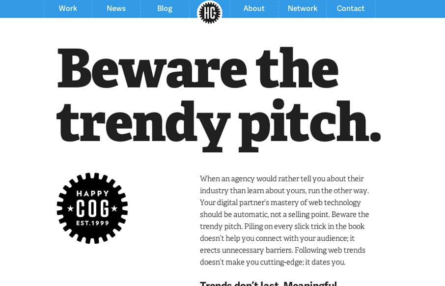
by Gene Crawford | Jun 9, 2014 | Design Firm, Gallery
New updated on the Happy Cog site. I love these guys and just about everything they do, so always take notice when they relaunch their own stuff. It is of course smartly executed. I especially dig the employee profile pages.